Wikipedia logo
From Wikipedia, the free encyclopedia
The logo of the online encyclopedia Wikipedia depicts a white, incomplete globe-shaped jigsaw puzzle, each jigsaw piece inscribed with a glyph from a different writing system. As displayed on the web pages of the English-language edition of the project, there is the wordmark "WIKIPEDIA" (styled as WikipediA (in small caps, with the leading W and trailing A taller than the other letters)) beside the globe, and below that, the text "The Free Encyclopedia" in the open-source Linux Libertine font.[2][3]

The unfinished puzzle symbolizes the project's state as a perpetual work in progress.
Design and history
Summarize
Perspective
Early logos (2001)
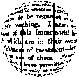
In January 2001, Jimmy Wales used the flag of the United States as a placeholder logo for Wikipedia's UseModWiki instance.[4] Wikipedia's first true logo was an image originally submitted by Bjørn Smestad – under the username Bjornsm – for a Nupedia logo competition which took place in 2000.[5] It was used provisionally as Wikipedia's logo until the end of 2001.[6]
The logo included a quote from the preface of the 1879 book Euclid and his Modern Rivals by Lewis Carroll. It utilized the fisheye effect to make the text appear to be wrapped onto a sphere, leaving only part of it readable. The used text was (visible text in bold):[6]
In one respect this book is an experiment, and may chance to prove a failure: I mean that I have not thought it necessary to maintain throughout the gravity of style which scientific writers usually affect, and which has somehow come to be regarded as an 'inseparable accident' of scientific teaching. I never could quite see the reasonableness of this immemorial law: subjects there are, no doubt, which are in their essence too serious to admit of any lightness of treatment – but I cannot recognise Geometry as one of them. Nevertheless it will, I trust, be found that I have permitted myself a glimpse of the comic side of things only at fitting seasons, when the tired reader might well crave a moment's breathing-space, and not on any occasion where it could endanger the continuity of the line of argument.
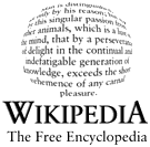
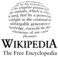
In November 2001, Wikipedia users began suggesting new logos for the website. A list of 24 leading candidates was chosen in the contest, which took place from November to December 2001. The winner was the last logo (#24), contributed by the user The Cunctator.[6]
The logo included the quote, taken from Thomas Hobbes's 1651 book Leviathan, from chapter VI of part I, placed within the circle and distorted by the fisheye effect. Underneath it was written "Wikipedia" in the capital letters, with W and A being slightly taller than the others. Beneath that was placed the motto of Wikipedia: The Free Encyclopedia.[6] The text used for the logo was (visible text in bold):
Desire to know why, and how, curiosity; such as is in no living creature but man: so that man is distinguished, not only by his reason, but also by this singular passion from other animals; in whom the appetite of food, and other pleasures of sense, by predominance, take away the care of knowing causes; which is a lust of the mind, that by a perseverance of delight in the continual and indefatigable generation of knowledge, exceedeth the short vehemence of any carnal pleasure.
The logo of the French Wikipedia used until 2003
The logo of the Swedish Wikipedia used until 2003
As the logo utilized text in English language, its usage was not favored by other-language versions of Wikipedia. Some websites used similar designs with texts in their own languages. For example, Dutch Wikipedia used text from Multatuli's 1860 Max Havelaar classic book.[7] Other websites used the logo with English text, painted in the colours of the national flags. Such design was used for example by Danish and Swedish versions, using the flags of Denmark and Sweden, respectively.[8][9] The other option used by some versions of Wikipedia was to design their own distinct logos, for example the French Wikipedia, which used the green circle with a white dove on it, as its logo.[10] Additionally, some websites used a logo with English text in it, with the motto "The Free Encyclopedia" translated to their languages. It was done, for example, by the German Wikipedia.[11]
Puzzle globe (2003)
Contest
In 2003, following a suggestion by Erik Möller, known under the username Eloquence, an international logo contest was conducted to find a new logo that was suitable for all language versions of Wikipedia.[12][13] After a two-stage voting process, a design by Paul Stansifer, at the time known under username Paullusmagnus, won with considerable support. His project depicted an unfinished globe constructed of puzzle pieces, of multiple colors. It was covered by text with links in various languages and writing systems, to symbolize the continuous construction and development of the project. It was made in POV-Ray, using a puzzle image wrapped around a sphere.[13]
A ratification vote was held soon after, to confirm community consensus. As a result, twelve direct adaptations of the design were created by members of the community. One of the propositions made by David Friedland, known under username Nohat, was chosen. Friedland removed the color and changed the overlaid text into one letter or symbol per puzzle piece. His design included various characters from various writing systems. The writing in the logo used Hoefler Text font.
Before being officially released, the logo slightly lightened up and had replaced nearly obsolete kana wi (ヰ) from katakana script with modern kana wa (ワ) and small i (ィ). A smooth breathing mark before the Greek omega (Ω) was deleted and Russian Short I (Й) replaced by Russian I (И). It was adopted by the English Wikipedia on 26 September 2003.[13]
Final version
The logo included 16 characters from 16 different writing scripts, many of which—but not all, chosen to represent due to their similarity to letter W from English language, as in the name Wikipedia. The alphabets represented were as follows:[13]
| — | — | — | |
| — | |||
 Tibetan wa + i(ཝི, transcription: wi) Tibetan wa + i(ཝི, transcription: wi) |
 Latin capital W Latin capital W |
 Arabic isolated yodh(ي, transcription: y) Arabic isolated yodh(ي, transcription: y) | |
 Korean Hangul wicombined letters ieung, u and i(위, transcription: wi) Korean Hangul wicombined letters ieung, u and i(위, transcription: wi) | |||
 Mongolian Todo I (rotated 90 degrees)(ᡅ, transcription: i) Mongolian Todo I (rotated 90 degrees)(ᡅ, transcription: i) |
 Thai chà(ฉ, transcription: ch) Thai chà(ฉ, transcription: ch) |
There was a second version with differences on the Greek and the Cyrillic letters:
| Version with Ω and И | Version with Ώ and Й | |
|---|---|---|
| (and with ワィ) | (and with ウィ) | |
Examples:Portuguese |
Examples:Polish |
Examples:French |
English |
Chinese |
English |
| ΩGreek capital omega(Ω, transcription: o) | ΏGreek capital omega with tonos(Ώ, transcription: ó) | |
| ИCyrillic capital I(И, transcription: i) | ЙCyrillic capital Short I(Й, transcription: y) | |
The logo included several mistakes. Due to a formatting error:
- letters va + i (वि) from Devanagari script were rendered incorrectly, being reversed in the process, showing as (वि).
- In the combined letters va + i (ವಿ) from Kannada script, the diacritic was attached to the wrong place.
- In the case of the Japanese katakana, a wrong kana was used: wa (ワ) was mistakenly used instead of kana u (ウ), forming wai (ワィ), instead of wi (ウィ), which is present in the Japanese name of the website, Wikipedia (ウィキペディア).[13]
Redesign (2010)

Wikipedia logos used on the mobile application and website
In late 2009, the Wikimedia Foundation undertook the efforts to fix the errors and generally update the puzzle globe logo. Among other concerns, the original logo did not scale well and some letters appeared distorted.[14] For the new logo, the Wikimedia Foundation defined which characters appear on the "hidden" puzzle pieces, and had a three-dimensional computer model of the globe created to allow the generation of other views.[15]
The new design was published in May 2010. It features the new 3D rendering of the puzzle globe, as well as correct versions of previously wrong characters, including fixed versions of letters from Kannada and Devanagari, and usage of correct Japanese katakana characters. Additionally, several letters had been replaced by others. It included:[16][2]
- ini (Ի) being replaced with vev (Վ), both originating from the Armenian alphabet;
- letter lo (ល) being replaced with combined letters vo and i (វិ), both originating from the Khmer script;
- combined letters wa and i (ཝི) from Tibetan script being replaced by short u (উ) letter from Bengali–Assamese script, while Tibetan character was moved elsewhere;
- letter Todo I (ᡅ) from Mongolian script being replaced by letter vini (ვ) from the Georgian Mkhedruli script;
- radical 145+5 strokes (袓) from Simplified Chinese script being replaced by radical 120+8 strokes (維) from the Traditional Chinese script.
- letter resh (ר) being replaced by letter waw (ו), both originating from the Hebrew alphabet;
- r () from Klingon pIqaD script being replaced by letter wə (ው) from the Geʽez script;
- letter yodh (ي) being replaced by letter waw (و), both originating from the Arabic script;
- letter cho (ฉ) being replaced by combined letters wo waen and sara i (วิ), both originating from the Thai script.
The wordmark has been modified from the Hoefler Text font to the open-source Linux Libertine font, and the subtitle was no longer italicized. The "W" character, which was used in various other places in Wikipedia, such as the favicon, and was seen as a distinctive part of the Wikipedia brand, was stylized as crossed V's in the original logo, while the W in Linux Libertine was rendered with a single line. To provide the traditional appearance of the Wikipedia "W", a "crossed" W was added as an OpenType variant to the Linux Libertine font.[2]
Glyphs in the Wikipedia logo redesign (2010)
For the new logo, the entire surface of its globe was designed, including puzzle pieces hidden on the non-visible parts of the logo. In total, there were designed 51 puzzle pieces, of which 18 were visible in the logo. There were 21 empty spaces left, for the missing puzzles.
The visible puzzle pieces are:[13][17]
- in the leftmost column, from the top down: capital letter vev (Վ, transcription: v) from the Armenian alphabet, combined letters vo and i (វិ, transcription: vi) from the Khmer script, letter short u (উ, transcription: u) from the Bengali alphabet, combined letters va and i (वि, transcription: vi) from Devanagari script, letter vini (ვ, transcription: v) from Georgian Mkhedruli script;
- in the middle-left column, from the top down: capital letter omega (Ω, transcription: o) from the Greek alphabet, the Radical 120 with 8 additional strokes (維) from the Traditional Chinese script, letter vi (ವಿ, transcription: vi) from the Kannada script, combined letters wa and i (ཝི, transcription: wi) from the Tibetan script;
- in the middle-right column, from the top down: kanas u and small i (ウィ, romanization: wi) from the katakana script, capital letter W from the Latin script, capital letter i (И, transcription: i) from the Cyrillic script, letter waw (ו, transcription: v) from the Hebrew alphabet, combined letters va and i (வி, transcription: vi) from the Tamil script;
- in the rightmost column, from the top down: letter wə (ው, transcription: wə) from the Geʽez script, isolated letter waw (و, transcription: w) from the Arabic alphabet, combined letters ieung, u and i (위, transcription: wi) from the Hangul script, combined letters wo waen and sara i (วิ, transcription: vi) from the Thai script.
The puzzle pieces from the not visible portion of the logo are:[13][17]
- in the central left column, from the top down: capital letter V from the Latin script, combined letters yodh and aleph (يا, transcription: yā) from the Arabic alphabet;
- in the first row to the left from the central left column, from the top down: capital letter wi (Ꮻ, transcription: wi) from the Cherokee syllabary, letter wa (ᥝ, transcription: v) from the Tai Le script, capital letter pi (Π, transcription: p) from the Greek alphabet;
- in the second row to the left from the central left column, from the top down: combined letters va and i (వి, transcription: vi) from the Telugu script, capital letter E-acute (É) from the Latin script, combined letters v and i (ဝီ, transcription: vi) from the Mon–Burmese script, letter o (ᐅ, transcription: o) from the Canadian Aboriginal syllabics, combined letters wa and i (ᤘᤡ) from the Limbu script;
- in the third row to the left from the central left column, from the top down: letter uuinne (𐍅, transcription: w) from the Gothic alphabet, letter wi (ୱି, transcription: wi) from the Odia script, combined letters va and i (വി, transcription: vi) from the Malayalam script, letter wa (ᠸ, transcription: w) from the Mongolian script;
- in the fourth row to the left from the central left column, from the top down: combined letters va and i (વિ, transcription: vi) from the Gujarati script, combined letters wa and i (ᨓᨗ, transcription: wi) from the Lontara script, letter vedi (Ⰲ, transcription: vi) from the Glagolitic script, capital letter U from the Latin script;
- in the central right column, from the top down: capital letter de (Д, transcription: d) from the Cyrillic script, capital dotted I (İ) from the Latin script;
- in the first row to the right from the central right column: combined letters va and i (වි, transcription: vi) from the Sinhala script;
- in the second row to the right from the central right column, from the top down: combined letters vava and sihari (ਵਿ, transcription: vi) from the Gurmukhi script, combined letters vaavu and i (ވި, transcription: vi) from the Thaana script, capital letter H from the Latin script, capital letter A-umlaut (Ä) from the Latin script;
- in the third row to the right from the central right column, from the top down: capital letter ya (Я, transcription: ya), combined letters w and i (ວິ, transcription: vi) from the Lao script, capital letter u (У, transcription: u) from the Cyrillic script, radical 12 with additional 6 strokes (典, pinyin: diǎn) from the Traditional Chinese script;
- in the fourth row to the right from the central right column, from the top down: combined letters wa and i (ꦮꦶ, transcription: wi) from the Javanese script, isolated letter waw (ܘ, transcription: w) from the Syriac alphabet, capital letter ve (В, transcription: v) from the Cyrillic script, letter wi (, transcription: wi) from the Baybayin script.
| — | — | — | |||||||
| — | — | — | |||||||
| — | — | — | — |  Armenian vev(Վ) Armenian vev(Վ) |
— | — | — | — | — |
| — | — | — |  Telugu va + (i)(వి) Telugu va + (i)(వి) |
 Khmer vo + i(វិ) Khmer vo + i(វិ) |
— |  Katakana u + small i(ウィ) Katakana u + small i(ウィ) |
 Gəʿəz wə(ው) Gəʿəz wə(ው) |
— | — |
 Javanese wa + i(ꦮꦶ) Javanese wa + i(ꦮꦶ) |
 Gujarati va + i(વિ) Gujarati va + i(વિ) |
 Gothic winja(𐍅) Gothic winja(𐍅) |
 Latin E-acute(É) Latin E-acute(É) |
 Bengali–Assamese short u(উ) Bengali–Assamese short u(উ) |
 Greek omega(Ω) Greek omega(Ω) |
 Latin W Latin W |
 Arabic waw(و) Arabic waw(و) |
 Gurmukhī vava + sihari(ਵਿ) Gurmukhī vava + sihari(ਵਿ) |
![the last letter of names of most Wikipedias using the Cyrillic Alphabet[citation needed]](http://upload.wikimedia.org/wikipedia/commons/thumb/6/67/Cyrillic_%D0%AF.svg/60px-Cyrillic_%D0%AF.svg.png) Cyrillic ya(Я) Cyrillic ya(Я) |
 Syriac wāw(ܘ) Syriac wāw(ܘ) |
 Lontara w + i(ᨓᨗ) Lontara w + i(ᨓᨗ) |
 Oriya w + i(ୱି) Oriya w + i(ୱି) |
 Burmese script v + i(ဝီ) Burmese script v + i(ဝီ) |
 Devanagari va + i(वि) Devanagari va + i(वि) |
 Traditional Chinese維 Traditional Chinese維 |
 Cyrillic i(И) Cyrillic i(И) |
 Hangul/Chosongul wi(위) Hangul/Chosongul wi(위) |
 Tāna vaavu + (i)(ވި) Tāna vaavu + (i)(ވި) |
 Laotian w + i(ວິ) Laotian w + i(ວິ) |
 Cyrillic ve(В) Cyrillic ve(В) |
 Glagolitic vědě(Ⰲ) Glagolitic vědě(Ⰲ) |
 Malayalam va + short i(വി) Malayalam va + short i(വി) |
 Inuktitut short u(ᐅ) Inuktitut short u(ᐅ) |
 Georgian vini(ვ) Georgian vini(ვ) |
 Kannada va + (i)(ವಿ) Kannada va + (i)(ವಿ) |
 Hebrew vav(ו) Hebrew vav(ו) |
 Thai wo waen + sara i(วิ) Thai wo waen + sara i(วิ) |
 Latin H Latin H |
 Cyrillic u(У) Cyrillic u(У) |
 Tagalog Baybayin wi() Tagalog Baybayin wi() |
 Latin U Latin U |
 Mongolian wa(ᠸ) Mongolian wa(ᠸ) |
 Limbu wa + i(ᤘᤡ) Limbu wa + i(ᤘᤡ) |
 Cherokee wi(Ꮻ) Cherokee wi(Ꮻ) |
 Tibetan wa + (i)(ཝི) Tibetan wa + (i)(ཝི) |
 Tamil va + (i)(வி) Tamil va + (i)(வி) |
 Sinhala va + i(වි) Sinhala va + i(වි) |
 Latin A-umlaut(Ä) Latin A-umlaut(Ä) |
 Chinese character典 Chinese character典 |
 Tai Le wa(ᥝ) Tai Le wa(ᥝ) |
 Latin V Latin V |
 Cyrillic de(Д) Cyrillic de(Д) |
|||||||
 Greek pi(Π) Greek pi(Π) |
 Arabic yāʾ + ʾalif(يا) Arabic yāʾ + ʾalif(يا) |
 Latin dotted I(İ) Latin dotted I(İ) |
|||||||
Anniversary logos
Summarize
Perspective
10th anniversary logo

On 15 January 2011, a special logo replaced the standard globe on the English Wikipedia in order to mark the tenth anniversary of Wikipedia's founding. The logo depicts a single black jigsaw piece, representing the addition of another piece to the puzzle. On it is written "10 years".[18]
20th anniversary logos
On 14 January 2021, a four-sectioned logo was used instead of the puzzle globe on the English Wikipedia, in order to mark the 20th anniversary of Wikipedia. The four sections, depict, in clockwise order, starting from the top-left:
- yellow background, a woman in a hijab reading a book with the letter "W" on the cover, signifying Wikipedia;
- blue background, a computer showing a blue screen with the letter "W" on it, signifying Wikipedia;
- green background, the normal Wikipedia globe, in blue, but with most letters aside from the "W" being replaced with various other objects and symbols.
- red background, a phone showing a blue screen with the letter "W" on it, signifying Wikipedia.[19][20]
On 22 January 2021, the previous anniversary logo was replaced with a less striking version, consisting of the normative Wikipedia globe above the text "20 years of Wikipedia – Over One Billion Edits"[21] to commemorate the concurrent milestone of reaching one billion recorded edits to the English Wikipedia.
Physical recreations
Summarize
Perspective
In 2009, the Wikimedia Foundation had put a 3D printed sign depicting a half of the Wikipedia globe, in its headquarters in San Francisco, California, United States. It was made by Because We Can, a design firm based in Oakland, California.[22]
On 22 October 2014, in the town of Słubice, Poland, was unveiled the Wikipedia Monument, a statue by sculptor Mihran Hakobyan honoring Wikipedia contributors. The monument depicts four nude figures holding aloft a globe based on the Wikipedia logo, reaching over two metres (6 ft 7 in) up, made out of the fiber and resin. It is the world's first monument to the online encyclopedia.[23][24][25][26]
On 29 September 2017, the sculpture of the logo of Wikipedia was submerged to the bottom of Lake Sevan in Armenia, to form an artificial reef. It was done thanks to the joint efforts of the Wikimedia Armenia community and ArmDiving divers' club. The 2 metre-wide and 2 metre-high (6 ft 7 in by 6 ft 7 in) sculpture (the largest depiction of Wikipedia logo in the world) was made in Armenia for the annual meeting of the Central and Eastern Europe Wikimedia affiliates, Wikimedia CEE Meeting that the country hosted in August 2016 in Dilijan.[27]
- The signage of the Wikipedia logo at the Wikimedia Foundation headquarters in San Francisco, California, in 2009
- The sculpture of the logo of Wikipedia, prior to being submerged in Lake Sevan in Armenia, in 2016
Trademark and copyright
The 2010 logo is registered with the Madrid system under registration numbers 1221024,[28] 1221826,[29] and 1238122.[30]
In the United States, the 2003 and 2010 logos are registered trademarks under registration numbers 3594356 and 4710546, respectively.
The 2003 and 2010 logos are registered as a Community Trade Mark of the European Union by the Wikimedia Foundation. The 2003 logo bears a filing date of 31 January 2008 and a registration date of 20 January 2009.[31][32] The 2010 logo bears a filing date of 28 March 2014 and a registration date of 22 August 2014.[33]
On 24 October 2014, the Wikimedia Foundation released the logo, along with all other logos belonging to the Foundation, under the Creative Commons Attribution-ShareAlike 3.0 license.[34]
On 1 January 2021, the 2003 and 2010 logos were granted UK trademark numbers as a result of Brexit.[35]
Gallery of logos
Historical logos
- 2001 (prototype)
- 2001–2003
- Logo of the French Wikipedia (2002–2003)
- Logo of the Dutch Wikipedia (2002–2003)
- Logo of the Spanish Wikipedia (2002–2003)
- Logo of the Swedish Wikipedia (2003)
- 2003–2010
- 2010–present
Special logos
Anniversaries
- Fifth anniversary of the Hebrew Wikipedia (2006)
- Fourth anniversary of the Asturian Wikipedia (2008)
- Tenth anniversary of Wikipedia (2011)
- Tenth anniversary of Wikipedia celebrated on the Azerbaijani Wikipedia (2011)
- Tenth anniversary of Wikipedia celebrated on the Basque Wikipedia (2011)
- Tenth anniversary of Wikipedia celebrated on the Belarusian Taraškievica Wikipedia (2011)
- Tenth anniversary of Wikipedia celebrated on the Chinese edition. Traditional Chinese red variant (2011)
- Tenth anniversary of Wikipedia celebrated on the Chinese edition. Traditional Chinese black variant (2011)
- Tenth anniversary of Wikipedia celebrated on the Chinese edition. Traditional Chinese black corner variant (2011)
- Tenth anniversary of Wikipedia celebrated on the Chinese edition. Traditional Chinese orange variant (2011)
- Tenth anniversary of Wikipedia celebrated on the Chinese edition. Simplified Chinese red variant (2011)
- Tenth anniversary of Wikipedia celebrated on the Chinese edition. Simplified Chinese black variant (2011)
- Tenth anniversary of the Basque Wikipedia (2011)
- Tenth anniversary of the Polish Wikipedia (2011)
- Tenth anniversary of the Greek Wikipedia (2012)
- Tenth anniversary of the Alemannic Wikipedia (2013)
- Tenth anniversary of the Aragonese Wikipedia (2014)
- Tenth anniversary of the Asturian Wikipedia (2014)
- Tenth anniversary of the Ukrainian Wikipedia (2014)
- Tenth anniversary of the Aragonese Wikipedia (2015)
- Tenth anniversary of the Cantonese Wikipedia (2016)
- Tenth anniversary of the Belarusian Wikipedia (2017)
- Fifteenth anniversary of the Azerbaijani Wikipedia (2019)
- Fifteenth anniversary of the Ukrainian Wikipedia (2019)
- Sixteenth anniversary of the Ukrainian Wikipedia (2020)
- 1st logo for twentieth anniversary of Wikipedia on English edition (2021)
- 2nd logo for twentieth anniversary of Wikipedia on English edition (2021)
- Twentieth anniversary of Wikipedia on Chinese edition (2021)
- Twentieth anniversary of the Polish Wikipedia (2021)
- Twentieth anniversary of the Spanish Wikipedia (2021)
- Twentieth anniversary of the Russian Wikipedia (2021)
- Twentieth anniversary of the Vietnamese Wikipedia (2021)
- Seventeenth anniversary of the Ukrainian Wikipedia (2021)
- Eighteenth anniversary of the Ukrainian Wikipedia (2022)
- Twentieth anniversary of the Greek Wikipedia (2022)
- Twentieth anniversary of the Turkish Wikipedia (2022)
- Twentieth anniversary of the Indonesian Wikipedia (2023)
Milestone commemorations
- 1 000 articles on the Aragonese Wikipedia (2005)
- 50 000 articles on the Chinese Wikipedia (2005)
- 50 000 articles on the Italian Wikipedia (2005)
- 100 000 articles on the Italian Wikipedia (2005)
- 15 000 articles on the Romanian Wikipedia (2005)
- 14 000 articles on the Serbian Wikipedia (2005)
- 15 000 articles on the Serbian Wikipedia (2005)
- 100 articles on the Udmurt Wikipedia (2005)
- 20 000 articles on the Arabic Wikipedia (2006)
- 5 000 articles on the Aragonese Wikipedia (2006)
- 30 000 articles on the Korean Wikipedia (2006)
- 10 000 articles on the Vietnamese Wikipedia (2006)
- 30 000 articles on the Arabic Wikipedia (2007)
- 50 000 articles on the Arabic Wikipedia (2007)
- 10 000 articles on the Asturian Wikipedia (2007)
- 150 000 articles on the Chinese Wikipedia (2007)
- 20 000 articles on the Greek Wikipedia (2007)
- 30 000 articles on the Greek Wikipedia (2007)
- 50 000 articles on the Turkish Wikipedia (2007)
- 40 000 articles on the Korean Wikipedia (2007)
- 60 000 articles on the Arabic Wikipedia (2008)
- 10 000 articles on the Aragonese Wikipedia (2008)
- 100 000 articles on the Catalan Wikipedia (2008)
- 200 000 articles on the Chinese Wikipedia (2008)
- 100 000 articles on the Czech Wikipedia (2008)
- 100 000 articles on the Esperanto Wikipedia (2008)
- 100 000 articles on the Hungarian Wikipedia (2008)
- 50 000 articles on the Korean Wikipedia (2008)
- 60 000 articles on the Korean Wikipedia (2008)
- 70 000 articles on the Korean Wikipedia (2008)
- 80 000 articles on the Korean Wikipedia (2008)
- 100 000 articles on the Turkish Wikipedia (2008)
- 100 000 articles on the Ukrainian Wikipedia (2008)
- 30 000 articles on the Vietnamese Wikipedia (2008)
- 50 000 articles on the Vietnamese Wikipedia (2008)
- 75 000 articles on the Vietnamese Wikipedia (2008)
- 250 000 articles on the Chinese Wikipedia (2009)
- 1 million articles on the German Wikipedia (2009)
- 50 000 articles on the Greek Wikipedia (2009)
- 100 000 articles on the Korean Wikipedia (2009)
- 10 000 articles on the Malayalam Wikipedia (2009)
- 500 000 articles on the Portuguese Wikipedia (2009)
- 400 000 articles on the Russian Wikipedia (2009)
- 100 000 articles on the Serbian Wikipedia (2009)
- 150 000 articles on the Ukrainian Wikipedia (2009)
- 100 000 articles on the Vietnamese Wikipedia (2009)
- 10 000 articles on the Armenian Wikipedia (2010)
- 50 000 articles on the Basque Wikipedia (2010)
- 100 000 articles on the Bulgarian Wikipedia (2010)
- 250 000 articles on the Catalan Wikipedia (2010)
- 90 000 articles on the Croatian Wikipedia (2010)
- 300 000 articles on the Chinese Wikipedia (2010)
- 150 000 articles on the Czech Wikipedia (2010)
- 1 million articles on the French Wikipedia (2010)
- 50 000 articles on the Greek Wikipedia (2010)
- 700 000 articles on the Italian Wikipedia (2010)
- 150 000 articles on the Korean Wikipedia (2010)
- 100 000 articles on the Lithuanian Wikipedia (2010)
- 100 000 articles on the Persian Wikipedia (2010)
- 500 000 articles on the Russian Wikipedia (2010)
- 600 000 articles on the Russian Wikipedia (2010)
- 150 000 articles on the Turkish Wikipedia (2010)
- 200 000 articles on the Ukrainian Wikipedia (2010)
- 25 000 articles on the Aragonese Wikipedia (2011)
- 50 000 articles on the Azerbaijani Wikipedia (2011)
- 150 000 articles on the Esperanto Wikipedia (2011)
- 200 000 articles on the Vietnamese Wikipedia (2011)
- 200 000 articles on the Arabic Wikipedia (2012)
- 200 000 articles on the Korean Wikipedia (2012)
- 500 000 articles on the Swedish Wikipedia (2012)
- 250 000 articles on Vietnamese Wikipedia (2012)
- 500 000 articles on Vietnamese Wikipedia (2012)
- 500 000 articles on the Swedish Wikipedia (2012)
- 100 000 articles on the Armenian Wikipedia (2013)
- 150 000 articles on the Hebrew Wikipedia (2013)
- 250 000 articles on the Korean Wikipedia (2013)
- 100 000 articles on the Latin Wikipedia (2013)
- 50 000 articles on the Latvian Wikipedia (2013)
- 1 million articles on the Russian Wikipedia (2013)
- 1 million articles on the Swedish Wikipedia (2013)
- 750 000 articles on the Vietnamese Wikipedia (2013)
- 1 million articles on the Vietnamese Wikipedia (2013)
- 100 000 articles on the Azerbaijani Wikipedia (2014)
- 200 000 articles on the Esperanto Wikipedia (2014)
- 100 000 articles on the Greek Wikipedia (2014)
- 400 000 articles on the Persian Wikipedia (2014)
- 1 million articles on the Vietnamese Wikipedia (2014)
- 400 000 articles on the Arabic Wikipedia (2015)
- 50 000 articles on the Asturian Wikipedia (2015)
- 100 000 articles on the Belarusian Wikipedia (2015)
- 300 000 articles on the Korean Wikipedia (2015)
- 200 000 articles on the Slovak Wikipedia (2015)
- 2 million articles on the Swedish Wikipedia (2015)
- 200 000 articles on the Armenian Wikipedia (2016)
- 500 articles on the Atikamekw Wikipedia (2016)
- 1000 articles on the Atikamekw Wikipedia (2016)
- 400 000 articles on the Finnish Wikipedia (2016)
- 2 million articles on the French Wikipedia (2016)
- 2 million articles on the German Wikipedia (2016)
- 400 000 articles on the Hungarian Wikipedia (2016)
- 5 000 articles on the Kashubian Wikipedia (2016)
- 500 000 articles on the Persian Wikipedia (2016)
- 3 million articles on the Swedish Wikipedia (2016)
- 400 000 articles on the Korean Wikipedia (2017)
- 300 000 articles on the Turkish Wikipedia (2017)
- 150 000 articles on the Belarusian Wikipedia (2018)
- 250 000 articles on the Esperanto Wikipedia (2018)
- 1.5 million articles on the Russian Wikipedia (2018)
- 150 000 articles on the Azerbaijani Wikipedia (2019)
- 200 000 articles on the Belarusian Wikipedia (2020)
- 6 million articles on the English Wikipedia (2020)
- 100 000 articles on the Latvian Wikipedia (2020)
- 500 000 articles on the Korean Wikipedia (2020)
- 1 million articles on the Ukrainian Wikipedia (2020)
- 1 250 000 articles on the Vietnamese Wikipedia (2020)
- 1 500 000 articles on the Polish Wikipedia (2021)
- 500 000 articles on the Hungarian Wikipedia (2022)
- 600 000 articles on the Korean Wikipedia (2022)
- 500 000 articles on the Turkish Wikipedia (2022)
- 2 000 000 articles on the Russian Wikipedia (2024)
- 3 000 000 articles on the German Wikipedia (2025)
Events
- Latvian Wikipedia logo displayed in memory of the victims of the Zolitūde shopping centre roof collapse (23–26 November 2013)
- Turkish Wikipedia logo after being blocked in Turkey (2017)
- Turkish Wikipedia logo used during the #WeMissTurkey campaign to lift block of the website in Turkey (2018)
- The protest on Spanish Wikipedia against Directive on Copyright in the Digital Single Market (2018)
- Turkish Wikipedia logo displayed after the second anniversary of the ban, with the message "2 yıldır özlüyoruz" (English: "missing you for two years") (2019)
- Turkish Wikipedia logo following the lifting of the block of the website in Turkey with the message "kavuştuk" (English: "reunited") (2020)
- Day of Remembrance of the Heroes of the 2020 Nagorno-Karabakh war on the Armenian Wikipedia (2020)
- The logo of the Ukrainian Wikipedia, used since 4 March 2022, in support of Ukraine and its population, in the Russian invasion of Ukraine
- Turkish Wikipedia logo displayed in memory of the victims of 2023 Turkey–Syria earthquake (2023)
- Arabic Wikipedia logo displayed in solidarity with the Gaza Strip during the ongoing Gaza war (2023–present)
- Additional logo displayed on Arabic Wikipedia in solidarity with the Gaza Strip during the ongoing Gaza war, showing the puzzle ball alongside a Palestinian keffiyeh (2023–present)
Holidays
- Christmas and New Year at the Russian Wikipedia (2006–2007, 2007–2008, 2008–2009, 2009–2010, 2011–2012, 2012–2013)
- Persian Wikipedia logo for Nowruz (March 2015)
- Persian Wikipedia logo for Nowruz (March 2016)
- Persian Wikipedia logo for Nowruz (March 2017)
- National Day of Aragon at the Aragonese Wikipedia (2008)
- New Year at the Vietnamese Wikipedia (2008)
- National Day of Aragon at the Aragonese Wikipedia (2009)
- National Day of Aragon at the Aragonese Wikipedia (2010)
- New Year at the Vietnamese Wikipedia (2010)
- National Day of Aragon at the Aragonese Wikipedia (2011)
- New Year at the Vietnamese Wikipedia (2012)
- New Year and 250 000 articles at the Vietnamese Wikipedia (2012)
- New Year at the Vietnamese Wikipedia (2013)
- Christmas and New Year at the Russian Wikipedia (2013–2014)
- New Year at the Vietnamese Wikipedia (2014)
- Christmas and New Year at the Russian Wikipedia (2014–2015, 2015–2016)
- New Year at the Vietnamese Wikipedia (2015)
- New Year at the Vietnamese Wikipedia (2016)
- Christmas and New Year at the Russian Wikipedia (2016–2017)
- New Year at the Vietnamese Wikipedia (2017)
- Christmas and New Year at the Russian Wikipedia (2017–2018)
- New Year at the Vietnamese Wikipedia (2018)
- Christmas and New Year at the Armenian Wikipedia (2018–2019)
- Christmas and New Year at the Russian Wikipedia (2018–2019, 2021–2022, 2023–2024, 2024–2025)
- New Year at the Vietnamese Wikipedia (2019)
- Christmas and New Year at the Russian Wikipedia (2019–2020)
- Christmas and New Year at the Armenian Wikipedia (2019–2020)
- New Year at the Vietnamese Wikipedia (2020)
- Christmas and New Year at the Russian Wikipedia (2020–2021)
- New Year at the Vietnamese Wikipedia (2021)
- New Year at the Vietnamese Wikipedia (2025)
References
External links
Wikiwand - on
Seamless Wikipedia browsing. On steroids.


