Loading AI tools
From Wikipedia, the free encyclopedia
The list of municipal flags of the Netherlands lists the flags of municipalities of the Netherlands. Most municipalities of the Netherlands have unique flags. Like provincial flags, most of them are with either derived on the corresponding municipal coat of arms, or the flag colours are taken from the corresponding municipal coat of arms.[1] Therefore, the list will also discuss the symbolism of the municipal flags. Please note that some of the flags listed are either de facto flags, flags that are flown for local purposes, or flags that are not yet approved by municipal resolution.

The Dutch municipal flags are often used during official regional events and at municipal events. Not every Dutch municipality has or had its own flag. It is the municipal council that decides whether and, if so, which municipal flag to fly. Municipal flags are adopted by the municipal council, after adoption of the municipal coat of arms by the High Council of Nobility (Dutch: Hoge Raad van Adel; HRvA). Thus, the flag is not granted by the king, as is the case with the coat of arms. The High Council of Nobility advises municipalities in choosing the municipal flag and also records municipal flags in the flag register. However, the trend is for many municipalities to replace their flag with a bedsheet - usually white - with a logo and the name of the municipality on it, similar to and barely distinguishable from most corporate flags. These logo flags are not recorded in the flag register.
A municipality may adopt a different flag and/or coat of arms when municipal boundaries change, or when there is a need for renewal for some other reason. After a municipal redivision, the flags of the former municipalities that were merged are often designated by the municipal council as town or village flags for the respective localities. The same happens with village coats of arms.
It is customary in the Netherlands for a municipal flag entered the flag register to have the same colours as the municipal coat of arms, unless there are good reasons to deviate from this, for example when historical research has shown that the original colours of the municipal coat of arms are different from the colours in which the coat of arms was granted. Another reason for using different colours may be when the municipality historically flagged with certain colours that were, for example, associated with local patron saints or historical rulers.
Until around 1960, the High Council of Nobility recommended using strips of bedsheet in the colours of the municipal coat of arms as municipal flags. This enabled citizens to manufacture their own flag at low cost, while manufacturing was inexpensive using methods common at the time. These flags are sometimes referred to as colour flags,[2] as a result of the small number of possible variations, many municipal flags from that period look similar. Later, High Council of Nobility stepped away from this opinion. There was more prosperity in the country and the manufacture of flags changed, allowing flags with symbols to also be manufactured at a reasonable price.
Some Dutch merger municipalities use a logo flag. Many of these logo flags have no official status because they are not adopted by the municipal council. They therefore only represent the municipal organisation and not the citizens or the territory. Even when the municipal council does officially adopt a logo flag, these flags are not included in the flag register of the High Council of Nobility because they do not adhere to the rules of flag doctrine.[3]
As early as the Middle Ages, cities had their own flags and banners. Often these were based on the colours of the city's coat of arms. They usually consisted of strips of fabric sewn together in the distinctive colours for the city. The shape and design were not always fixed and could change over time.
Historically, flags were carried at sea since the 16th century, by which boaters could recognise their town or regional counterparts. Municipalities that were home to fishing in the North Sea fishery were asked by the King's Commissioner in 1857 to indicate which flags were flown at sea in addition to the national flag. These were flags of shipowners, but also of the home port municipality. For the sake of compliance with the Fisheries Act, several municipalities adopted their own flags at that time. Later (from 1882), the flags on board were replaced by a letter code. However, the municipal flags remained.
In 1938, Many Dutch municipal flags came into being only after Queen Wilhelmina's 40th anniversary of her reign, when each municipality sent a delegation, consisting of young people. Each delegation was preceded by a municipal flag. For municipalities that did not have their own flag, a flag was made in the colours of the provincial flag with the municipal coat of arms on it in the canton. Friesland and Brabant used their current flag. A flag was designed for all other provinces, which did not yet have their own flag. It was only after World War II that the provincial flags were given official status, none of the provincial flags designed for the parade were adopted as official flags. Curiously, some municipalities still used their occasional flag as an unofficial municipal flag for many years. Currently, there are still four municipalities (Eemnes, Epe, Hellendoorn and Oldebroek) that fly a flag derived from the parade flag.[4]
The 1938 parade flags were an extension of the flags made for all Brabantian municipalities in 1935 during a parade to mark the 750th anniversary of the North Brabantian capital 's-Hertogenbosch. These had an identical design and were intended to promote the Brabantian flag. The idea for these came from the Brabantian state archivist J. Smit.[5]
| Flag | Municipality | Province | Adoption | Description |
|---|---|---|---|---|
 | Aa en Hunze | Drenthe | 9 July 1998 | The flag has a green background colour with a yellow saltire in the foreground. The saltire refers to the cross on which the Andrew the Apostle was crucified. Because of saltire, the flag is divided into four quarters. These quarters represent the four former municipalities that made up Aa and Hunze before 1998. The quarter on the hoist side contains a so-called fleur-de-lis crown, which can also be seen on the municipal coat of arms. Like this coat of arms, the flag is completely new and does not contain any symbols from former municipalities' coats of arms. The fleur-de-lis crown is a reference to the etching chair, which from the Middle Ages represented the most important legal college of Drenthe.[6] |
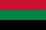 | Aalsmeer | North Holland | 7 April 1976 | The flag has a horizontal tricolour of red, green and black. The flag is one of the few flags that is not based on the municipal coat of arms. The flag colours symbolize the strawberry plants, which were very important to the municipality around 1850. The red colour stands for the strawberry fruit itself, the green for the leaves and the black for the soil in which the strawberry plants grow. In 2009, a variant flag would have been and devised a while ago by Mr Lissenburg, designed on which the municipal coat of arms would be placed in the middle of the flag. The municipal coat of arms shows an orange (officially red) standing lion with a white eel in its paws. The eel is a canting element referring to the municipal name. The lion is probably the same lion as that of the former County of Holland, to which Aalsmeer once belonged. There is no mention of any other connection with the coat of arms, so the red in the flag does not come from the coat of arms. It is more common for municipal flags to show the colours of the municipal arms.[7][8] |
 | Aalten | Gelderland | 17 October 1961 | The flag has a horizontal bicolour of white at the top and green at the bottom. The green and white are derived from the municipal coat of arms. In this, green was used for the lime tree and the white for the background of the coat of arms. The flag is identical to the flag of Ridderkerk. It is possible that the future flag of Aalten will carry three stripes in green, blue and orange instead of two. This is because the current municipality was formed in 2005 from three municipalities, each with its own colour.[9] |
 | Achtkarspelen | Friesland | 28 April 1958 | The flag is based on the municipal coat of arms, which has been recognised since 1818. The municipal coat of arms depicts eight church towers that together form a kerspelkerk. This church symbolises the eight church villages (kerspelen) that were in Achtkarspelen at the beginning of the nineteenth century. No doubt, the name of the municipality is also derived from this. However, the coat of arms with the eight towers is much older, dating from the early 15th century. The municipal flag contains three horizontal stripes in red, white and green in the background. In the foreground is an eight-pointed blue star representing the eight church towers, or church villages.[10][11][12] |
 | Alblasserdam | South Holland | 28 November 1961 | The flag is derived from the corresponding municipal coat of arms. The background consists of an equal yellow and red stripe. The foreground contains an image of the municipal coat of arms, showing a climbing Dutch lion. This municipal coat of arms is possibly derived from the coat of arms of South Holland, which dates from the twelfth century. The Dutch lion is a common heraldic animal and was most probably introduced to North Holland by the Vikings. |
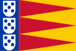 | Albrandswaard | South Holland | 28 October 1985 | The flag is derived from the corresponding municipal coat of arms. On the hoisting side, the flag features a blue vertical stripe showing three so-called quinas with five dots. These quinas are also included in the coat of arms and flag of Portugal. The village of Poortugaal is in Albrandswaard and probably met and adopted the Portuguese during the Crusades. Besides the vertical stripe, the Albrandswaard flag features a triangle pattern in red and yellow. This pattern comes from the family coat of arms of the Van Duyveland family. |
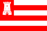 | Alkmaar | North Holland | 26 February 2002 | The flag is based on the municipal coat of arms. At the centre of the city's coat of arms is a castle, which can also be seen in the top left corner of the flag. This castle most probably represents the Torenburg, which was built in the 13th century and demolished by the local population in the 15th century. However, people had been using the flag as Alkmaar's city flag since 27 August 1920. On 26 February 2002, the flag was again officially adopted, this time as the municipal flag.[13][14][15][16] |
 | Almelo | Overijssel | 20 December 1948 | The flag has a horizontal tricolour of blue, white and blue. The colours of the flag are derived from the municipal coat of arms, which was officially granted in 1915. Here, the blue colour is reflected in the coat of arms and white in the three diamonds. Unfortunately, very little is known about the meaning of the colours. The municipal coat of arms is probably derived from the coat of arms of Heerlijkheid Almelo, an ancient administrative district, which also shows diamonds on a blue background.[17][18][19] |
 | Almere | Flevoland | 28 August 1982 | The flag is partly derived from the corresponding municipal coat of arms. The flag consists of a cross-shaped pattern with four squares in the colours white, red, blue and yellow. The white field in the top left shows a cog (ship), which is also at the centre of the municipal coat of arms. A cog was a cargo ship introduced by the Hanseatic League (a cooperation between various trading cities, including Almere). This symbol still appears on several (city) coats of arms.[20][21] |
 | Alphen aan den Rijn | South Holland | 6 February 2014 | The flag is based on the corresponding municipal coat of arms. The design for the flag came about after the merger with former municipality Rijnwoude and the town of Boskoop. The eight-pointed star in the top right corner comes from the Van Alphen family. This was central on the previous flag of Alphen van den Rijn. Also depicted is a castle, which comes from the coat of arms of the former municipality of Rijnsburg and the village arms of Boskoop. The castle and star are separated by a wavy diagonal strip symbolising the Oude Rijn and the Gouwe, both rivers in the municipality of Alphen aan den Rijn.[22][23][24] |
 | Alphen-Chaam | North Brabant | 23 October 1997 | The flag is based on the corresponding municipal coat of arms and is composed of two vertical stripes. The green stripe depicts a triangle and a scallop shell. The triangle comes from the flag of former municipality Alphen en Riel and represents a stylised mountain (alp). The scallop refers to the residential area of Galder and symbolises James the Great. This was an apostle of Jesus and parish saint of Galder. On the white stripe are a green crest and oblique cross-referring to the village of Chaam and the former municipality of Strijbeek.[25][26] |
 | Altena | North Brabant | 1 January 2019 | The flag is derived from the municipal logo. The municipal logo is centrally placed on the white background of the flag and consists of a vignette with the municipal name. The survey revealed that the community of Altena preferred simple, organic shapes in the colours green and blue. These were therefore used in the municipal logo. And because the polder landscape and rivers are characteristic natural elements of the municipality, these have also been stylised in the logo.[27][28] |
 | Ameland | Friesland | 27 June 1950 | The flag is based on an older municipal coat of arms that has been in official use since 1816. The historical origin of the coat of arms is unknown, but goes back much further than this year. There is a story going around about the symbolic black crossbars on the coat of arms that are also included in the flag. Thus, the crossbars are supposed to represent stolen beams. These were looted by the Amelanders from Terschelling at night and were supposedly used to build a gallows. The municipal flag is very popular among the community of Ameland and consists of four coloured stripes in the colours blue and yellow. These represent the colours of Ameland. Besides the black bars, two white crescent moons are also included in the flag. These crescent moons are based on the story of the beam robbery, which took place at night in moonshine.[29][30][31][32] |
 | Amersfoort | Utrecht | 28 April 1959 | The flag is derived from the corresponding municipal coat of arms and contains three horizontal stripes in red and white. On the hoisting side of the flag, two red blocks are placed below and above, with a Saint George's Cross in the middle. This cross is also found on the provincial flag of Utrecht and the flag of England. Saint George is considered the patron saint of Amersfoort and, according to legend, defeated a dragon from his horse. Since the Second Crusade, it has been customary to use the Saint George's Cross as a sign on flags and coats of arms.[33][34][35][36] |
 | Amstelveen | North Holland | Before 1962 | The flag is based on the municipal coat of arms and consists of five horizontal stripes in red and black. Four white Saint Andrew's crosses are placed on the black stripes. The flag of Amsterdam also contains these crosses. The municipal coat of arms is derived from the coat of arms of the Persijn family and has been in official use since 1816. The coat of arms of this influential family also features the Saint Andrew's crosses.[37] |
 | Amsterdam | North Holland | 5 February 1975 | The flag is very similar to the flag of Amstelveen and, like that flag, is almost an exact copy of its municipal coat of arms. The municipal flag is made up of three horizontal bands and has three white Saint Andrew's crosses depicted in the middle black band. The meaning of these crosses is not known. In all likelihood, they are derived from the coat of arms of the Persijn family. The Persijn family was based in and around Amsterdam around the 13th century. Yet there is speculation about a possible other meaning of the crosses. For instance, they could represent the three plagues that befell Amsterdam, namely water, fire and the plague.[38][39][40][41][42] |
 | Apeldoorn | Gelderland | 30 June 1966 | The flag consists of a vertical white stripe and a horizontal red and yellow stripe. These colours are derived from the municipal coat of arms, which is also placed on the flag itself. The municipal coat of arms features a red eagle carrying a silver key on its chest. This coat of arms is based on the coat of arms of the extinct noble family Van Apeldoorn.[43] |
 | Arnhem | Gelderland | After 1962 | The flag is derived from the corresponding municipal coat of arms. The flag is composed of a white and blue stripe and features a double-headed eagle on the hoist side. This eagle is central to the municipal coat of arms. It probably comes from the older coat of arms carried by the Van Arnhem family. Double-headed eagles date back to the Byzantine Empire and were frequently used on coats of arms and flags.[44][45][46] |
 | Assen | Drenthe | 21 May 1959 | The flag has a horizontal bicolour of blue at the top and white at the bottom. These two colours refer to the colours in the municipal coat of arms. This municipal coat of arms dates from the 13th century and was depicted on the seal of the County of Drenthe. This is the former name of the province of Drenthe. The blue colour can be found on the coat of arms as the background colour of the coat of arms. The white colour is incorporated in a cloak worn by a crowned statue of Mary. The flag is identical to the flag of Hoogeveen.[47][48][49] |
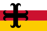 | Asten | North Brabant | 29 January 1987 | The flag is derived from the corresponding municipal coat of arms and consists of three horizontal stripes in the colours white, red and yellow. In the foreground of the flag, a black cross moline is placed on the hoisting side. This cross moline represents Christian hope and comes from the old coat of arms of Asten when the municipality was still a heerlijkheid. A heerlijkheid is a form of government in which a certain area is owned by a lord.[50][51] |
 | Baarle-Nassau | North Brabant | 20 August 1965 | On the hoist side, the flag has a vertical blue field containing a yellow rectangle. This element of the flag refers to the municipal coat of arms, on which three straw bales are placed on a blue coat of arms. The rest of the flag consists of four red stripes and three white stripes partially overlapping the blue field. These two colours refer to the colours in the old coat of arms. |
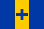 | Baarn | Utrecht | 27 January 1999 | The flag has a vertical tricolour of blue, yellow and blue, with a blue Greek cross on the yellow stripe. The blue and yellow flag colours come from the corresponding municipal coat of arms. The Greek cross placed in the middle yellow stripe symbolises the bishop of the coat of arms. This is because, according to the rules, bishops are not allowed to be depicted on flags. |
 | Barendrecht | South Holland | 29 July 1997 | The flag is based on the corresponding municipal coat of arms. The flag is divided into three strips, the middle of which is red and features a half yellow Dutch lion. The two white strips each contain three green rectangles meant to represent peat blocks and turf. The design for the municipal flag was taken from the fourteenth-century coat of arms of the Van Wijngaarden family. According to stories, the Dutch lion was awarded to this family as a reward after they had hindered enemy armies. This by laying turf over traps.[52] |
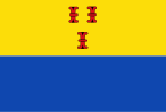 | Barneveld | Gelderland | 12 February 1965 | The flag is based on the corresponding municipal coat of arms and composed of a yellow and blue stripe. Centred on the yellow stripe are three red columns. These can also be seen on the small inescutcheon in the municipal coat of arms. The yellow colour is used in the municipal coat of arms for an image of the sun, a butterfly and a flower. The blue colour has been used for the background of the coat of arms.[53][54][55] |
 | Beek | Limburg | 30 June 1969 | The flag colours are taken from the corresponding municipal coat of arms. At the centre of the flag is a blue wavy strip placed against a white background. This blue strip represents a stream and refers to the municipal name. |
 | Beekdaelen | Limburg | 4 July 2019 | The flag is based on the corresponding municipal coat of arms. The municipality of Beekdaelen was created following a merger between Onderbanken, Nuth and Schinnen. For this reason, the flag is a combination of the flags and coats of arms of these dissolved municipalities. Only the white wavy stripes on a green background are a new element and refer to the three old municipalities. In the foreground, a Limburgian lion in a white field and a serpentine cross in a red field are placed. These elements refer to the Huyn van Amstenrade family, a knightly family that once enjoyed power in the area where Beekdaelen now lies.[56][57][58] |
 | Beesel | Limburg | 24 September 1973 | The flag is based on the corresponding municipal coat of arms. The flag has a yellow and blue stripe as its background. On the hoisting side, the foreground shows a dragon placed in a circle with fourteen protrusions. This dragon represents the dragon from the legend of Saint George. In this legend, George fought a dragon from his horse. It is unclear how the dragon ended up on the municipal flag and coat of arms. The water wheel in which the dragon is placed refers to the former water mill in Reuver.[59] |
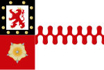 | Berg en Dal | Gelderland | 22 September 2016 | The flag is based on the corresponding municipal coat of arms. The flag and municipal coat of arms are an amalgamation of the arms and flags of the former municipalities that made up Berg en Dal, namely Groesbeek, Millingen aan de Rijn and Ubbergen. The grafted red bar is from the coat of arms of Groesbeek and dates from the fourteenth century. The rose comes from both the coat of arms of the former municipality of Ubbergen and the coat of arms of the Van Ubbergen family, and also dates from the fourteenth century. The lion at the top left of the flag is taken from the coat of arms of Millingen aan de Rijn.[60][61][62] |
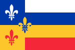 | Bergeijk | North Brabant | 25 September 1997 | The flag is derived from the corresponding municipal coat of arms. The flag consists of four horizontal stripes with a blue and yellow field on the hoist side. In the foreground are three fleur-de-lis which come from the coat of arms of Charles the Bold, Duke of Burgundy in the 15th century. A fleur-de-lis is often associated with France and symbolises purity and virginity. The two fields on the hoist side symbolise the municipality in its former size. The four strips on the fly side are meant to symbolise the merging of the four, formerly separate areas into one enlarged municipality.[63][64] |
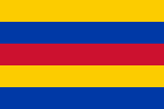 | Bergen (LI) | Limburg | 14 October 1969 | The flag colours are taken from the corresponding municipal coat of arms. The flag is divided into five horizontal stripes in the colours yellow, blue and red. The blue (azure) and yellow (or) were used as background colours in the shield of the municipal coat of arms. The red (gules) was used for the cloaks of the three saints depicted on it.[65] |
 | Bergen (NH) | North Holland | 1 January 2001 | This flag is not official. However, the flag is used unofficially and contains the municipal logo on a white field. This logo was designed in 2001. It is more common for flags to contain (part of) the municipal logo. The blue rectangle is a reference to the abundance of water in this area. At the same time, the shape and colour of the logo represent stability and reliability. In the orange part, It featured a wave or sand drifting upwards, which is always - in interaction with the sea - in motion. Just like the municipality of Bergen, which evolves with society and tries to meet the ever-changing needs of its residents. A paint stroke can also be recognised in it, as a reference to Bergen's artistic past and present. Both the movement and the orange give the logo a certain dynamism, which is also in line with what the organisation has in mind. Moreover, the orange moves outside the blue frame.[66][67] |
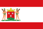 | Bergen op Zoom | North Brabant | 24 February 1978 | The flag was adopted by municipal resolution on 24 February 1978. However, the flag is much older and was already used unofficially in 1870. The municipal flag contains the municipal coat of arms. The background of the municipal flag consists of three horizontal stripes in white and red. On the hoisting side is the municipal coat of arms, which dates from the thirteenth century. The shield of this coat of arms shows three Saint Andrew's crosses and a three-headed mountain. On the left and right side of the coat of arms, there are two wild men with a baseball bat.[68] |
 | Berkelland | Gelderland | 29 November 2005 | The flag is based on the municipal logo. The flag consists of a blue field and has an arc consisting of four brown blades in the foreground. These four blades form a cut-out of the municipality's logo, which has nine blades in total. The blue background refers to the water of the Berkel, the brown paddles to the water mills. The paddles represent dynamism, nostalgia and thrust.[69][70] |
 | Bernheze | North Brabant | 22 December 1994 | The flag is derived from the corresponding municipal coat of arms. The background of the flag is composed of four blocks in white and red. At the intersection of these blocks, a stylised bulrush has been placed. This is a common riparian plant in the Netherlands and the flag represents vegetation along the many banks in the municipality. The bulrush is divided into four parts symbolising Bernheze's four residential areas.[71] |
 | Best | North Brabant | 24 April 1962 | The flag is derived from the corresponding municipal coat of arms. The background consists of two horizontal stripes in yellow and black. At the centre of the design is a red diamond containing a white Latin cross. Around this are three yellow stylised apples. The cross and apples refer to Odulf, the patron saint of the municipality, who is also depicted on the municipal coat of arms and was born in the town.[72] |
 | Beuningen | Gelderland | 2013 | The flag features the municipal logo on a white field. The logo is placed against a white background and contains a centrally placed logo in the colours black, red and grey. The municipality's logo gives the impression of a coat of arms. In it, the four village centres of Weurt, Beuningen, Ewijk and Winssen take centre stage, depicted in the red squares. The cores have a unifying character and lie geographically between land (black stripes) and water (grey waves).[73] |
 | Beverwijk | North Holland | 8 October 1948 | The flag consists of a red field and contains three white fleur-de-lis. The design is derived from the top of the shield of the municipal coat of arms. The fleur-de-lis dates from the 14th century and were linked to Beverwijk even then. There has been discussion about the placement of the fleur-de-lis. Officially, according to the old municipal coat of arms, there should in fact be two fleur-de-lis above and one fleur-de-lis below.[74][75] |
 | Bladel | North Brabant | 27 November 1997 | The flag is derived from the corresponding municipal coat of arms. The background of the flag consists of arrow elements (chevrons) in the colours red and yellow. On the hoist side is a black field containing a key. This key appears in duplicate on the municipal coat of arms and symbolises the keys to heaven handed to Saint Peter. Saint Peter forms the parish saint of Bladel. The chevrons come from the flag of the former municipality of Hoogeloon, Hapert en Casteren, which merged into the municipality of Bladel.[76] |
 | Blaricum | North Holland | 21 August 1980 | The flag is derived from the older municipal coat of arms. The flag is composed of five horizontal stripes and contains a cornflower plant on the hoisting side. Where this cornflower plant comes from is not known. However, cornflowers did appear on earlier coats of arms in the past. The white of the flag is reflected in the coat of arms as the background colour of the coat of arms. Blue is the colour of the cornflower and green of its roots and stems.[77] |
 | Bloemendaal | North Holland | 22 May 2019 | The flag consists of nine equal horizontal stripes in white and green. The five green stripes represent the five municipal districts, namely Aerdenhout, Bennebroek, Bloemendaal, Overveen and Vogelenzang. The black multi-leaves (or seeblatt) come from the municipal coat of arms and can also be found, for example, on the flag of Friesland. This municipal coat of arms is in turn derived from the coat of arms of the Tetrode family, a noble family that owned a hunting lodge on the territory where the Bloemendaal municipality is now located.[78][79][80] |
 | Bodegraven-Reeuwijk | South Holland | 1 January 2011 | The municipality was created on 1 January 2011 from the merger of two municipalities of Bodegraven and Reeuwijk. The new municipality decided to continue using the former municipal flag of Bodegraven, which was originally adopted on 9 September 1952. The flag has a horizontal bicolour of yellow at the top and blue at the bottom. This makes the flag very similar to the Ukrainian flag and the flag of Zandvoort. The yellow colour is derived from the golden deer's head at the bottom of the coat of arms and the golden upper half of the coat of arms. The blue colour is derived from the crossed spades with hat on the municipal coat of arms. Yellow is the colour of dairy and blue is the colour of the Rhine and polder water. These factors have shaped the municipality's development.[81] |
 | Boekel | North Brabant | 28 June 1963 | The flag colours are taken from the corresponding municipal coat of arms and form the so-called national colours. This colour combination of blue and yellow is also used in the national coat of arms of the Netherlands. The blue background colour for the blue coat of arms depicting the church. The yellow colour represents the golden church on the municipal coat of arms. The yellow inverted chevron resembles the letter V and signifies the initial letter of Venhorst, the second residential area within the municipality. |
 | Borger-Odoorn | Drenthe | 28 February 2002 | The flag has clear symbolism. For instance, the yellow colour, of which the flag is mainly composed, represents the sandy soils of the municipalities. The black strip stands for the peaty soils. On the hoisting side of the flag, a yellow shovel, chevron and dolmen are depicted in a black shield. The shovel also symbolises the bogs, while the dolmen further emphasises the sandy soils. The dolmen also symbolises the eighteen dolmens scattered across the municipality. The characteristic shovel has a shape typical of southeast Drenthe. The yellow chevron represents the Hondsrug that runs through the municipality.[82][83] |
 | Borne | Overijssel | 28 March 1957 | The flag, with its two thick strips and one centred narrower strip. The flag is derived from the municipal coat of arms. The municipal coat of arms has been established since 1898, almost 60 years earlier than the flag. The blue colour of the flag is based on the coat of arms of the municipal coat of arms. The yellow colour is derived from the beehive with bees depicted on it. This beehive symbolises municipal former beekeeping.[84][85][19] |
 | Borsele | Zeeland | 5 January 1971 | The background of the flag is divided into twelve triangular pieces that circle geometrically around a red diamond. In this red diamond, the municipal coat of arms of Borsele is stylised. The coat of arms of Borsele was also used as the family coat of arms of the noble Van Borssele family. The twelve triangular pieces represents the twelve former municipalities merged into Borsele. Of the thirteenth municipality, 's-Heer Arendskerke, only a small part has been merged into Borsele and is represented by the diamond with the Borssele emblem. The Van Borssele family runs like a thread through the municipality's history, which is represented by the red border. The colours of the flag also appear in some of the coats of arms of Borsele's predecessors. The flag has all the colours of the Dutch flag, indicating that the area is part of the Netherlands.[86][87] |
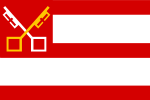 | Boxtel | North Brabant | 5 March 1971 | The flag is derived from the corresponding municipal coat of arms. The red and white in the flag come from the provincial flag of North Brabant. The crossed keys in the top left corner refer to the keys to heaven that apostle Saint Peter. (Saint) Peter is also the parish saint of Boxtel. The yellow and white colours in the flag refer to the papal colours, as is the case with the Vatican flag.[88] |
 | Breda | North Brabant | 11 June 1952 | The flag is derived from the corresponding municipal coat of arms and contains three white Saint Andrew's crosses against a red background. The origins of this flag design date back to the twelfth century, where the elements were already found in the coat of arms of the noble family of Breda and Schoten. The lords of Breda and Schoten ruled Breda at the time. The Saint Andrew's crosses refer to the Andrew the Apostle, who would have been crucified on a similar cross.[89][90][25][91] |
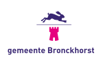 | Bronckhorst | Gelderland | 1 January 2005 | The flag features the municipal logo on a white field. The municipal logo consists of a purple rabbit with a magenta-coloured castle underneath. These two elements are separated by a line of lilac. It also featured the municipal name below. The rabbit symbolises life and nature. The castle tower stands for culture, history and that which is strong and enduring. The use of purple and magenta is warm, positive, surprising and refreshing.[92] |
 | Brummen | Gelderland | 21 April 1970 | This flag is based on the municipal coat of arms. The flag is blue and features a climbing orange lion on the hoist side. This lion holds a bramble branch. The name Brummen dates back to the eighth century and is derived from the word 'brummel' which is the Low Saxon word for bramble. This explains the bramble branch on both municipal coat of arms and flag.[93] |
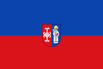 | Brunssum | Limburg | 19 April 1963 | The flag contains a representation of the corresponding municipal coat of arms and is divided into a horizontal blue and red stripe. Centred in the foreground is the municipal coat of arms. This coat of arms features a serpentine cross and an image of Pope Gregory I with a dove and Bible. The municipal coat of arms is derived from the coat of arms of the Huyn family. This family owned Brunssum around the seventeenth century.[54][94][95] |
 | Bunnik | Utrecht | 15 August 1974 | The flag is green and has a centred white wavy stripe in the foreground. This wavy lane represents the river Kromme Rijn meandering through the green landscape. Like most municipal flags, the flag is not derived from the corresponding municipal coat of arms but has its own design.[96] |
 | Bunschoten | Utrecht | 27 February 1970 | The flag is based on the corresponding municipal coat of arms. A yellow Nordic cross is placed against the blue background of the flag. This cross symbolizes Christianity and also characterizes, for example, the Swedish flag. The hoisting side shows a Frisian half-eagle overlapping the cross. This eagle probably comes from the coat of arms of a Frisian squire who once ruled Bunschoten. The cross comes from the time of the Prince-Bishopric of Utrecht and is probably due to the bishop of Utrecht granting city rights to Bunschoten.[97] |
 | Buren | Gelderland | 18 May 1999 | This flag is based on the municipal coat of arms. Both the coat of arms and flag contain a red background with an embattled white stripe in the foreground. This white stripe represents a storm bar and was thrown at attackers by defenders in earlier times, among others.[98][99] |
 | Capelle aan den IJssel | South Holland | 3 November 1980 | The flag contains the full municipal coat of arms. The background of the flag is dark blue, with a vignette consisting of two stylised fish (probably Cypriniformes) in the foreground. This vignette comes from the municipal logo and presumably represents the ever-important fishing industry within the municipality. On the upper left, on the hoisting side, the municipal coat of arms with the municipality's name is placed. On this municipal coat of arms, the fish also appear.[100][101][102] |
 | Castricum | North Holland | 24 February 2004 | The flag has a vertical tricolour of blue, yellow and green, with the municipal coat of arms on the yellow stripe. At first, this municipal coat of arms was not to be placed on the flag. Nevertheless, it was eventually applied because otherwise the flag would not be unique. Before 2004, Castricum used a different flag with a coat of arms. After merging with the villages of Akersloot and Limmen, the current flag was adopted and a new municipal coat of arms was created. |
 | Coevorden | Drenthe | 13 July 1999 | The flag is based on the municipal coat of arms and is an amalgamation of the flags of the five former municipalities that made up Coevorden. The flag is red and has a dark blue cross in the foreground. Just behind the cross are two narrow yellow strips which, in terms of colour, symbolize the municipality's sandy soil. In addition, the yellow colour together with dark blue symbolize the municipality's roads (yellow) and waterways (blue). The castle at the centre of the flag represents the main town (Coevorden) of the municipality. The four red squares symbolize the former municipal districts.[103][104] |
 | Cranendonck | North Brabant | 18 November 1997 | The flag colours are derived from the corresponding municipal coat of arms. In terms of design, the flag itself is based on the flag of the village of Maarheeze which is located in Cranendonck municipality. Against the background consisting of two red and two white fields, a flying crane can be seen. This symbolizes the original natural conditions of the municipality.[105] |
 | Culemborg | Gelderland | Unknown | The flag has not been officially adopted and is therefore used on an unofficial basis. The flag has a horizontal bicolour of yellow at the top and red at the bottom. The flag colours are derived from the municipal coat of arms. The municipal coat of arms is yellow (gold) and the columns depicted on it are red. These pillars are in turn derived from the coat of arms and name of the Lords Van Zuylen. These played a role in the genesis of Culemborg. The flag is identical to the flag of Schagen. |
 | Dalfsen | Overijssel | 21 July 1961 | The flag features a white and blue chequered pattern with 24 distinct fields. This makes the flag very similar in design to the flag of North Brabant, which features a red and white chequered pattern. The flag is derived from the previously adopted municipal coat of arms. On this municipal coat of arms, the chequered pattern is also applied. This is derived from Rechteren Castle, the only castle from the Middle Ages preserved in Overijssel. After the merger between Dalfsen and Nieuwleusen, this same flag remained on as the municipal flag.[106] |
 | Dantumadiel | Friesland | 22 March 1962 | The flag consists of four equal stripes in the colours white (silver), red, yellow (gold) and green. These colours are derived from the older municipal coat of arms, which has been used officially since 1818. However, the municipal coat of arms has uneven stripes placed in a slightly different order. The silver lane, on the other hand, is also wavy, which may be a reference to the rich amount of water on the Dantumadiel territory. The other colours have no specific meaning.[107] |
 | De Bilt | Utrecht | 1 January 2001 | The flag is based on the corresponding municipal coat of arms and is divided into a yellow and blue field. The fields intersect diagonally. In the foreground is a black and white grid which symbolizes Saint Lawrence. This martyr lived during the persecution of Christians in the Roman Empire and is considered the patron saint of several cities. The grid refers to a grate over a fire, on which Saint Lawrence was allegedly tortured. The blue triangle on the hoisting side of the municipal flag is a reference to a cloak of Martin of Tours, half of which he gave to a beggar.[108][109][110] |
 | De Fryske Marren | Friesland | 17 December 2014 | The flag forms a combination of the three flags of the former municipalities of Gaasterlân-Sleat, Lemsterland and Skarsterlân. The background is composed of two thick stripes (white and azure) and one narrow centred yellow stripe. There is a meaning attached to these coloured stripes. For instance, the overall colour pattern represents the vastness of De Fryske Marren. The colours also have individual meanings. For instance, white symbolizes the sky, yellow the sandy soil and blue the municipality's many lakes. The white stripe depicts a running hare which, firstly, is common in the municipality and, secondly, symbolically jumps around in the vastness that the flag represents.[111][112][113] |
 | De Ronde Venen | Utrecht | 9 January 2017 | The flag is based on the corresponding municipal coat of arms. The symbols on the flag are all derived from municipal coats of arms of former municipalities, from which De Ronde Venen originated. The lamb with banner (an Agnus Dei) is derived from the coat of arms of Mijdrecht and symbolizes Jesus. The crossed keys come from the coat of arms of Abcoude, as do the three pillars, and represent the keys to heaven. These are also depicted, for example, on the flag of Leiden. The snake on the middle white flag line comes from the coat of arms of Wilnis. The finch on the bottom left is from the coat of arms of Vinkeveen, where the bird represents the former municipal name.[114][115][116][117] |
 | De Wolden | Drenthe | 31 May 2001 | The flag is based on the municipal coat of arms. The flag consists of 9 horizontal stripes in yellow and green and a black vertical stripe on the hoisting side. The black stripe features a white winding line, which is meant to represent the river Reest. The black lane symbolizes the peat forests and the yellow lanes the sandy soils in the municipality. The four green stripes symbolize the four trees in the municipal coat of arms. These trees in turn represent the municipalities from which De Wolden was formed, namely De Wijk, Ruinerwold, Zuidwolde and part of Ruinen.[118][119] |
 | Delft | South Holland | 30 May 1996 | The flag was officially adopted on the occasion of "750 years of city rights." However, the flag had been used on ships of the Dutch East India Company for centuries. The flag has a horizontal tricolour of white, black and white. Its design is similar to the municipal coat of arms, but vertically. The black stripe represents Oude Delft and dates from the 13th century. The Oude Delft is the oldest canal in Delft and dug around the eleventh century. This was before the city of Delft even existed.[120][121][122] |
 | Den Helder | North Holland | 2 October 1962 | The flag is based on the corresponding municipal coat of arms. The background of the banner consists of seven horizontal stripes alternating in red and yellow. These stripes are traced to the coat of arms of Huisduinen and that of the counts of Egmond. They ruled between the 13th and 17th centuries over the bailiwick of Huisduinen, to which Den Helder also belonged. The canton of the flag, top left, depicts two crossed anchors in a yellow circle. These anchors symbolize the naval port, which holds an important function in Den Helder.[123][124] |
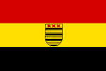 | Deurne | North Brabant | 23 January 1962 | The flag is derived from the corresponding municipal coat of arms and consists of three horizontal stripes in red, yellow and black. At the centre of the yellow stripe is the coat of arms from the municipal coat of arms, on which, among other things, three Saint Andrew's crosses can be seen. These represent the Andrew the Apostle who was put to death on a similar cross. Why the crosses were used for the municipal coat of arms and flag is not known.[125][126] |
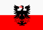 | Deventer | Overijssel | 25 September 1997 | The flag has a horizontal bicolour of white at the top and red at the bottom, with an image of a black eagle with red legs, beak and tongue in the centre of the flag. The colours of the flag come from the coat of arms of the Prince-Bishopric of Utrecht. The Prince-Bishopric is a territory, within which the bishops of Utrecht enjoyed some power in the Late Middle Ages. The eagle is taken from the municipal coat of arms and probably derived from that of the Holy Roman Empire. The eagle is single-headed. This indicates that the coat of arms has probably been linked to Deventer since the 13th century.[127] |
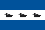 | Diemen | North Holland | 6 February 2009 | The flag is based on the corresponding municipal coat of arms. The flag has a horizontal tricolour of blue, white and blue. In the white strip are three swimming black ducks, placed one behind each other. What makes the municipal flag unique are the three black ducks swimming behind each other. These ducks are also come from the coat of arms of former water board Amstelland. There is little to say about its significance of the municipal flag and coat of arms. It is notable, however, that the blue-white-blue can also be seen in the arms and flags of Diemen's neighbouring municipalities of Muiden and Weesp, including the former Weesperkarspel. So it seems to be a kind of regional coat of arms. The ducks could refer to the river the Diem, which runs straight through the municipality, on which these birds can be found.[128][129] |
 | Dijk en Waard | North Holland | 1 January 2022 | This flag is not official. This municipality was created on 1 January 2022 from the former municipalities of Heerhugowaard and Langedijk. The name was coined by the inhabitants. Officially, Dijk en Waard does not have its own flag, but it does have an official municipal coat of arms. It is possible that the future flag will be based on this. The flag has a gradient in the background which runs from blue to poison green. Green and blue were used as colours in the Heerhugowaard and Langedijk house styles and were adopted from there. Blue stands for water and green for land. The gradient is also reflected in the municipal logo. This logo is placed in the centre of the flag. It consists of the municipal name and two stripes. The straight stripe represents land and the wavy stripe represents water.[130] |
 | Dinkelland | Overijssel | 1 January 2008 | The top right shows an image of the official municipal logo against a dark blue background. Depicting the municipal logo on the flag has been done more often in recently created municipalities. The significance of the municipal logo and the pattern on the flag is unknown. |
 | Doesburg | Gelderland | 30 December 1964 | The flag is derived from the municipal coat of arms and consists of three horizontal stripes in white and red. A yellow crescent moon is placed in the middle red stripe. The design of the flag and coat of arms is based on the oldest seal of Doesburg which dates from the thirteenth century. The meaning attached to the crescent moon as a municipal symbol is unknown.[131][132] |
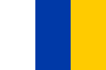 | Doetinchem | Gelderland | 29 July 1954 | The flag has a vertical tricolour of white, blue and yellow. The three colours are taken from the municipal coat of arms. The yellow colour was used for the lion on the coat of arms and the crown above it. The blue is reflected as the background colour of the coat of arms, and the white in the three medlar flowers around the lion. Previously, Doetinchem wanted to design its municipal flag with horizontal stripes. However, this turned out not to be a good idea because several municipalities implemented this on their flags, which would make the flag no longer unique.[133] |
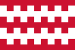 | Dongen | North Brabant | 20 September 1990 | The flag is based on the corresponding municipal coat of arms and consists of three white stripes and two embattled red stripes. The coat of arms and flag design originate from the family arms of the noble Van Arkel family, who once ruled Dongen. The embattled stripes represent so-called storm ladders, referring to the storming of Damietta. This was a port city in Egypt during the Fifth Crusade in the 13th century. Previously, people used an alternative flag for the municipality.[134][25] |
 | Dordrecht | South Holland | March 1857 | The flag was mentioned as early as March 1857. However, the flag has been in use much longer and its colours date back to the 13th century. The flag is identical to the older flag of Gouda and that of Hoorn, which is also centuries old. This also makes the flag identical to the flag of Austria. The flag has a horizontal tricolour of red, white and red, which can also be seen on the municipal coat of arms of Dordrecht. The municipal colours are probably derived from the coat of arms of the Lords of Merwede, which also contained red and white stripes. The Lords of Merwede were knights in the service of the Count of Holland and had a castle near Dordrecht. A remnant of this castle can still be visited.[135][136][137][138] |
 | Drechterland | North Holland | Unknown | The flag is composed of six stripes in the colours white, green and yellow. These meaningless colours, together with the depicted sword and the two roses, are derived from the municipal coat of arms. The municipal coat of arms is much older than the flag and dates from the 13th century. The sword represents justice in both the coat of arms and the flag, while the roses probably refer to Mary.[139] |
 | Drimmelen | North Brabant | 10 October 2024 | The flag was designed by a heraldist René van Troost, and is based on the corresponding municipal coat of arms, which was presented to the municipal council on May 2024. The flag consists of horizontally wavy stripes of equal height in alternating gold (yellow) and azure (blue) in the background. The colours gold (yellow) and azure (blue) are the national colours used in the old coats of arms of the former municipalities of Made en Drimmelen, Terheijden and Hooge en Lage Zwaluwe. The three wavy stripes represent these three municipalities and symbolize the water that plays and has played a major role plays and has played in the municipality. In the centre of the flag is a black shield placed with three white saltires, two of which are on top and one on the bottom centre. This is the old coat of arms of the heerlijkheid of Drimmelen, namesake of the municipality. This coat of arms dates from before 1402, making it by far the oldest in the municipality.[140][141][142][143][144][145] |
 | Dronten | Flevoland | 27 May 1982 | The flag is based on the municipal logo. The background of the flag is green and refers to the polder pioneers who moved into Dronten in 1962. The vignette, derived from the municipal logo, is placed large on the flag and consists of seven white mooring posts placed in a circle. Such a mooring post has become an icon of Dronten and to this day forms an association for this place. The original logo was designed in 1973, but was slightly modified several times over the years, creating some variations. To restore unity in the use of the logo, the design was redefined in 2008. Since 2008, the Municipality of Dronten has also adopted seven future perspectives, which give a new dimension to the logo.[146] |
 | Druten | Gelderland | 23 February 1984 | The flag is based on the corresponding municipal coat of arms and consists of three horizontal stripes of white, green and white, and a vertical black field. In this black field a lion is placed, which comes from the coat of arms of Horssen. Horssen is a former municipality that now falls under Druten. Before the adoption of the current municipal flag, the municipality used a different flag. The current flag was adopted by municipal resolution when Druten merged with Horssen.[147] |
 | Duiven | Gelderland | 25 June 1954 | The flag consists of a white and blue stripe with a smaller yellow and red stripe in the upper left corner. All these colours are derived from the municipal coat of arms. In the municipal coat of arms, the blue colour is incorporated in the depicted doves, which literally refer to the municipal name. The yellow (gold) is reflected in the carbuncle, an ornamental element consisting of eight arms with a fleur-de-lis attached to each. The red colour is used for a quarter in which this carbuncle is depicted. The white (silver) was used for the background of the coat of arms, among other things.[148][149][150][151] |
 | Echt-Susteren | Limburg | 11 November 2004 | The flag design was created after the merger of the Echt and Susteren municipalities, each with their own flag. The white diagonal cross, together with the yellow recrosses and the red colour, comes from the old flag of Echt. The origin of these elements is otherwise unclear. The white lozenges and blue colour come from the old flag of Susteren. Together with the blue, the diamonds symbolize the noblewomen from the old municipal coat of arms of Susteren.[152][153] |
 | Edam-Volendam | North Holland | 1 January 2016 | The flag contains the respective municipal logo on a white field. The logo has a stylised shield with the name of the municipality next to it as a pictorial mark. The red and green colours in the shield come from Edam, and the orange and blue from Volendam. The green and blue also stand for Zeevang, the former municipality, with which Edam-Volendam recently merged. This logo was designed in 2015.[154][155] |
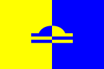 | Ede | Gelderland | 6 September 1967 | The flag is based on the corresponding municipal coat of arms. The background of the flag is divided into two vertical fields in yellow and blue. A so-called pileus is placed in the foreground, with a stylised back of the Bible underneath. Both elements, together with the Dutch Maiden, can be seen in the municipal coat of arms, which originated in the early nineteenth century. This municipal coat of arms originates from old Dutch one guilder coins (peaks).[156][157][54][158][159] |
 | Eemnes | Utrecht | 24 January 1975 | The flag is derived from its municipal coat of arms and has a unique, square shape. The representation of the three bishops in the top left corner is also rather unusual. Normally, in fact, no bishops are allowed to be depicted on a flag. The bishops were probably assigned the flag and coat of arms in gratitude for Eemnes obtaining city rights. This thanks to the bishop of Utrecht. The red and yellow flag colours come from the municipal coat of arms, where they are used for the coat of arms and the crown above it. The municipal flag was used in 1951 for the first time to mark the celebration of 600 years of city rights. As is now known, that celebration was a year too early. The municipal flag appears to have been based on the municipal parade flag during the Amsterdam parade in honour of the 40th anniversary of Queen Wilhelmina's reign in 1938. During the event, flags were carried in colours that varied by province, with the canton having an image taken from the municipal coat of arms. The basis for Utrecht was a flag with three equal horizontal stripes in red, white and yellow.[160][161][162] |
 | Eemsdelta | Groningen | 1 January 2021 | This flag is not official. This municipality was created on 1 January 2021 from the former municipalities of Appingedam, Delfzijl and Loppersum. Officially, Eemsdelta does not have its own flag, but it does have an official municipal coat of arms. It is possible that the future flag will be based on this. The flag features the municipal logo on a white field. The logo consists of the municipal name with the coloured waves above and below. The blue wavy bars represent the blue water, the green ones the landscape. The wavy shape signifies residents' strength in good times and bad. The red colour stands for the houses in the municipality and represents the municipal organisation. This logo was designed in 2020.[163] |
 | Eersel | North Brabant | 28 June 1988 | The flag is derived from the corresponding municipal coat of arms. The top of the municipal flag contains a white stripe containing a half-red climbing lion. The rest of the flag consists of a black field containing three yellow triple bars. Such a triple bar is composed of three thin yellow strips. The flag design is derived from one of the two oldest city seals of Eersel from the thirteenth century.[164][165] |
 | Eijsden-Margraten | Limburg | 18 December 2012 | The flag is based on the corresponding municipal coat of arms and is a combination of two former municipal flags. A yellow and red raguly cross is placed in the foreground of the flag. This so-called the Cross of Burgundy symbolizes the solidarity within the municipality. Through this cross, the flag is divided into four blocks. The white blocks feature a red circle taken from the coat of arms of the Van Gronsveld family. The black blocks contain a white martlet (legless and beakless female blackbird), taken from the coat of arms of the Van Eijnatten family.[166][167][168] |
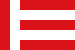  | Eindhoven | North Brabant | 14 October 1927 | The flag colours come from the corresponding municipal coat of arms and also form the colours of the provincial flag of North Brabant. The municipal flag has two vertical stripes on the hoist side. In addition, five horizontal stripes in red and white can be seen. These horizontal stripes represent the five former municipalities that made up Eindhoven before 1920. A municipal standard was also adopted at the same time, and is basically the same as the municipal flag: it consists of red and white stripes. The difference is in the canton at the top left. This shows a red standing lion and three post horns. These images are both taken from the municipal coat of arms. The coat of arms was originally traced to the arms of the lords of Brabant and Cranendonck, specifically the House of Hornes family, a branch of this noble family. This is where the post horns come from. The lion comes from the coat of arms of the Duke of Brabant and represented his power. This makes Eindhoven the only municipality in the Netherlands with two official flags: a municipal flag and a municipal standard.[169][170][171][172] |
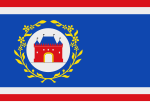 | Elburg | Gelderland | 26 August 1982 | The flag forms a combination of two former municipal flags, namely that of Doornspijk and the old flag of Elburg. The flag has a blue background and at the top and bottom a narrow red and white stripe. The blue background depicts a circle with a red gatehouse. The circle is surrounded by a wreath of yellow blackthorn branches. These blackthorn branches formed a canting element on the old municipal coat of arms of Doornspijk and literally stood for the name of this former municipality.[173] |
 | Emmen | Drenthe | After 1968 | The flag is based on the municipal coat of arms. This has often been the way to establish a municipal flag in the past. The flag contains a white centred field with a black and green zigzagged border at the top and bottom. The hoisting side of the flag features the municipal coat of arms. On one side, this coat of arms symbolizes agriculture thanks to the depicted (turning) plough and on the other side it symbolizes peat extraction with a peat cutter. The horses on either side of the coat of arms represents old Drenthe black horses.[174][175] |
 | Enkhuizen | North Holland | 8 August 1949 | The flag consists of thirteen equal stripes in the colours yellow and red. On the hoisting side, a white square is placed in the upper corner containing the municipal coat of arms. This coat of arms has been in use since 1355, when Enkhuizen received its city rights. The coat of arms shows three herrings, presumably symbolizing the important herring catch of the past. The woman is probably a reference to Enkhuizen's city maiden. City virgins date back to Greek times and were also worshipped as goddesses. A similar flag, without the municipal coat of arms, was actually used since 1711. The variant flag has an image of an escutcheon from the municipal coat of arms in the upper corner instead of a white square containing the municipal coat of arms.[176][177] |
 | Enschede | Overijssel | 29 January 2024 | The flag has a horizontal tricolour of white, red and white, with a white battle fence on the red stripe. The red (gules) and white (argent) in the flag are derived from the municipal coat of arms, in which these colours are also reflected. This coat of arms has existed since 1819 and was later changed again after merging with the village of Lonneker. The colours are already older and probably date from the 14th century. The design is basically identical to the previous flag, with its three horizontal stripes in white-red-white. However, the current flag features an abstract white symbol in the middle: a so-called battle fence that also serves as the city coat of arms. This little symbol was already used by the city around during the 17th century and can be found many times in local history. Since 1670, it has been officially used on a seal. The municipal coat of arms consists of three horizontal bands (crossbars) and a diagonal cross (or Saint Andrew's cross). Together, these form a so-called battle axe. One significance of this coat of arms is that it represents the former division between the regions of Twente and Münster. The current flag was presented a new municipal flag on 22 August 2023 and was officially adopted on 29 January 2024 and was conceived on the occasion of the city's 700th anniversary.[178][179][180][181][182] |
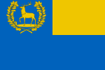 | Epe | Gelderland | After 1938 | The flag is derived from the municipal coat of arms. The background of the flag is blue with a yellow field in the top right corner. The flag thus uses the so-called national colours, which are also used for the national coat of arms of the Netherlands. In the top left-hand corner of the municipal flag is the municipal coat of arms. This shows a golden deer surrounded by a wreath of oak leaves. This deer has been used for the municipal coat of arms since the fifteenth century, and possibly refers to the wooded area in which the municipality is located. The flag was based on the municipal parade flag during the Amsterdam parade in honour of the 40th anniversary of Queen Wilhelmina's reign in 1938. During the event, flags were carried in colours that differed per province with an image in the canton taken from the municipal coat of arms. For Gelderland, the basis was a flag with two equal horizontal stripes in yellow and blue.[183][184][185] |
 | Ermelo | Gelderland | 26 June 1973 | The flag is derived from the corresponding municipal coat of arms. The background of the flag is blue with a yellow stripe at the top and bottom. On the hoisting side, a peafowl is depicted, which refers to a centuries-old tradition of breeding white peafowls for counts and dukes. The Maltese cross depicted next to the peafowl refers to the former Sint-Jansdal monastery, which was co-founded by ten Maltese knights (or hospital knights). These knights belonged to the Sovereign Military Order of Malta, which still exists today. This organization engaged in organizing charity work and emergency relief.[186][187] |
 | Etten-Leur | North Brabant | 11 March 1968 | The flag is derived from the corresponding municipal coat of arms. The municipal coat of arms, which dates from the seventeenth century, depicts three castles against a white (silver) background. The flag simply depicts one castle, which stands for the borough's cultural-historical values. This red castle is placed on a white triangle which runs across the entire width of the flag. The triangle symbolizes the municipality's commitment to progress.[188][25] |
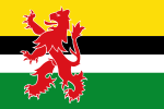 | Geertruidenberg | North Brabant | 9 July 1998 | The flag is derived from the corresponding municipal coat of arms. The red, black and red colours refer to the old flag of Geertruidenberg and the municipal coat of arms. The black colour, together with the green and white, also refers to the flag of the former municipality of Raamsdonk, which merged into Geertruidenberg. The climbing Brabantian lion on the hoisting side stands for courage and is a commonly used coat of arms. |
 | Geldrop-Mierlo | North Brabant | 24 March 2005 | The flag is derived from the corresponding municipal coat of arms. The background of the flag consists of four squares in the colours blue and yellow. On the hoisting side, a yellow seeblatt (or pompeblêd) and a red mill iron (part of a millstone) are placed. Both elements recur in sixfold on the municipal coat of arms. The mill iron comes from the coat of arms of the Van Rode family, who ruled Mierlo during the thirteenth and fourteenth centuries. The seeblatt leaves come from the old coat of arms of Geldrop and may have originally had a heart shape.[189][190][191] |
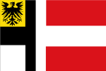 | Gemert-Bakel | North Brabant | 18 November 1998 | The flag is derived from the corresponding municipal coat of arms. The background of the flag is red and white. In the foreground is a cross which, together with the black eagle, was established in the past by the Teutonic Order. This was a knightly unit at the time of the Crusades that enjoyed power in Gemert.[192] |
 | Gennep | Limburg | 6 March 1978 | The flag is based on the corresponding municipal coat of arms. The background of the flag consists of a yellow and red field. Where the fields meet, a diagonal cross is placed surrounded by four so-called dry shearers. These shears were formerly used in making sheets. The flag design is ultimately based on the coat of arms of the noble Van Gennep family. The flag of Wijchen uses a similar design.[193] |
 | Gilze en Rijen | North Brabant | 30 July 1962 | The flag is derived from the corresponding municipal coat of arms. The background of the flag consists of a yellow and blue triangle touching diagonally. The diagonal line represents the take-off and descent of aircraft at Gilze-Rijen Air Base. The two triangles refer to the two village centres within the municipality. Centrally placed on the flag is the key of Saint Peter. This key symbolizes the keys of heaven that Saint Peter was handed by Jesus.[194][195][196][25] |
 | Goeree-Overflakkee | South Holland | 4 March 2021 | The flag is based on the corresponding municipal coat of arms. The flag's design refers to the island's origins, in which the conquest of land from the sea played an important role. The flag also symbolizes the relationship between water and land. The yellow-gold sheaf of wheat rising above the white wavy stripes refers to the fertile land. The twelve ears of corn thereby represent the various villages on Goeree-Overflakkee. These are held together by a band: the municipal government. The five wavy stripes, three white and two blue, symbolize the water that surrounds the municipality, the Grevelingen, the Haringvliet, the Krammer, the Volkerak and the North Sea.[197][198] |
 | Goes | Zeeland | 15 April 1964 | The background of the flag is divided into thirteen stripes in the colours red and white. The flag dates back to the 15th century. These colours have long been the city colours of Goes. The origin of these red and white stripes is unclear. In any case, the flag design was not derived from the corresponding municipal coat of arms. In terms of design, the flag of Goes is very similar to the flag of Gorinchem.[199][86] |
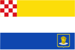 | Goirle | North Brabant | 3 May 1961 | The flag colours are taken from the corresponding municipal coat of arms. The upper left corner of the flag depicts the provincial flag of North Brabant in square form. The background consists of three horizontal stripes in the colours yellow, white and blue. At the bottom right, the municipal coat of arms is depicted with a yellow outline. This municipal coat of arms depicts the head of John the Baptist on a platter. John the Baptist is considered the patron saint of Goirle.[200] |
 | Gooise Meren | North Holland | 1 January 2016 | This flag is not official. In fact, officially, this municipality does not yet have a flag. This is partly because the municipality was created fairly recently (2016) from the merger of three other municipalities (Bussum, Naarden and Muiden). However, the municipality does have an official coat of arms and logo. The logo is depicted on the unofficial flag, as this is more often the case with recently created municipalities. The exact meaning of the municipal logo is not known. |
 | Gorinchem | South Holland | 9 August 1938 | The flag is divided into nine white and red stripes, thus resembling the flag of Goes. The colours are taken from the coat of arms of the Land van Arkel. The Land van Arkel was a territory under the control of the Lords of Arkel. Gorinchem is one of the towns located in this former territory. In the nineteenth century, people used a similar flag with an image of the municipal coat of arms.[201] |
 | Gouda | South Holland | Unknown | This flag was never officially adopted because the flag is exactly the same as the flag of Dordrecht. The flag of Dordrecht is older and has been officially adopted. The flag has a horizontal tricolour of red, white and red. This also makes the flag identical to the flag of Austria and that of Hoorn. These colours probably come from the coat of arms of the noble Van der Goude family. These were the founders of a settlement which would later develop into Gouda.[202][203] |
 | Groningen | Groningen | 1879 | This flag was never officially adopted. The flag has a horizontal tricolour of white, green and white. This green stripe is based on the green bar in the coat of arms of the city of Groningen. Ever since the seventeenth century, the city colours have featured in the municipality's history. The colours are derived from the coat of arms of the Groningen prefects. These were representatives of the bishop of Utrecht in the city of Groningen. This flag should not be confused with the provincial flag of Groningen, which is derived in design from it.[204][205] |
 | Gulpen-Wittem | Limburg | 1 January 1999 | The flag features the municipal logo. This municipal logo is placed on the white background of the flag. The ten stripes accompanying the logo symbolize the 10 cores of the municipality. The three blue stripes are the cores from the former municipality of Gulpen (Gulpen, Wijlre and Reijmerstok) and the seven green stripes are the cores from the former municipality of Wittem (Mechelen, Epen, Slenaken, Nijswiller, Wahlwiller, Partij-Wittem and Eys). The green colour refers to the landscape character of the municipality and the blue colour to its many watercourses. The rounding in the lines refers to the rolling hills.[206] |
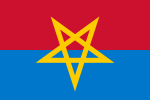 | Haaksbergen | Overijssel | 21 March 1962 | The flag has a horizontal bicolour of red at the top and blue at the bottom. The blue colour represents the Schipbeek, a tributary of the IJssel River that flows through Haaksbergen. The red and yellow colours are derived from the municipal coat of arms. Both the flag and the coat of arms shows a pentagram. This dates from 1737 when the pentagram still amounted to a star with rounded points. The pentagram probably represents the union of two marken (collective of larger farmers/village area) into one marke. Around this marke, there were five other marken which were eventually joined.[207][19] |
 | Haarlem | North Holland | Unknown | The flag is based on the corresponding municipal coat of arms and first appeared in the seventeenth century. At the time, the flag was slightly simpler and contained only the sword and two stars. Later, two stars and a broad-armed cross were added. The objects on the shield were added throughout history and linked to historical events and legends of the Haarlem municipality.[208][209] |
 | Haarlemmermeer | North Holland | 2 January 2019 | The flag is derived from the municipal coat of arms. The municipal coat of arms of Haarlemmermeer was created after the merger of the municipality of Haarlemmermeer with Haarlemmerliede en Spaarnwoude. For this reason, the flag also forms a combination of both former municipal flags. The climbing lion comes from the flag of Haarlemmerliede en Spaarnwoude. The ears of corn together with the white wavy stripe from the former flag of Haarlemmermeer.[210][211][212] |
 | Halderberge | North Brabant | 29 May 1997 | The flag is derived from the corresponding municipal coat of arms. The background of the flag consists of three horizontal stripes, which turn into three blocks on the hoisting side. Each block contains an image derived from former municipal arms. The castle in the upper left corner comes from the coat of arms of Hoeven, the bird from the coat of arms of Oud- en Nieuw-Gastel and the tree from the village arms of Oudenbosch.[213] |
 | Hardenberg | Overijssel | 3 December 2002 | The flag is based on the municipal coat of arms. Both the coat of arms and the flag were created after Hardenberg merged with the municipalities of Avereest and Gramsbergen. Like the municipal coat of arms, the flag also has a yellow (gold) background with two blue wavy bars and a red cloverleaf. The bars symbolize the rivers the Reest and the Vechte and the red cloverleaf the agricultural character of the municipality. The cloverleaf has three leaves, which should represent the three former municipalities.[214] |
 | Harderwijk | Gelderland | 30 June 1966 | The flag uses the so-called national colours (blue/azure and yellow/or). These national colours are derived from the national coat of arms of the Netherlands. In the case of Harderwijk, they represent the Hanseatic League (yellow) and the connection with the House of Nassau (blue). The flag consists of six horizontal stripes in total, with the middle two embattled stripes. These embattled stripes are a reference to its past as a fortified town. A fortified town was a fortified city and offered protection to strategically important locations. The six lanes on the flag symbolize the six fields of study that could be followed at University of Harderwijk in the seventeenth to nineteenth centuries.[215][216] |
 | Hardinxveld-Giessendam | South Holland | 7 April 1965 | The flag is based on the corresponding municipal coat of arms and divided into a triangular white and red area. The fields are separated by a blue diagonal band. The black raven in the top left is from the former coat of arms of Hardinxveld. The white mill wheel on the bottom right is from the former coat of arms of Giessendam. It refers to the coat of arms of the Molenaer family. |
 | Harlingen | Friesland | 10 March 1857 | The flag is officially in use since 10 March 1857. For Harlingen as a city, people have been using the flag for a long time. This especially in shipping. The history of the flag and the municipal coat of arms are centuries old. The first appearance of the flag as it looks today dates from 1695. The flag is composed of a yellow field with a blue stripe at the top and bottom. Central to the flag is a blue-bordered circle consisting of four quarters. This circle is derived from the widely used municipal coat of arms. Indeed, today, the municipal coat of arms is still depicted in many places, such as properties of the city of Harlingen as bridges and vehicles. The municipal coat of arms, as well as the flag, contains eight fleur-de-lis and crosses. Both elements symbolize piety. The fleur-de-lis represent Marian devotions and the crosses represent Michael, the town's patron saint.[217] |
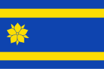 | Hattem | Gelderland | 22 February 1971 | The colours are derived from the corresponding municipal coat of arms. The flag consists of a blue field with two narrow yellow stripes. On the hoisting side, a so-called medlar flower (or guelder rose) has been placed, which already featured on the oldest Gelderland provincial coat of arms. The origin of this medlar flower lies in a legend from the twelfth century. In this legend, a dragon was fought by the sons of Pont near a medlar tree.[218][219][220] |
 | Heemskerk | North Holland | 28 January 1965 | The flag is based on the municipal coat of arms. Like the coat of arms, the flag has a blue background with a white (silver) climbing lion in the foreground. The municipal coat of arms dates from the 13th century and was depicted on seals, among other things. The coat of arms of Heemskerk is undoubtedly derived from the coat of arms of Gerard II van Heemskerk, lord of Oosthuizen. This also featured the climbing lion.[221] |
 | Heemstede | North Holland | 26 August 1982 | The flag was adopted by the municipal council on 26 August 1982. However, the flag has been in unofficial use since 1925. The flag consists of four horizontal stripes in the colours red and yellow. These colours are derived from the municipal coat of arms. The municipal coat of arms has been used since the fourteenth century and contains a shield with seven red martlets on it. A martlet is an armorial animal and is supposed to represent a stylised blackbird without a beak and legs. The yellow colour of the municipal flag is reflected on the coat of arms as gold in the coat of arms, the crown and the two shield-holding griffins.[222] |
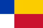 | Heerde | Gelderland | 23 February 1976 | The flag colours are taken from the municipal coat of arms. The flag consists of four squares in blue, yellow, white and red, unlike the municipal coat of arms which consists of three squares. The white, fourth field on the flag refers to the depicted sheep's heads and oxen's heads on the municipal coat of arms. In turn, these images refer to the sheep farming and cattle breeding of the past. Together with arable farming, these were the main sources of livelihood for the municipality at the time.[223] |
 | Heerenveen | Friesland | 27 May 1963 | The design consists of three horizontal stripes in black and white and a blue vertical stripe on the hoisting side. At the top of the blue stripe is a golden crown with five pearl points. The flag refers to the birth of Heerenveen thanks to peat extraction in the area. Peat mining takes place by draining and settling pieces of peatland. The peat is symbolized by the black stripe on the flag, and the water by the two white stripes. The (lords') crown refers to the noblemen, who were also called lords, who started the reclamation. The lords and the peat thus logically form the name Heerenveen.[224][225] |
 | Heerlen | Limburg | 7 February 1966 | The flag colours are taken from the corresponding municipal coat of arms. The background of the flag is blue and refers to the area's trade and industry. The yellow eagle placed in the foreground represents the development of the municipality.[226][227] |
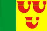 | Heeze-Leende | North Brabant | 23 March 1998 | The flag is derived from the corresponding municipal coat of arms. The green vertical stripe on the hoist side of the flag refers to an oak tree, which is used as a supporter in the municipal coat of arms. The tree probably refers to the municipality's wooded surroundings. The yellow field with the three red horns on the flag originates from the coat of arms of the noble family Horne. This family once ruled the municipality.[228] |
 | Heiloo | North Holland | 27 May 2021 | In the background, the flag consists of two horizontal stripes in yellow and blue. In the upper left, in the canton of the flag, there is a red field containing a white cross. The yellow stripe symbolizes the beach embankment in the Dutch landscape. The colours of the flag came from the flag of North Holland. Yellow and blue are also the colours of the Christian Saint Willibrord. Among other things, he was a missionary during the early Middle Ages in the Heiloo area. The red field with the white cross in the canton of the flag, came from the municipal coat of arms, which has been recognized since 1816. Nothing is known with certainty about the meaning of this coat of arms. The cross is said to indicate Saint Willibrord, who is said to have come here around 720 to build a church. He was known for striking holy wells, and there is also a well of Willibrord in Heiloo behind the white church.[229][230][231][232][233] |
 | Hellendoorn | Overijssel | 19 December 1961 | The municipal flag appears to have been based on the municipal parade flag during the Amsterdam parade in honour of the 40th anniversary of Queen Wilhelmina's reign in 1938. During the event, flags were carried in colours that varied by province, with the canton having an image taken from the municipal coat of arms. The basis for Overijssel was a flag with three equal horizontal stripes in red, yellow and blue. The municipal flag has a horizontal tricolour of red, yellow and blue. However, the flag features an image of a climbing deer and a tree (an elder) in the upper left corner. These are both derived from the municipal coat of arms, in which they occupy a prominent position. A deer and an elder were probably chosen because they are common in the Hellendoorn municipality. The coloured stripes of the municipal flag appear to have been taken from the 1938 parade flag. This flag was the one-time provincial flag of Overijssel because the province did not have its own flag at that time.[234][19] |
 | Helmond | North Brabant | 3 February 2004 | The flag is derived from the corresponding municipal coat of arms. The background of the flag is divided into an even red and white field. Centred on the flag is a so-called tournament helmet. This helmet already appeared on a seal from the 13th century and literally stands for the name Helmond.[235][236] |
 | Hendrik-Ido-Ambacht | South Holland | 6 July 1964 | The flag is derived from the corresponding municipal coat of arms. The flag has a white background with six red narrow stripes and three black Saint Andrew's crosses. The red stripes represent the red-coloured coat of arms of the former municipality of Sandelingen Ambacht, which merged into Hendrik-Ido-Ambacht. The red stripes also represent the three cocks on this former coat of arms and the three Saint Andrew's crosses on the current coat of arms of Hendrik-Ido-Ambacht. A Saint Andrew's crosses is an ancient symbol and used on many flags (e.g. on the flag of Scotland). This cross owes its name to the Andrew the Apostle, who was put to death on such a cross.[237][221] |
 | Hengelo | Overijssel | 18 November 1969 | A blue and white bicolour was used to create the current municipal flag. The flag has a blue background and a diagonal white wavy bar in the foreground. This white bar symbolizes the stream that flows through the municipality. The flag is derived from the corresponding municipal coat of arms. It is a common phenomenon for municipal flags to be based on the municipal coat of arms. The flag was out of the running for a considerable time, but was 'rediscovered' in 2016, after which the flag began to enjoy more popularity.[238][239][240] |
 | 's-Hertogenbosch | North Brabant | 23 September 1999 | The flag is derived from the corresponding municipal coat of arms and is composed of five horizontal stripes in red and white. The flag colours refer to the Maasland to which the former municipalities of Rosmalen, Empel and Meerwijk belonged. The five stripes represent the five former municipalities from which the current municipality of 's-Hertogenbosch emerged. A tree has been placed in the top left corner. This refers to the forest to which the municipality and the city of 's-Hertogenbosch owe their names. The tree has five branches, which also refer to the five former municipalities.[241][242] |
 | Het Hogeland | Groningen | 1 January 2019 | This municipality was created from four other municipalities namely De Marne, Bedum, Eemsmond and Winsum. The flag is not a combination of the former municipal flags, but features a white municipal logo. This logo is also called 'The H' and is placed against a greenish-blue background. Designed by a Groningen design agency, the logo has an underlying meaning. For instance, a number of elements from the municipal area, such as villages, fields, dykes and windmills, are stylised in the logo. The logo also includes a little boy with a kite, which, according to the designers, symbolizes the recent emergence of the municipality. This allows plenty of opportunities for growth and development.[243][244][245][246] |
 | Heumen | Gelderland | 29 October 1981 | The flag is derived from the corresponding municipal coat of arms. The flag consists of a chequered pattern with a blue vertical field on the hoist side. A so-called crozier is depicted in this blue field. Together with the two fleur-de-lis, this symbolizes the monks who used to have a settlement in the former municipality of Overasselt. Overasselt merged with Heumen in 1980. Since then, a municipal flag with coat of arms symbolizing both municipalities has been adopted.[247] |
 | Heusden | North Brabant | 8 February 2000 | The flag is derived from the corresponding municipal coat of arms. The background of the flag is divided into four squares in blue and yellow. These fields are overlapped at the quadrangle by a wheel with six spokes. This wheel dates from the 13th century and comes from the coat of arms of the Lords of Heusden en Altena. These lords ruled Heusden at the time. |
 | Hillegom | South Holland | 9 February 1951 | The flag has a horizontal tricolour of yellow, green and red. The flag colours are derived from the corresponding municipal coat of arms. In this, yellow is used as the background colour of the coat of arms. The green colour for a horizontal bar and the red for three fleur-de-lis. The municipal coat of arms is derived from the coat of arms of the Van Hillegom family. The flag has the same colour pattern as the flag of Lithuania is due to coincidence. The aspect ratio of the flag of Hillegom is 2:3, while the flag of Lithuania has an aspect ratio of 3:5.[248] |
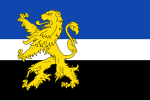 | Hilvarenbeek | North Brabant | 3 July 1997 | The flag is derived from the corresponding municipal coat of arms. The background of the flag is made up of three horizontal stripes in blue, white and black. A yellow climbing Brabantian lion is depicted in the foreground. This is a common coat of arms and symbolizes bravery and courage.[249] |
 | Hilversum | North Holland | 4 March 1958 | The flag is derived from the municipal coat of arms. The flag uses the so-called national colours (blue/azure and yellow/or) which are also used for the national coat of arms of the Netherlands. The background of the flag is blue, and four yellow buckwheat grains are placed symmetrically in the foreground. Buckwheat was an important source of food for the local population in the 16th century and thrived on sheep manure, which was abundant at the time. Meanwhile, buckwheat cultivation has completely disappeared from Hilversum municipality.[250][251] |
 | Hoeksche Waard | South Holland | 17 December 2019 | This municipality was created on 1 January 2019 from six other municipalities (Binnenmaas, Cromstrijen, Korendijk, Oud-Beijerland and Strijen). After the presentation of the new municipal logo in 1 January 2019, it was unclear for a long time which flag would be adopted for the municipality. The current design was finally chosen on 17 December 2019. On the hoisting side, the flag has a green stripe, which comes from the municipal coat of arms and flag of former municipality Binnenmaas. Next to it is a yellow field with a blue wavy stripe and three red crosses. These elements also come from a former municipal coat of arms and flags. What stands out most about the flag is the Bavarian blue and white lozenge pattern. Bavarian lozenges do often feature prominently on municipal flags, such as the flag of Woerden.[252][253][254][255] |
 | Hof van Twente | Overijssel | 24 August 2010 | The design was conceived by the municipality itself and taken from the corresponding municipal coat of arms. The flag was created by using elements from coats of arms of former municipalities that now all belong to the Hof van Twente. This happens with regularity. The flag is divided by a white cross into two yellow and two green squares. Three of these squares feature an image, all of which originate from former municipal coats of arms. The medlar in the upper left corner comes from the coat of arms of Goor and also represents the Prince-Bishopric of Utrecht. The hogweed in the lower left corner comes from the coat of arms of Diepenheim and the lime leaf is a reference to the coats of arms of Ambt Delden and Markelo.[256][257] |
 | Hollands Kroon | North Holland | 1 January 2012 | The municipal logo is displayed on a white flag. The municipal logo has as its logo a stylised water lily with five petals. The petals of the water lily refer to the core values of the municipal government. The colours each also have their own meaning. For instance, the green colour stands for agriculture and nature, the red-brown colour for buildings, inhabitants and the central position of the municipality itself, and the blue colour for the waters bordering Hollands Kroon. The overlap of the colours represents the mixture between the various municipal activities.[258] |
 | Hoogeveen | Drenthe | 17 April 1958 | The flag has a horizontal bicolour of blue (Nassau blue) at the top and white at the bottom. The meaning of these colours is virtually unknown. However, there is symbolism attached to the colours. They date back to the time when Hoogeveen emerged as a peat colony. For instance, the blue is said to refer to heathland in bloom and the white to the reflective water of fens, ponds and lakes. Before the official adoption of the flag, the municipality had been flying this flag since 1925, after the flag was presented by a local association on the occasion of Hoogeveen's 300th anniversary. The flag is identical to the flag of Assen.[259] |
 | Hoorn | North Holland | 26 March 1957 | The flag was adopted by municipal resolution on 26 March 1957. However, the flag was already seen in a painting in 1622. The flag has a horizontal tricolour of red, white and red. This makes the flag almost identical to the flag of Austria, the flag of Dordrecht and the flag of Gouda. In the past, the flag was also flown with the musical horn from the municipal coat of arms. This Horn literally stood for the municipal name.[260][261] |
 | Horst aan de Maas | Limburg | 19 February 2002 | The flag is based on the corresponding municipal coat of arms. The background of the flag is composed of seven equal stripes in the colours black and yellow. In the foreground, a vertical white strip containing five red medlar flowers or guelder rose is placed on the hoist side. These flowers represent the five villages of the municipality and symbolize the historical connection with County of Gelre.[262][263] |
 | Houten | Utrecht | 27 August 1985 | The flag is derived from the corresponding municipal coat of arms and has three horizontal stripes as a background. In the foreground are three blue and white blocks bearing vair. Vair is a pattern based on the grey-blue fur of a squirrel species. This is normally found only on coats of arms. The municipal coat of arms, and hence the flag, are ultimately based in design on the family coat of arms of the Van Goyen family. This family ruled the then Houten at the end of the Middle Ages.[264] |
 | Huizen | North Holland | 21 November 1961 | The flag is derived from the corresponding municipal coat of arms. The flag has a horizontal bicolour of red at the top and yellow at the bottom. The red stripe depicts a milkmaid wearing a dress with two milk cans hanging from it. The milkmaid refers to an originally very old 18th-century stamp of this seal, depicting a farmer's wife delivering milk to customers elsewhere. The milkmaid, in legend, is said to have risen from a milk well after a miserly farmer who refused to share his milk with poor people was drowned in it after being struck by lightning and still places bottles of milk at front doors as a ghost.[265][266][267] |
 | Hulst | Zeeland | 22 June 1956 | The flag was adopted by municipal resolution on 22 June 1956. Since then, the flag has been re-established as the municipal flag three times. The flag is derived from the corresponding municipal coat of arms and has a yellow background. Central to the flag is a black Dutch lion with a crown. The lion is a commonly used heraldic animal and generally stands for courage and bravery within heraldry. The municipal flag is very similar to the flag of Flanders, but the lion on the municipal flag carries a crown. The origin of both flags is the Flemish lion.[86][268][269] |
 | IJsselstein | Utrecht | 1857 | The flag has a horizontal bicolour of yellow at the top and black at the bottom. The flag colours originate from the coat of arms of the noble Van Amstel family, which dates from the thirteenth century. This family ruled over IJsselstein in the thirteenth century. The flag is based on the municipal coat of arms, which is gold with a black crossbar on top. The flag is very old: it is mentioned as early as the end of the 16th century. The flag is identical to the flag of Tiel.[270][271] |
 | Kaag en Braassem | South Holland | 1 January 2009 | The flag contains the municipal logo. The flag has a white background with a green and purple bar at the bottom. In the centre of the flag is the municipal logo, which is also coloured in green and purple. Green represents the municipality's rural character, and purple the mixture of water (blue) and urbanization (red). A windmill shape symbolizing the many windmills in the municipality was used as a logo. The shape consists of four unique sails, each with its own meaning. For example, the wavy light purple blade stands for recreation and water within the municipality and the thick purple blade for the A4 motorway and the Schiphol–Antwerp high-speed railway line that cross the municipality. The two green wicks refer to the municipality's greenhouses, horticulture, fields and grasslands.[272] |
 | Kampen | Overijssel | 25 January 1973 | The flag has a horizontal bicolour of white at the top and blue at the bottom. The flag dates back to the 14th century in unofficial form. The colours come from the municipal coat of arms. In it, blue (azure) is used for the coat of arms and white (argent) for the castle depicted on it. The two shield bearing lions are also argent. Over the centuries, the castle has constantly changed shape. In 1819, a final coat of arms was adopted, which still applies today.[273] |
 | Kapelle | Zeeland | 24 March 1970 | The flag colours are taken from the municipal coat of arms. Thanks to the red-blue Nordic cross in the foreground, the flag is divided into four fields in white and yellow. The main colours being those of the seigniorial coat of arms of Kapelle and those of the coat of arms of Wemeldinge. Using these colours, a cross was made, symbolising the chapel in the coat of arms. The four fields around the Nordic cross represent the other four former municipalities: Biezelinge, Eversdijk, Schore and Wemeldinge.[86] |
 | Katwijk | South Holland | 17 December 2009 | The flag is derived from the corresponding municipal coat of arms. The flag forms a combination of the flags of the three former municipalities (Rijnsburg, Valkenburg and Katwijk) that merged into the current municipality of Katwijk. The saltire of the old flag of Katwijk forms the basis. One explanation for the presence of this cross is that the Andrew the Apostle was also seen as the patron saint of fishermen. Many people of Katwijk had this as a profession. The red and yellow colours are derived from the other two old municipal flags of Rijnsburg and Valkenburg.[274][275] |
 | Kerkrade | Limburg | About 1950 | The flag was never officially adopted, but is used by residents. The flag has a horizontal bicolour of red at the top and white at the bottom. The red and white are repeated in the municipal coat of arms, both of which are used three times. This for the saint depicted on it (Lambert of Maastricht), the Limburgian lion, the sword and the smaller shield. The flag is identical to the flag of Indonesia, and the flag of Monaco. |
 | Koggenland | North Holland | 1 January 2007 | The flag consists of ten triangles pointing to one point in the flag. The triangles have the colours yellow, blue and white. The gyronny resembles the letter K and signifies the initial letter of the municipality. It is not known where the flag colours came from. The flag is one of the few municipal flags not based on the municipal coat of arms.[276] |
 | Krimpen aan den IJssel | South Holland | 5 April 2001 | The flag is based on the corresponding municipal coat of arms and split into four triangular shapes. These shapes are separated by three converging white stripes. The white stripes refer to the Hollandse IJssel, the Nieuwe Maas and the Sliksloot. These are three major rivers that flow through the municipality and eventually converge. The flag also contains the colours red and blue, in contrast to the municipal coat of arms. These refer to the flag of the Netherlands. On the hoist side, the municipal coat of arms with its three half moons (crescent moons) is depicted.[277][278] |
 | Krimpenerwaard | South Holland | 22 December 2021 | The flag is based on the municipal coat of arms, which dates from 2016 and was designed by Hillegonda Rikkoert from Schoonhoven. It replaces the old unofficial design which containing a municipal logo. The flag consists of four squares in white and red: the same layout as the corresponding coat of arms. Each of the fields features its own figure. In the white field in the top left corner is a black standing lion, which symbolizes the town of Schoonhoven. Next to this is a yellow castle, which refers to Vlist. The yellow six-pointed star on the bottom left is a reference to Ouderkerk and the three crescent moons on its right represent the Van Polanen family. They also represent the towns of Bergambacht, Nederlek and Ouderkerk.[279][280][281][282] |
 | Laarbeek | North Brabant | 23 June 1998 | The flag's design came about after the merger of several other municipalities: Aarle-Rixtel, Beek en Donk and Lieshout. These first each used their own flag. The flag consists of five horizontal stripes: a thicker blue, red and green stripe and two thinner white stripes. All colours recur at least twice in the former municipal flags of Aarle-Rixtel, Beek en Donk and Lieshout.[283] |
 | Land van Cuijk | North Brabant | 15 June 2022 | This municipality was created on 1 January 2022 from the former municipalities of Boxmeer, Cuijk, Sint Anthonis, Mill en Sint Hubert and Grave. The flag is based on the corresponding municipal coat of arms and has a yellow background. The foreground of the flag features two red stripes and eight so-called martlets. A martlet is a commonly used armorial animal which represents a female blackbird without beak and legs. The former flag and the coat of arms of Cuijk are both derived from the family arms of the noble family Van Cuyk. They were already in use when Cuijk was still a heerlijkheid (Land van Cuijk) from the 11th century onwards under the leadership of the Lords of Cuyk. The flag is very similar in design to the former municipal flag of Cuijk. The only difference is that this flag features a red castle in the centre. This castle comes from the coat of arms of Grave, which in turn bears many similarities to the family coat of arms of the Van Cuijk family. Indeed, Grave originated as a heerlijkheid within the Land of Cuijk.[284][285][286] |
 | Landgraaf | Limburg | 13 October 1983 | The flag colours are taken from the corresponding municipal coat of arms. The background of the flag consists of three vertical stripes in the colours blue, yellow and red. A stylised branch with three leaves is depicted in the middle of the yellow strip. Possibly the leaves are a reference to the three former municipalities that merged to form present-day Landgraaf.[287] |
 | Landsmeer | North Holland | 9 February 1962 | The flag is based on the municipal coat of arms. A Waterland swan is depicted against the flag's red background. This swan is also present on several other municipal flags of North Holland and was a status symbol during the Middle Ages. The more swans someone owned, the richer this person was. The Waterland swan on the municipal flag holds seven arrows in its right leg. These arrows represent the six villages that took part in the historical alliance called the Waterland Union (Ransdorp, Zuiderwoude, Landsmeer, Zunderdorp, Broek in Waterland, Schellingwoude and Buiksloot).[288] |
 | Lansingerland | South Holland | 22 November 2007 | The design is derived from the corresponding municipal coat of arms. The flag is divided into three stripes in the colours yellow, green and white. The middle green stripe refers to the green dyke that still runs through the municipality. This green dyke is also called a land division or lansing and thus gave rise to the current municipality name. The red eight-pointed star in the yellow flag stripe is derived from the coats of arms of former municipalities Bergschenhoek and Berkel en Rodenrijs. The diamond is derived from the coat of arms of the former municipality Bleiswijk. All these former municipalities have merged into the municipality of Lansingerland.[289][290] |
 | Laren | North Holland | 25 March 1987 | The flag is derived from the municipal coat of arms. The flag depicts a large yellow S against a blue background. What its meaning is so far unknown. However, it has been established that the S shape was already present on seals in the sixteenth century. Various speculations circulate about the origin of the S. It could be a stylised eel from the Zuiderzee, a corrupted L (from Laren) or a hook used to hang sheep's wool. |
 | Leeuwarden | Friesland | 29 March 2019 | The flag consists of a large dark blue field topped by a yellow climbing lion. On the hoisting side of the flag is a red and white vertical strip derived from the flag and arms of Eastergoa, a historical region in which (a large part of) Leeuwarden is located today. The yellow climbing lion also appears on the current and former municipal coat of arms of Leeuwarden and various historical flags. Previously (from 1947), a different flag consisting of two blue and two yellow stripes was used. The familiar blue and yellow flag will remain as the city flag of Leeuwarden.[291][292][293] |
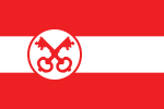 | Leiden | South Holland | 11 April 1949 | The flag is based on the corresponding municipal coat of arms. The flag is similar to the flag of Dordrecht and the flag of Gouda with its white and red stripes but is distinguished by the image of two crossed keys. These keys date from the 13th century and represent Leiden as 'Key City' and the keys of heaven. On old city stamps of Leiden, Saint Peter regularly appeared. In his hand, the apostle held these keys given to him by Jesus. The main church in Leiden, the Pieterskerk, is named after Saint Peter.[294][295][296][297] |
 | Leiderdorp | South Holland | 31 October 1966 | The flag is based on the corresponding municipal coat of arms. The municipal coat of arms of Leiderdorp is related to the municipal coat of arms of Leiden. Both coats of arms, and therefore both flags, depict two crossed red keys. These represent the keys of heaven, which the apostle Saint Peter received from Jesus. On the municipal flag, the keys are placed centrally against a white background. In the foreground is a blue wavy stripe, which refers to the growth of the town Leiderdorp around the water.[298] |
 | Leidschendam-Voorburg | South Holland | 24 July 2003 | The flag is based on the corresponding municipal coat of arms and has a white background. In the foreground is a blue wavy stripe which divides the flag in two. This blue stripe represents the Vliet, a canal between Leiden and Delft. Above the wavy strip, an opened Roman fortress is depicted, taken from the coat of arms of the former municipality of Voorburg. A similar castle seems to have once stood in the municipality. At the bottom, a black crescent moon can be seen, which eventually came from the coat of arms of Veur, a now defunct municipality.[299] |
 | Lelystad | Flevoland | 11 September 1979 | The flag is partly derived from the corresponding municipal coat of arms. The flag has a yellow background and shows four cobalt blue legs in the foreground, which are distributed clockwise across the surface. Where the legs meet is a hexagon with a white fleur-de-lis. The hexagon refers to the concrete blocks that form the dykes of Flevoland. The fleur-de-lis is also incorporated in the municipal coat of arms and comes from the coat of arms of Cornelis Lely. Cornelis was a hydraulic engineer and engineer and made a major contribution to the Zuiderzee Works, which ultimately helped reclaim Flevoland.[300][301] |
 | Leudal | Limburg | 29 January 2009 | The flag is based on the corresponding municipal coat of arms and has a yellow background. On the hoisting side, the flag contains a blue vertical strip depicting the Leubeek. The Leubeek is a stream that flows through the municipality and inspired the naming of Leudal. The three red horns are a reference to the County of Horne and come from the coat of arms of the noble Horne family. The flag of Weert also shows these horns. Both Leudal and Weert were owned by the Horne family for long periods of time.[302][303] |
 | Leusden | Utrecht | 27 January 1977 | The flag is derived in colour from the municipal coat of arms. A stylised church building in Leusden can be seen against the flag's green background. This in the colours black, red and white. This silhouette is also an interpretation of the letter L: the first letter of Leusden. |
 | Lingewaard | Gelderland | 1 January 2003 | The flag is based on the municipal logo. The flag is white and contains a large stylised butterfly on the right-hand side. This butterfly also forms the municipal logo, which is made up of seven parts, each shape representing seven villages in the municipality. The butterfly also symbolizes the rural environment of the municipality in the Batavia region. |
 | Lisse | South Holland | 1 August 1958 | The flag has a horizontal tricolour of yellow, blue and yellow. The flag colours are derived from the colours of the corresponding municipal coat of arms. The yellow colour is predominant as it is used as the background colour of the municipal coat of arms. Blue is used for the climbing lion depicted on it. This lion comes from the family coat of arms of the Dever family. Reinier Dever owned Huys Dever in Lisse between 1370 and 1417. This is a so-called keep, a medieval fortified residential tower.[304] |
 | Lochem | Gelderland | 29 April 1974 | The flag uses the so-called national colours (blue/azure and yellow/or). These national colours are based on those of the Dutch national coat of arms. The flag consists of two horizontal strips and two narrow strips angled out towards on the hoist side. The colours yellow and blue are derived from the metal of the lion and the colour of the field in the coat of arms; the two narrow lanes indicate the Berkel and the Twentekanaal, on which the town is situated; the old fortress is represented in a simple manner by two ravelins in the 2nd and 5th lane, thus enclosing a rectangular town shape, and the touristically famous Lochemse Berg is indicated in the bulge thus created in the third lane. Until then, a flag, with a horizontal bicolour of yellow at the top and blue at the bottom, was used on festive occasions.[305] |
 | Loon op Zand | North Brabant | 6 June 1968 | The flag is derived from the corresponding municipal coat of arms. The overall flag design is actually a stylised representation of the municipal coat of arms. The flag consists of a horizontal white stripe with three black lines and a yellow stripe with three red lines. The yellow and white stripes refer to the background of the municipal coat of arms. The black represents the shoemaker's hammers depicted on it. The red represents the three horns. These three horns originate from the coat of arms of the noble family Horne. This family once ruled the municipality.[306][307] |
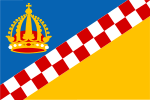 | Lopik | Utrecht | 28 November 1995 | The flag is derived from the corresponding municipal coat of arms. The flag is divided into a blue and yellow triangle. These two triangles are separated by a red and white chequered stripe. This chequered stripe comes from the coat of arms of the noble Van Amstel family, who once ruled Lopik. In the top left-hand corner of the flag is an emperor's crown from one of the former emperors of Europe.[308][309] |
 | Losser | Overijssel | 25 June 1970 | The flag contains the Saxon colours red and white. These were used to emphasize the municipality's location amidst the old Saxon countryside. The background of the flag is white and the elements in the foreground are red. On the left and right sides, the flag features two red squares. In the middle of the flag, two elements symbolizing the Saxon Steed are placed and are supposed to represent two highly stylised horse heads. These symbols still appear on the facades of old farms.[310][311] |
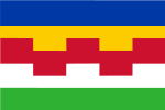 | Maasdriel | Gelderland | 5 April 2001 | The flag colours are taken from the corresponding municipal coat of arms. This colourful flag is distinguished, among other things, by the embattled red stripe. This red stripe comes from the municipal coat of arms of the former Ammerzoden municipality. It is a reference to the Van Arkel castle from the 15th century. Ammerzoden merged with the municipality of Hedel, Rossum and Heerewaarden to form Maasdriel. The municipal coat of arms of Maasdriel forms a combination of the four former municipal coats of arms for this reason. Both the five stripes and the five battlements of the red stripe refer to the five former municipalities from which Maasdriel emerged.[312] |
 | Maasgouw | Limburg | 4 February 2010 | The flag is based on the corresponding municipal coat of arms and has a blue background. On the hoist side, a sword, wavy white stripe and abbess's staff are placed. The sword and staff are symbols of the secular and spiritual power of the principality of Thorn. This principality existed up to and including the eighteenth century and included Maasgouw. The white lane represents the river Meuse flowing through the municipality.[313][314][315] |
 | Maashorst | North Brabant | 14 November 2024 | The flag is based on the corresponding municipal coat of arms, and it forms a combination of the two former municipal flags. The municipal coat of arms combines the colours and elements of the coats of arms of the former municipalities of Landerd and Uden. For example, the green chevron of Landerd is included, as well as the carbuncle from the old coat of arms of Uden.[316][317][318][319] |
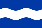 | Maassluis | South Holland | 23 October 1961 | The flag is derived from the corresponding municipal coat of arms. On the blue background of the flag, a white wavy stripe is placed in the centre. This wavy stripe symbolizes river the Nieuwe Maas and dates from the seventeenth century. |
 | Maastricht | Limburg | 1 January 1994 | The flag is based on the corresponding municipal coat of arms and has a red background. A white five-pointed star is placed in the foreground. This star dates from the 13th century and was probably used as a distinctive sign on merchandise back then. It had been a historical flag, with its first image of appearance dating from 1549, of the municipality but was replaced in 1938 with a flag similar in design to the Polish flag. To avoid confusion, the old flag was reinstated in 1994.[320][321][322][323] |
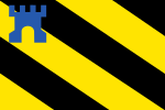 | Medemblik | North Holland | 30 June 1959 | The colours of the flag come from the municipal coat of arms and the older flag of Medemblik. The current flag consists of six diagonal bars taken from the flag of Friesland. An image of a blue castle is placed in the top left corner. This castle refers to Radboud Castle, which dates from 1288. The castle once served as a coercive castle and after its construction offered protection against the many infiltrations of the Frisians.[324][325] |
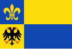 | Meerssen | Limburg | 28 October 1982 | The flag is based on the corresponding municipal coat of arms. The background of the flag consists of four squares in the colours yellow and blue. These squares refer to the four former municipalities from which Meerssen emerged. In the top left corner of the flag, a fleur-de-lis is depicted, which refers to Louis IV from the 10th century and symbolizes purity and virginity. In the lower left corner, a two-headed black eagle is placed. This is a common heraldic animal and generally stands for power and dominance.[326][327] |
 | Meierijstad | North Brabant | 13 March 2019 | The flag was created by combining the municipal flags of three former municipalities (Sint-Oedenrode, Veghel and Schijndel). The flag consists of three horizontal stripes in the colours blue, black and yellow. The upper blue strip symbolizes the Aa and the Dommel, two watercourses that flow through the municipality. The upper left castle is taken from the former coat of arms of Sint-Oedenrode and probably represents the Old Castle from the eighth century. The red-and-white chequered saltire comes from the coat of arms of Veghel and refers to the Lords of Erp. The three moons (crescent moons) are from the coat of arms of Schijndel and refer to the Van Wassenaer family.[328][329][330] |
 | Meppel | Drenthe | 2 January 1998 | The design forms a combination of the two former flags of Meppel and Nijeveen, which have merged since 1998. The flag features a red frame with ten white dots. This dotted frame refers to a historical event in one of the most important church villages of southern Drenthe, namely Kolderveen. Meppel also used to belong here and became an independent church village in 1422. However, this came at a price. Thus, the pastor of Meppel had to hand over ten mud (± 100 litres) of rye annually to Kolderveen as tax. This obligation continued until the seventeenth century. Besides the frame, the flag is divided into two lanes. The black squares in the upper lane symbolize peat extraction and the cloverleaf symbolizes agriculture.[331][332] |
 | Middelburg | Zeeland | 27 April 1974 | The flag dates back to the eighteenth century. The flag is derived from the corresponding municipal coat of arms and has a red background. In the foreground of the Middelburg flag is a yellow double tower with an open gate in the middle. This tower represents a historic castle placed in the middle of two other castles. This explains the naming of Middelburg. The red and yellow are probably derived from the 13th-century coat of arms of the viscounts of Zeeland.[333][334][335][336] |
 | Midden-Delfland | South Holland | 29 March 2005 | The flag is derived from the corresponding municipal coat of arms. The top of the flag's blue symbolizes the sky. The green at the bottom symbolizes grass and refers to the municipality's vast green area. In the middle of the flag is a wavy white stripe representing the water of the river the Leede. A sailing ship with three masts, sails on it. This ship represents movement and the municipality's history and comes from the village arms of Schipluiden. On the underside of the flag, a stretched letter M can be seen. This comes from the municipal coat of arms of former Maasland municipality and represented the river the Meuse.[337] |
 | Midden-Drenthe | Drenthe | 29 June 2002 | The flag is based on the municipal coat of arms. The flag is green and features four symmetrical fleur-de-lis, each pointing in one of the four wind directions. They refer to the municipality's central location in the province of Drenthe and are in turn taken from the coat of arms of Drenthe. The green colour refers to the municipality's agriculture and nature.[338] |
 | Midden-Groningen | Groningen | 1 January 2018 | This flag has been adopted since the establishment of the municipality. This is because the municipality previously consisted of three other municipalities. The white logo depicted on the flag's purple background was unveiled in 2017. This logo has its own underlying meaning. For instance, the centred M with arc shape is supposed to symbolize a 'location pin' (or location marker) on Google Maps and the connections made between the three former municipalities. Below the logo, 'gemeente Midden-Groningen' is written in full. This municipality name was chosen because it manages to make it clear at a glance where the municipality is located. Namely, in the middle of the province of Groningen.[339][340][341] |
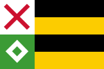 | Moerdijk | North Brabant | 27 November 1997 | The flag is derived from the corresponding municipal coat of arms. The background of the flag consists of four horizontal stripes in black and yellow. On the hoisting side, a white and green block are included. The white block features a red Saint Andrew's cross and the green block a white pierced diamond. The crosses come from the arms of Zevenbergen and Willemstad, two former municipalities that merged into Moerdijk. The diamond comes from the arms of former municipalities Standdaarbuiten and Fijnaart en Heijningen.[342] |
 | Molenlanden | South Holland | 1 January 2019 | The flag has not been officially adopted so far. The provisional flag features the municipal logo. This logo was designed in 2018 and is central on the white flag. The vignette on the hoist side consists of different colour areas, which were also used for decoration for the top and bottom of the flag. The multicoloured vignette symbolizes the diversity of Molenlanden and the uniqueness of its inhabitants and village centres. The vignette is divided into two parts by the graceful capital M which stands for both the M of Molenlanden and the rivers in the municipality.[343][344][345] |
 | Montferland | Gelderland | 1 January 2005 | The flag contains the municipal logo. The logo is set against a white background and consists of a blue area and a larger green area containing the name of the municipality. The exact meaning of the municipal logo is unclear. |
 | Montfoort | Utrecht | 1974 | The flag is derived from the corresponding municipal coat of arms. On the hoisting side of the flag, several symbols are depicted against the white background. One of these is the Maltese cross which, among other things, symbolizes the bishops of Utrecht who founded Montfoort as a city. The Maltese cross is overlaid by a black mill iron (part of a millstone) symbolizing the former viscount ship of the Lords of Montfoort. A viscount was a noble position between a count and a baron who enjoyed power in a certain area. Amidst the Maltese cross and the millstone, a kind of diamond can be observed. This diamond refers to Montfoort as the jewel of the Lopikerwaard polder.[346] |
 | Mook en Middelaar | Limburg | 24 April 1991 | The flag is based on the corresponding municipal coat of arms. The background of the flag consists of a blue and red field. Both fields feature an emblem from the municipal coat of arms. The yellow climbing lion is a lion of Guelders and comes from the coat of arms of the former Duchy of Guelders. The other emblem, a so-called carbuncle with eight golden rays and a silver inescutcheon, comes from the coat of arms of the Duchy of Cleves. Both duchies played a historical role in the genesis of Mook and Middelaar.[347] |
 | Neder-Betuwe | Gelderland | 18 September 2014 | The flag is based on the corresponding municipal coat of arms. The design was created after the merger of former municipalities Echteld, Kesteren and Dodewaard. The blue and white together with the lion of Guelders appear in the three former municipal coats of arms of these municipalities. The lion of Guelders is an ancient armorial animal and was already used by the former Duchy of Guelders in the 14th century. The lion on the flag consists of two colours. This is because both a yellow and red lion appeared on the old municipal coats of arms of the former municipalities.[348][349][350] |
 | Nederweert | Limburg | 24 August 1973 | The flag is based on the corresponding municipal coat of arms and features three bands in blue, white and green. These stripes symbolize the geographical location of the municipality of Nederweert. In this respect, the white wavy stripe probably represents a waterway.[351][352] |
 | Nieuwegein | Utrecht | 30 April 2002 | The design is based on the municipal coat of arms, which dates from 1972. During the celebration of the municipality's 50th anniversary in 2021, it emerged that in many cases the wrong, previous flag of Nieuwegein was offered and used. The current flag consists of a white background with a red rectangular field on the hoist side. In it, a white castle can be seen. This castle is traced to the coat of arms of the former city of Geyne. Four blue wavy stripes are placed on the white field.[353][354] |
 | Nieuwkoop | South Holland | 6 November 2008 | The flag is based on the corresponding municipal coat of arms. The flag is divided into four squares in the colours red and yellow. Each field features a unique image taken from former municipal flags. The yellow wheel at the top left comes from the old coat of arms of Nieuwkoop and was also used on the old flag. It may represent the symbol of Catherine of Alexandria, martyr and one of the most popular saints of the Middle Ages. The red double-headed eagle at the top right comes from the coat of arms and flag of Zevenhoven and the left part of the coat of arms of Liemeer. It was incorrectly depicted in red on the coat of arms of Liemeer in 1991; the actual eagle of Zevenhoven was black. The red fox at the bottom left came from the coat of arms of Ter Aar, Ter Aar only used a vertically striped yellow-red flag. The yellow eight-pointed star at the bottom right came from the coat of arms of Nieuwveen and later the coat of arms of Liemeer. Also, the star appeared on the flag of Liemeer. Such a similar eight-pointed star can also be seen on the flag of Alphen aan den Rijn.[355][356][357][358] |
 | Nijkerk | Gelderland | After 2000 | The flag is based on the corresponding municipal coat of arms. The background of the flag is blue and on the hoist side contains elements of the municipal coat of arms such as the attacking lion and elements such as fleur-de-lis, columns and a Greek cross. The municipal coat of arms, and hence the flag, was created after the merger with Hoevelaken municipality in 2000. In turn, Hoevelaken's coat of arms was based on various arms of influential families from the past.[359] |
 | Nijmegen | Gelderland | 1 January 1995 | The flag has a horizontal bicolour of black at the top and red at the bottom. Before the current flag of Nijmegen was adopted, several variations of the flag were used. This often included three horizontal stripes instead of two. There was also much discussion about the correct historical colours of Nijmegen. Especially the colour red was under fire. For a long time, it was therefore replaced by chromate yellow. In the end, the red colour was chosen because sufficient historical arguments had been found for it.[360][361][362] |
 | Nissewaard | South Holland | 8 July 2020 | The flag is derived from the corresponding municipal coat of arms. This new design replaces the former flag with the municipal logo on it. The right part of the flag has a green background and shows a white wavy stripe in the middle. This lane represents the Bernisse, water that flows through the municipality. A red climbing lion can be seen in the upper right canton of the flag. This lion is taken from the Bernisse coat of arms and eventually from the coat of arms of the Van Voorne family. Below the lion are three blue bars containing white Saint Andrew's crosses. These nine crosses eventually came from the coat of arms of Spijkenisse. This town falls under the municipality of Nissewaard. The crosses probably symbolize legal security in this case, and can also be found in the flag of Amsterdam and the flag of Breda, for example.[363][364][365][366] |
 | Noardeast-Fryslân | Friesland | 2 September 2021 | The flag was designed by H. de Haan from Leeuwarden. Months earlier, a design for a new flag was also adopted. However, this one fell into disrepute, after which a new design had to be devised. The flag is based on the municipal coat of arms. The flag has a green background and shows a yellow and dark blue wavy horizontal band at the top and bottom. The green colour refers to the agricultural character of the municipality. The layout gives an indication of the municipality's location on the Wadden Sea. Yellow and blue thereby indicate the sea and its coast. To the left of the centre is a yellow six-pointed star. This is a symbol which was used by the three former municipalities (Dongeradeel, Ferwerderadiel and Kollumerland en Nieuwkruisland).[367][368][369][370] |
 | Noord-Beveland | Zeeland | 26 November 1996 | The flag shows a representation of the municipal coat of arms. This municipal coat of arms is placed centrally against the white background. It is a combination of arms of the three former municipalities, Wissenkerke, Kats and Kortgene. A vertical red stripe can be seen on the hoisting side of the flag. It is not known what this refers to. It is possible that the red stripe is derived from the red stylised buckle seen on the municipal coat of arms.[371][372][373] |
 | Noordenveld | Drenthe | 19 October 2000 | The flag is based on the municipal coat of arms. On the hoisting side, the flag has a black and white chequered stripe, referring to the historical location of the area. The black blocks symbolize the bogs that once surrounded the municipality. The upper green strip of the flag symbolizes the lower northern part of the municipality. The yellow colour symbolizes the sandy soils in the south. A three-leaf clover leaf is depicted on the flag. Each leaf refers to one of the three former municipalities, namely Norg, Peize and Roden.[374][375] |
 | Noordoostpolder | Flevoland | 28 August 1963 | The flag is partly derived from the corresponding municipal coat of arms. The flag consists of a quartered cross which divides the flag into four sections. A red castle is placed in the white field at the top left. This castle refers to a castle of the counts of Kuinre who once ruled over the former Noordoostpolder. The fleur-de-lis on the bottom left refers to Cornelis Lely, a hydraulic engineer who made a major contribution to the Zuiderzee Works (such as the Afsluitdijk) that made the reclamation of Flevoland possible.[376][377] |
 | Noordwijk | South Holland | 29 September 2020 | The flag is based on the corresponding municipal coat of arms. On the hoisting side of the flag, a black climbing lion with red tongue and nails is depicted against a white background. These flag elements date from the 13th century and are derived from the coat of arms of the Lords of Noordwijk. The black lion had red nails and tongue according to old armorials such as Bellenville and Leblancq.[378][379][380][381] |
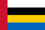 | Nuenen, Gerwen en Nederwetten | North Brabant | 21 October 1976 | The flag colours come from the corresponding municipal coat of arms. In it, black, white and blue are used as background colours of the coat of arms. Yellow (or) is reflected in the three six-pointed stars and two climbing Brabantian lions. Red (gules) is used for two roses.[382] |
 | Nunspeet | Gelderland | 30 March 1972 | The flag is based on the corresponding municipal coat of arms. The background of the flag is yellow and has a black vertical stripe with white crossed bars on the hoist side. The yellow field depicts a leaping deer, symbolizing the link between the municipality of Nunspeet and nature and referring to its wooded surroundings. The pattern of bars is derived from the coat of arms and flag of Ermelo.[383][384][385][386] |
 | Oegstgeest | South Holland | 25 March 1959 | The flag is based on the corresponding municipal coat of arms. Centrally, against the yellow background of the flag, a red cross moline is placed. This cross moline is derived from the Saint George's Cross and refers to Clement of Rome. This man was once bishop of Rome and was thrown into the sea while tied to an anchor. The yellow background of the flag is reflected in the municipal coat of arms as the background of the coat of arms and crown. |
 | Oirschot | North Brabant | 25 February 1997 | The flag is derived from the corresponding municipal coat of arms. The flag has a horizontal bicolour of white at the top and blue at the bottom. In the top left corner is an oak leaf, which refers to the oak on the municipal coat of arms. The oak is an ancient symbol for the town of Oirschot. |
 | Oisterwijk | North Brabant | 17 September 1987 | The flag colours are taken from the corresponding municipal coat of arms. The flag has a white background and three vertical red stripes to the left of the centre. The middle stripe is the thickest. These stripes refer to the interconnected towers on the municipal coat of arms. Together, these towers represent a local castle in the municipality of Oisterwijk, which dates from the thirteenth century.[387] |
 | Oldambt | Groningen | 21 April 2010 | The municipality was established in 2010 by merging the municipalities of Reiderland, Scheemda, and Winschoten. In terms of design, the flags of these former municipalities were all included in the visualisation of the new municipal flag. On the hoisting side, the flag has a toothed yellow stripe containing five red stars. Because the yellow stripe is toothed, the blue field next to it is also toothed. The 'teeth' of this field symbolize the four church towers in the Oldambt seal, which date from the Middle Ages. The wavy white lines on the blue field refer to the Dollart, an arm of the Wadden Sea that is inextricably linked to the municipality. The municipal flag is based on the corresponding municipal coat of arms.[388][389][390] |
 | Oldebroek | Gelderland | 5 March 2020 | The flag is derived from the municipal coat of arms but is also based on the original flag of Gelderland when it consisted of two bands. In the upper left corner of the flag, three alder leaves are placed, which also appear on the municipal coat of arms. Nothing is known about the origin of these alder leaves. They first appeared in 1855. The flag was based on the municipal parade flag during the Amsterdam parade in honour of the 40th anniversary of Queen Wilhelmina's reign in 1938. During the event, flags were carried in colours that differed per province with an image in the canton taken from the municipal coat of arms. For Gelderland, the basis was a flag with two equal horizontal stripes in yellow and blue. The flag was ratified by council resolution on 5 March 2020 following an initiative proposal by the People's Party for Freedom and Democracy. Before then, the flag had no official status since 1938. The celebration of 75 years of freedom prompted this.[391][392][393][394] |
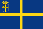 | Oldenzaal | Overijssel | 17 September 1992 | The elements and colours of the flag are taken from the municipal coat of arms, which has been granted to Oldenzaal since 1819. The flag has a dark blue (azure) background with a yellow (or) cross in the foreground. These are the two so-called national colours, which are also used in the national coat of arms of the Netherlands. The upper left corner of the flag shows the municipal coat of arms. This coat of arms depicts the bishop Balderic of Utrecht. According to the stories, this bishop gave the coat of arms to the city of Oldenzaal in the tenth century.[19] |
 | Olst-Wijhe | Overijssel | 1 January 2003 | Olst-Wijhe was first, as the name suggests, divided into the municipalities of Olst and Wijhe. The arms of these municipalities were merged and together now form the new municipal coat of arms of Olst-Wijhe. Like the coat of arms, the flag also features wavy elements. They also recur in the municipal logo. Unlike other municipal flags, the flag is based on the municipal logo rather than the municipal coat of arms. The wavy elements represent Overijssel's largest river, the IJssel. The blue and green colours represent the water and nature the municipality is richly endowed with.[395] |
 | Ommen | Overijssel | 14 August 1956 | The flag consists of a white and yellow field separated by a blue diagonal band. The colours are derived from the municipal coat of arms. The municipal coat of arms features a blue shield depicting Brigid of Kildare in silver, to which the oldest church in Ommen is dedicated. This female figure can be seen on centuries-old seals. Next to the saint are a single-headed eagle, a nine-pointed star and a climbing lion in gold.[396][397][398][399] |
 | Oost Gelre | Gelderland | 19 May 2006 | The flag is based on the municipal logo. The background of the flag is purple. In the foreground is a cut-off butterfly made up of many pictograms. This butterfly, which serves as the municipal logo, depicts the development, independence and beauty of the municipality. The butterfly's wings are made up of 18 different pictograms. These pictograms are a direct translation of the many aspects our municipality can be associated with. All separate elements, which together form one whole; the logo thus symbolises attention to the individual but also to the whole.[400][401] |
 | Oosterhout | North Brabant | 11 September 1956 | The flag is derived from the corresponding municipal coat of arms and, like these, contains a white background with three black crescent moons. This design is derived from the coat of arms of the noble family Van Polanen, a branch of the Wassenaer family. This explains the presence of the crescent moons.[402] |
 | Ooststellingwerf | Friesland | 2 October 1963 | The flag consists of a red field and a white field twice as large. A griffin is incorporated all over the flag, forming a unity with the coloured fields. A griffin is an ancient fable animal and is supposed to represent a cross between a lion and an eagle. All flag elements are derived from the previously created municipal coat of arms, which has been granted to the municipality of Ooststellingwerf since 1818. However, the first appearance of the municipal coat of arms dates back to 1350 when it was used on a seal. |
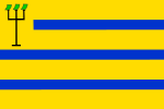 | Oostzaan | North Holland | 22 October 1959 | The flag is based on the municipal coat of arms. The flag has a yellow background and, in the foreground, three narrow blue stripes. In the top left corner, a trident is depicted with a rectangular sward attached to each tooth. Why a trident is depicted on both the flag and coat of arms is unknown. It could be a cabbage, The so-called cheeses are actually cabbages, as a lot of cabbages are grown and eaten in the area. Residents of Oostzaan are also said to have the nickname Kooleters or Koolhanen. It could be a cheese, which during the Eighty Years' War, an Oostzaaner freebooter is said to have strung three cheeses to his grasp instead of a Spaniard during a raid on a Spanish supply ship in Amsterdam. This event would be recorded in the Heerlijkheid's coat of arms. The origin of the colours is also unclear. It is possible that the colours blue and yellow refers to the so-called national colours. The national colours (blue and yellow) are derived from the national coat of arms of the Netherlands.[399][403] |
 | Opmeer | North Holland | 12 March 1981 | The flag is derived from the corresponding municipal coat of arms. The blue and yellow colours come from the flag of the former municipality of Hoogwoud, which merged into Opmeer. The current flag features a climbing lion, which can be found three times on the municipal coat of arms. What is striking is that one of these red lions has been decapitated. This lion refers to the fallen William II of Holland, count of both Zeeland and Holland, in the 13th century.[404][405] |
 | Opsterland | Friesland | 10 April 1963 | The flag is composed of four blocks of equal size in the colours red, white and green. This chequered pattern is derived from the flag of Sânwâlden, a so-called Germanic gau, which Opsterland was part of in the past. The colours of the flag come from the municipal coat of arms, and each has its own meaning. For instance, the red colour stands for the running hare and dog depicted on the coat of arms, the green colour for the five poplar trees and the white areas for the silver background of the coat of arms.[406][407] |
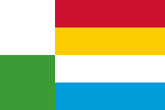 | Oss | North Brabant | 2 January 2003 | The flag was created by combining the municipal flags and arms of three former municipalities (Oss, Ravenstein and Megen, Haren en Macharen). The different colours of the flag are reflected in the former municipal arms. For example, green and white were used in the coat of arms of Oss where green (vert) was used for the background of the coat of arms and white (argent) for the ox depicted on it.[408] |
 | Oude IJsselstreek | Gelderland | 1 January 2005 | This flag is not official. Officially, Oude IJsselstreek does not have its own flag, but it does have an official municipal coat of arms. However, the municipality does use a logo flag in which the municipal logo consisting of text in front of a "pen stroke" appears on a white background. This consisted of green and blue, with blue and green triangles above. The colours are derived from the municipal logo. The exact meaning of this municipal logo is unknown. |
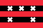 | Ouder-Amstel | North Holland | 14 November 1961 | The flag has red and black stripes with Saint Andrew's crosses in the foreground. The municipal flag and coat of arms are probably derived from the coat of arms of the Persijn family. This also features the Saint Andrew's crosses and colours. The flag is almost similar in design to the flag of Amsterdam and the flag of Amstelveen.[409][399][410][411] |
 | Oudewater | Utrecht | 24 May 1973 | The flag colours are derived from the corresponding municipal coat of arms. The flag of Utrecht bears the same colour combination. This is no coincidence. For Oudewater belonged to Utrecht until the 13th century and, like this city, was then governed by the Lords of Woerden. The flag is red and has two curved white stripes at the top and bottom. These stripes represent the Hollandse IJssel and the name Oudewater. On the hoisting side, a red four-leaf is placed in a white diamond. This four leaf refers to the community between the four city quarters that originally made up Oudewater.[412][413] |
 | Overbetuwe | Gelderland | 29 January 2002 | The flag is derived from the corresponding municipal coat of arms. The flag has a yellow background and features a chequered pattern containing a river-like figure. This figure refers to the flowing water from the municipal coat of arms. On the hoisting side is the Roode Toren, a former castle of the Van Heteren family. Heteren, named after this family, used to form a municipality that has since been absorbed into Overbetuwe.[414] |
 | Papendrecht | South Holland | 30 January 1958 | The flag has a horizontal tricolour of blue, yellow and blue. These three stripes refer to the number of (polder) mills on the municipal coat of arms. These mills were important for the development of the municipality and reclaimed the hinterland. The flag is exactly the same as the flag of Rijswijk.[415][416][417] |
 | Peel en Maas | Limburg | 5 July 2011 | The flag is based on the corresponding municipal coat of arms. The background of the flag consists of a white wavy field with a black stripe at the top and bottom. The white wavy field represents the river Meuse, as in many other Limburgian flags. The black field represents the extracted peat, which used to be an important source of income for the local inhabitants. Five red diamonds have been placed in the white field, forming a diamond cross. This diamond cross-refers to the county of Kessel, which used it as a symbol. The county of Kessel used to be located in what is now Peel and Maas.[418][419][420] |
 | Pekela | Groningen | 22 February 1991 | The flag is based on the corresponding municipal coat of arms. The flag has a wide red vertical stripe on the hoist side. In the centre, the flag has a white field with a black koff and on the other side a narrow blue stripe. The blue colour is used in the municipal coat of arms for the sea and the white colour for the background of the coat of arms. The red colour comes from the old coat of arms of Nieuwe Pekela and colours the church depicted on it.[421] |
 | Pijnacker-Nootdorp | South Holland | 27 April 2002 | The flag is derived from the corresponding municipal coat of arms and contains three stripes in blue and yellow. Below and above are two identical yellow snakes, which are derived from the old municipal coat of arms of Nootdorp. One explanation for these snakes is that they are actually eels, which are common in the area today. However, when the coat of arms was created there were no wetlands in the municipality yet, which does not help the explanation. Another explanation claims that the snakes symbolize caution regarding high water levels. They occurred as a symbol with one of the former water boards (Hoogheemraadschap van Delfland).[422][423] |
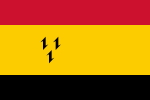 | Purmerend | North Holland | 12 May 1978 | The flag consists of a yellow field with a red upper stripe and black lower stripe. The origin of the flag colours is unclear, but may have been derived from the coat of arms of the County of Holland. The yellow field depicts three black harrows, which can also be found on the municipal coat of arms. These harrows (or barbs) were also present on the coat of arms of Willem Eggert. Willem Eggert was lord of Purmerend in the 15th century and a nobleman and banker by profession.[424][425][426] |
 | Putten | Gelderland | 1976 | This flag is not official. The flag is based on the municipal coat of arms. The flag is divided into four equal blocks in blue and yellow. At the top left, a leaping deer is placed, which is central to the municipal coat of arms and dates from the eighteenth century. What the deer symbolizes is not known. However, it is true that the deer appears in several flags of Gelderland and usually refers to its wooded surroundings.[427][428] |
 | Raalte | Overijssel | 28 February 2002 | The current flag was created after a merger with the village of Heino and therefore has elements of both former municipalities. The flag contains a yellow cross on a black background. Black and yellow are the historical colours of Raalte and can also be seen in the old municipal coat of arms. The ears of corn on the flag symbolize the municipality's agriculture, which has been one of its main livelihoods throughout history. The two trefoils come from the coat of arms of Heino and also symbolize agriculture. |
 | Reimerswaal | Zeeland | 27 July 1971 | The flag is derived from the corresponding municipal coat of arms and has a red background. At the centre of the flag are three wavy stripes in white and blue. Towards the hoist side, these are interrupted by a black bar. A sword can be seen between the stripes. This sword dates from the 15th century and probably comes from the Van Reimerswale or Van Yerseke family coat of arms. The wavy stripes symbolize a canal and refer to shipping over the centuries. |
 | Renkum | Gelderland | 29 March 1928 | The flag is based on the municipal coat of arms. The flag consists of four horizontal stripes in the colours red, white, yellow and blue. All these colours are frequently used in the municipal coat of arms which is composed of four former coats of arms, namely those of Lower Saxony, Guelders, Doorwerth and Bahr.[429] |
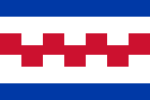 | Renswoude | Utrecht | 30 June 1992 | The flag is derived from the corresponding municipal coat of arms and composed of five stripes. The middle red stripe is embattled and can be seen in duplicate on the municipal coat of arms. Ultimately, the idea of the embattled stripe comes from the family coat of arms of the noble Van Arkel family. In 1345, Renswoude was sold as a so-called manor to John of Arkel, then bishop of Utrecht. Actually, the family coat of arms has always been kept as the coat of arms of Renswoude ever since.[430] |
 | Reusel-De Mierden | North Brabant | 16 February 1998 | The flag of is derived from the corresponding municipal coat of arms. A yellow sheaf of wheat can be seen against the flag's blue background. This sheaf of wheat comes from the coat of arms of the former municipality of Reusel and probably symbolizes agriculture. The upper left corner of the flag shows a sun with clouds. This symbol comes from the coat of arms of the former municipality Hooge en Lage Mierde and is supposed to represent the breaking open of the sky. |
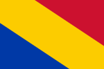 | Rheden | Gelderland | 30 August 1955 | The flag is based on the corresponding municipal coat of arms. The flag consists of three diagonal stripes in red, yellow and blue. These colours are all found on the municipal coat of arms. The blue colour of the flag is used in the coat of arms for a so-called label. This is a distinctive element that makes a son's coat of arms different from his father's.[431] |
 | Rhenen | Utrecht | 20 August 1968 | The flag is derived from the corresponding municipal coat of arms. The two stripes that make up the Rhenen flag are embattled and refer to the fortresses depicted on the coat of arms. On these, the fortresses are red (gules) and the background of the coat of arms is white (argent). These castles date from the 13th century and were already depicted on Rhenen's oldest known city seal at the time.[432] |
 | Ridderkerk | South Holland | 1 February 1957 | The flag has a horizontal bicolour of white at the top and green at the bottom. These colours are derived from the corresponding municipal coat of arms. Here, the green (vert) was used as the background colour of the coat of arms. The white (argent) is used for an image of Saint George killing a dragon from his horse. The flag is identical to the flag of Aalten.[433] |
 | Rijssen-Holten | Overijssel | 1 January 2003 | This flag is not official. Officially, this municipality, created from the two former municipalities Rijssen and Holten, does not yet have a flag, but it does have a municipal coat of arms and logo. The logo is depicted on the unofficial flag. It is possible that the official flag will be based on the new municipal coat of arms. As soon as there is more clarity about this, the flag offered here will be updated. The municipal logo was designed in 2001. The municipal logo consists of a wordmark of sleek Sans-serif letters and a figurative mark of semicircular shapes. The colours of the logo are dark blue and purple, combining cool and businesslike with warm and dynamic.[434] |
 | Rijswijk | South Holland | 30 September 1952 | The flag has a horizontal tricolour of blue, yellow and blue. The flag colours are derived from the corresponding municipal coat of arms, where the blue colour is used for the background of the coat of arms. The yellow colour is reflected as gold in an image of the rice branches. The flag is exactly the same as the flag of Papendrecht. |
 | Roerdalen | Limburg | 16 May 1991 | The flag colours are taken from the corresponding municipal coat of arms. The background of the flag consists of a blue field with two diagonal red stripes. In the foreground is a horizontal white wavy stripe symbolizing the Roer river. This is a tributary to the Meuse, which flows through the municipality of Roerdalen.[435] |
 | Roermond | Limburg | 11 February 2010 | The flag colours are taken from the corresponding municipal coat of arms. The background of the flag is divided into a horizontal white and blue stripe. In the top left corner, a red fleur-de-lis is placed, which is probably derived from the coat of arms of the Van Wachtendonck family and dates from the fourteenth century. In heraldry, the fleur-de-lis stands for purity and virginity.[436][437] |
 | Roosendaal | North Brabant | 26 February 1998 | The flag is derived from the corresponding municipal coat of arms. The background of the flag is divided into two triangles in black and red, with a white diagonal stripe in the middle. The white lane shows three roses, which literally represent the municipality (name). The municipality of Roosendaal carries the same flag as the former municipality of Roosendaal en Nispen. The then municipal council adopted this flag on 3 April 1958.[438][25][439] |
 | Rotterdam | South Holland | 10 February 1949 | The flag has a horizontal tricolour of green, white and green. The green and white colours have been the colours of Rotterdam since the Middle Ages. The two green stripes refer to the Hof van Wena, a now-vanished castle dating from the 14th century. This castle stood to the north of Rotterdam's former city centre. The middle white stripe represents the Rotte, a river in South Holland from which Rotterdam takes its name. In addition to the official flag, a variant of the municipal flag is also widely used, but with the image of the municipal coat of arms on the flag.[440][441][442] |
 | Rozendaal | Gelderland | 28 June 1954 | The flag is based on the corresponding municipal coat of arms. The flag features a dark blue background and a yellow guelder rose in the foreground. This rose probably dates back to the 12th century and appeared on the old coat of arms of Gelderland. The rose was also used by the dukes of Guelders who used to live at Rosendael Castle.[443] |
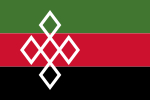 | Rucphen | North Brabant | 28 August 1990 | The flag colours come from the corresponding municipal coat of arms. The background of the flag consists of three horizontal stripes in the colours green, red and black. The hoisting side shows five lozenges that together form a lozenge cross. The lozenge cross symbolizes the unity of the five church villages in the municipality: Rucphen, Schijf, Sint Willebrord, Sprundel and Zegge.[444] |
 | Schagen | North Holland | 4 April 1950 | The flag has a horizontal bicolour of yellow at the top and red at the bottom. The red and yellow colours come from the municipal coat of arms. Red is hereby incorporated as the background colour of the coat of arms and the yellow (gold) is reflected in the depicted rose, ring and fleur-de-lis. The flag is identical to the flag of Culemborg.[445] |
 | Scherpenzeel | Gelderland | 29 March 1979 | The flag is based on the corresponding municipal coat of arms. The flag consists of a blue and white stripe with a large fleur-de-lis on the hoist side. This fleur-de-lis appears in sixfold on the municipal coat of arms and is a common coat of arms element. Traditionally, the fleur-de-lis symbolizes virginity and purity.[446] |
 | Schiedam | South Holland | 23 March 1962 | The flag was adopted on 23 March 1962 by municipal resolution. However, the flag has been used since 1857. The flag is derived from the corresponding municipal coat of arms. The flag is composed of six horizontal stripes in black and yellow. These colours are the colours of Hainaut, a Belgian province. In the coat of arms of Schiedam, the yellow colour is reflected as the background colour of the coat of arms. Black is used for the climbing lion, which represents the lion of Hainaut. The relationship between Schiedam and Hainaut is due to Adelaide of Holland, Count of Hainaut in the 13th century, who also enjoyed power in Holland.[447][448][449] |
 | Schiermonnikoog | Friesland | 19 April 1949 | The municipal council confirmed the use of the current design on 19 April 1949. However, a similar flag has been used by the islanders since the seventeenth century. The flag is composed of seven horizontal stripes with a centred green stripe. The red, white and blue are said to refer to the Dutch flag and the green to Schiermonnikoog itself. This green colour is derived from the municipal coat of arms, on which the depicted ground bears the same colour. This green ground shows a monk against a grey background. The name Schiermonnikoog literally means 'island of the grey monks' and this meaning is in line with the content of the municipal coat of arms.[450][451] |
 | Schouwen-Duiveland | Zeeland | 22 December 2005 | The flag colours are taken from the municipal coat of arms. The flag's middle blue and white stripes are wavy and symbolize the surrounding water. This is because Schouwen-Duiveland forms an island as well as a municipality. The mermaid and man refer to a local legend in which fishermen from the old village of Westerschouwen caught a mermaid. They refused to release the mermaid, after which the merman cursed the village. Westerschouwen subsequently went under.[452][453] |
 | Simpelveld | Limburg | 26 April 1984 | The flag is based on the corresponding municipal coat of arms and consists of three horizontal stripes in blue and white. The upper blue stripe has a white dove on the hoisting side. This dove symbolizes the patron Saint Remigius, bishop of Reims in the fifth century. In the lower blue lane, a scallop shell is depicted at the bottom left. This refers to the apostle James the Great.[454][455] |
 | Sint-Michielsgestel | North Brabant | 26 September 1996 | The flag is derived from the corresponding municipal coat of arms. Like the municipal coat of arms, the flag is also quartered and features a blue and white cross. This flag design symbolizes Michael, a Biblical archangel to which the municipal name also owes.[456][457] |
 | Sittard-Geleen | Limburg | 1 January 2001 | This flag is not official. This municipality was created on 1 January 2001 by a merger between the former municipalities of Born, Sittard and Geleen. Although Sittard and Geleen have their own (city) flag, the municipality of Sittard-Geleen does not yet have an officially adopted flag. However, the municipality does use an official logo. The logo is depicted on the unofficial flag. The background of the flag consists of a yellow-green background with dark blue, light blue and light green rectangles on it. The exact meaning of the municipal logo is not known. |
 | Sliedrecht | South Holland | 11 August 1958 | The flag is derived from the corresponding municipal coat of arms. At the centre of the flag is a black Cross of Burgundy depicted against the yellow background. This Cross of Burgundy comes from the coat of arms of the noble Van Lockhorst family. The Duke of Burgundy also used it on their banners. The Cross of Burgundy consists of two knotty diagonal lines. These lines are also called laurel canes.[458][459] |
 | Sluis | Zeeland | 27 February 2003 | The flag is based on the corresponding municipal coat of arms. On the hoisting side, the flag has a red vertical stripe with two white wavy stripes. These stripes possibly refer to the Zwin. This was a historic estuary that was widely used by ships. The rest of the flag consists of a yellow and white triangle separated by a blue diagonal line. A castle is placed in each of the two triangles. The red castle comes from the coat of arms of Aardenburg. The black castle and the blue line of the coat of arms of Oostburg. Aardenburg and Oostburg are dissolved municipalities that merged into the municipality of Sluis.[460] |
 | Smallingerland | Friesland | 4 March 1964 | The flag has a horizontal bicolour of white at the top and green at the bottom. A red leaping deer is placed in the foreground of the municipal flag. All flag elements are based on the municipal coat of arms, depicting the same deer (but without antlers) against a background with five oak trees. The simplest explanation for the coat of arms would be that the municipality is rich in forest and wildlife. The green colour on the flag thus depicts nature, and the white colour in the grey background of the municipal coat of arms.[461] |
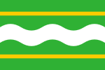 | Soest | Utrecht | 26 January 1962 | The flag is based on the corresponding municipal coat of arms. On the green background of the flag, a white wavy stripe in the foreground, the flag is very similar to the flag of Bunnik. However, the flag is distinguished by two yellow strips. The white wavy stripe is also slightly different and refers to the Eem, a river that flows through the municipality. The yellow strips refer to the golden elements (a plough and a haystack) in the municipal coat of arms. Agriculture has always been one of Soest's main sources of livelihood. Hence, references to it have been included.[462] |
 | Someren | North Brabant | 2 March 1995 | The flag is derived from the corresponding municipal coat of arms and features three horizontal stripes in white, black and yellow. On the hoisting side of the flag are three red mill irons (parts of a millstone). These come from the coat of arms of the former municipalities of Lierop and Peelland and form an old law symbol. The orange climbing Brabantian lion comes from the old Someren coat of arms and represents bravery and courage.[463] |
 | Son en Breugel | North Brabant | 31 March 1977 | The flag is derived from the corresponding municipal coat of arms and uses the so-called national colours. The national colours (blue and yellow) are derived from the national coat of arms of the Netherlands, in which they are also reflected. The flag consists of a yellow background with two blue diamonds. These diamonds represent the two villages of the municipality. The diamond on the hoist side shows a stylised sun. This literally refers to the municipal name and, has always been the symbol of Son en Breugel.[464][465] |
 | Stadskanaal | Groningen | After 1935 | It is unknown when this flag was officially adopted by the municipal council. In any case, this took place after 1935. However, the meaning of the colour palette is known. Thus, all colours refer to Stadskanaal's history. The combination of white-green-white is derived from the municipal flag of Groningen. This is because the city of Groningen played a major role in the creation of Stadskanaal by reclaiming the area's peat soil. The narrow blue stripe on the flag represents water in this regard. The narrow yellow stripes represent the prosperity obtained by mining the peat. The black colour is taken from the municipal coat of arms, which also features the yellow colour.[466][467] |
 | Staphorst | Overijssel | 27 February 1962 | Its design is based on the municipal coat of arms. The flag consists of a blue (azure) field with a yellow (or) stripe at the top and bottom. The hoisting side of the flag depicts three interconnected towers. No official meaning is attached to this image. The towers could stand for the municipality's three church villages (Staphorst, IJhorst and Rouveen), but also for the number of times the Staphorst church has been moved. The so-called national colours have also been used for the flag of Staphorst. These colours (or and azure) can also be seen in the national coat of arms of the Netherlands.[468] |
 | Stede Broec | North Holland | 14 October 1978 | The flag is derived from the corresponding municipal coat of arms. The flag consists of four squares in green and white and contains embattled bisection. These embattled shapes refer to the city rights acquired by Stede Broec in the 14th century. On the hoist side, a white star and a green lime tree are depicted. The star refers to the municipality of Stede Broec and the five points to its five village centres. The lime tree refers to the former administration of justice that took place under such trees. This symbol can be found in many West Frisian municipal coats of arms.[469][470] |
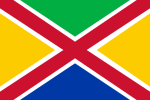 | Steenbergen | North Brabant | 30 October 1997 | The flag colours are taken from the corresponding municipal coat of arms. The outlined red saltire divides the flag into four parts. These colours are green, yellow, and blue. The saltire refers to the Andrew the Apostle, who is said to have been crucified on a similar cross. The blue colour refers to the water in the municipal coat of arms. The yellow colour refers to the background of the coat of arms, and the green colour to the three-headed mountain on this coat of arms.[471] |
 | Steenwijkerland | Overijssel | 18 February 2003 | The flag features the municipal logo and a background divided into two white fields, a light green field and a blue field in the canton. The field colours are all traced to the logo. Several recent municipalities fly a flag with the municipal logo. The exact meaning of the municipal logo is unknown. |
 | Stein | Limburg | 30 January 1970 | The flag colours are taken from the corresponding municipal coat of arms. The background of the flag consists of a yellow and red triangle separated diagonally by a black stripe. This black stripe refers to the black horse in the municipal coat of arms. The yellow colour refers to Martin of Tours sitting on that horse. Martin of Tours is a saint and church patron of Stein. A church patron means that a church is dedicated to that person. The diamond in the top left corner comes from the coat of arms of the Van Elsloo family and is found in sevenfold on the municipal coat of arms.[472] |
 | Stichtse Vecht | Utrecht | 17 December 2013 | The flag is based on the corresponding municipal coat of arms. The white cross placed on the hoist side is derived from the coat of arms of the Sticht Utrecht. The provincial flag of Utrecht shows this same cross. The wavy blue line to the right of this cross represents the river Vecht and serves as a canting symbol for the municipality. The yellow colour comes from the flags of former municipalities Breukelen and Maarssen, both of which merged into the municipality of Stichtse Vecht.[473][474] |
 | Súdwest-Fryslân | Friesland | 1 January 2014 | The background of the flag is white. Prominently present are the stylised capital letters 'SWF': the abbreviation of the municipality's name that serves as its logo. This logo was designed in 2013. Below the logo is the black text 'Gemeente Súdwest-Fryslân'.[475] |
 | Terneuzen | Zeeland | 2 January 2003 | The flag was created by combining the old flags of several disbanded municipalities (Axel, Terneuzen and Sas van Gent). Together, these municipalities now form Terneuzen. The background of the flag consists of nine horizontal stripes, six of which are shortened. The blue stripes symbolize the water present in Terneuzen. The red and white stripes refer to the canal arms that cut through Sas van Gent. The flag also features a white field containing a red climbing lion grasping a key. This key probably refers to the keys to heaven that Saint Peter was handed by Jesus.[476][477] |
 | Terschelling | Friesland | 27 October 1961 | This colourful flag consists of five equal horizontal stripes. It is a common phenomenon on the island of Terschelling and can be seen everywhere there. The colours each have their own symbolism, which are also included in a 1932 rhyme. For instance, red represents red clouds (or red roofs), blue represents the sky, yellow represents the (grain) stalks, green represents the grass and white represents sand. The same colours are included in the older municipal coat of arms, which dates from the 15th century. The flag of Terschelling bears some resemblance to the flag of Schiermonnikoog, although it consists of seven stripes and does not contain a yellow colour.[478][479][480][481][482] |
 | Texel | North Holland | 4 June 1964 | The flag has a horizontal bicolour of green at the top and black at the bottom. The flag dates back to the year 1705. Older versions of the flag also used blue instead of black and featured a red-white-blue hem, a reference to the Dutch flag. The colours black and green can be found all over the island in everyday life. However, the symbolism behind these colours is unclear. The variant flag contains the white tourism logo on the municipal flag. This logo includes the contours of the island of Texel as an abstract oval. A stylised flying seabird can be seen in the word Texel.[483] |
 | Teylingen | South Holland | 9 July 2009 | The flag is derived from the corresponding municipal coat of arms. In terms of design, the flag is very similar to the flag of South Holland and, like the provincial flag, features a red climbing Dutch lion against a yellow background. The Dutch lion is a common heraldic animal and most probably introduced to North Holland by the Vikings. The silver label in the foreground makes the distinction and comes from the village arms of Langerak. A label is a distinguishing element that makes a son's coat of arms different from his father's.[484][485][486] |
 | The Hague | South Holland | 2 December 1920 | The flag was on established on 2 December 1920 by a decision of the municipal government of The Hague. In 1920, it was decided that the flag would consist of two equal stripes of green and yellow. On 28 March 1949 the colours were modified. The order of the colours was reversed and the hue of the green stripe was changed. The current flag has a horizontal bicolour of yellow at the top and green at the bottom. Before 1920, The Hague colours were yellow and black. Black was presumably changed to green because green better symbolizes the peat soil on which The Hague was partly built. For the other part, The Hague was built on sandy soil (yellow). More plausibly, the green colour comes from the municipal coat of arms on which it is reflected in a grass field, on which a stork (The Hague's symbol) is depicted.[487] |
 | Tholen | Zeeland | 4 September 1962 | The background of the flag is yellow and derived from the municipal coat of arms, where yellow (gold) was used as the background colour for the coat of arms. Above and below, the flag features stripes in red-white-blue. Possibly this is a reference to the Dutch flag. Due to municipal redivisions, the flag has been redesignated as the municipal flag of Tholen three times.[488][489] |
 | Tiel | Gelderland | 9 June 1954 | The flag has a horizontal bicolour of yellow at the top and black at the bottom. The yellow and black colours are derived from the corresponding municipal coat of arms. The yellow (or) is thereby reflected in the coat of arms and the lion of Gelderland. The black (sable) is used for a two-headed eagle and the other Gelderlander lion. The flag is identical to the flag of IJsselstein.[490] |
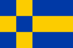 | Tilburg | North Brabant | 2 January 1997 | The flag was created after the merging of the municipalities of Tilburg, Berkel-Enschot and Udenhout. In terms of colours, the flag is derived from the corresponding municipal coat of arms. The colours blue and yellow are the so-called national colours, derived from the Dutch national coat of arms. The blue refers to the background of the shield in the municipal coat of arms. The yellow represents the golden castle depicted on it.[491][492][493][494] |
 | Tubbergen | Overijssel | 25 November 1963 | The flag colours are taken from the corresponding municipal coat of arms, presumably choosing a blue background instead of the black one on the coat of arms for aesthetic reasons. The flag has a blue background with three golden mountains in the foreground. These golden mountains are possibly a so-called "canting arms" and are a literal translation of the name (Tubbergen) in an image. These three mountains can also be seen on the coat of arms of the Sint-Pancratiusbasiliek, which stands in the centre of Tubbergen. Possibly the three mountains stand for Haamberg, Braamberg and Tutenberg.[19] |
 | Twenterand | Overijssel | 1 June 2002 | The flag has a modern look and contains the visual part of the municipal logo. The five blue diamonds represent the five largest villages: Geerdijk, Den Ham, Vriezenveen, Vroomshoop and Westerhaar-Vriezenveensewijk; the green area for the rural in the municipality.[495][496] |
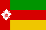 | Tynaarlo | Drenthe | 21 September 1999 | Tynaarlo arose from the former municipalities of Zuidlaren, Eelde and Vries. The flag is therefore also an amalgamation of the flags of these old municipalities. The flag is divided into a vertical stripe on the hoist side, with three equal horizontal stripes against it. The vertical red stripe features a dogwood flower. This dogwood flower can also be seen on the municipal coat of arms and refers to the village of Vries, which also used it in the old municipal flag.[497] |
 | Tytsjerksteradiel | Friesland | 22 November 1984 | The flag consists of four red and four white triangular squares, which together are gyronny. Gyron, in the case of this flag, means triangles of equal size rotated around a centred point. The white triangles feature an oak leaf. This is derived from the trees seen on the municipal coat of arms. The so-called post or hunting horn of Burgum is placed centrally on the flag and also derived from the municipal coat of arms. This horn appeared several times on the coat of arms of some noble families. |
 | Uitgeest | North Holland | 26 September 1974 | The flag shows the municipal coat of arms in the top left, containing an image of four climbing lions. The colour palette (black-white-red) of the horizontal flag bands are derived from this. The design of the municipal coat of arms may have been derived from the coat of arms of John of Beaumont. This man was temporary regent of Holland and Zeeland during the fourteenth century. In doing so, he possibly also owned Uitgeest.[498] |
 | Uithoorn | North Holland | 5 April 1963 | The flag is derived from the municipal coat of arms. The municipal coat of arms is a canting one: the coat of arms, which dates from 1815, literally depicts the name of the municipality to which it is linked. Thus, it depicts a large music horn from which a bust of a child protrudes. |
 | Urk | Flevoland | 9 April 1965 | The flag is derived from the corresponding municipal coat of arms and contains the colours of the Dutch flag. Indeed, it used to be common practice in shipping to add the Dutch flag colours to the top and bottom of the flag. In the foreground, in the middle of the flag, a white haddock is placed. This unmistakably refers to the connection between the fishing community and the sea.[499][500] |
 | Utrecht | Utrecht | 5 July 1990 | The current design was officially adopted by the municipal council on 5 July 1990. However, the history of the flag goes back much further, to before the sixteenth century when Utrecht still had its own local militia (schutterij). This militia consisted of two divisions. One section carried a white triangular pennant and the other a red triangular pennant. Together, these pennants form the flag design. The flag was ultimately derived from the corresponding municipal coat of arms.[501][502][503][504] |
 | Utrechtse Heuvelrug | Utrecht | 27 April 2007 | The flag is derived from the corresponding municipal coat of arms. In the foreground of the flag is a yellow cross placed against a red background. This yellow cross-refers to three golden elements from the municipal coat of arms, namely a fleur-de-lis, column and wheel. At the top left, a white climbing lion is depicted in a black field. This is originally from the coat of arms of the Van Gaesbeek family, which once enjoyed power in Utrecht.[505][506] |
 | Vaals | Limburg | 11 March 1963 | The flag is derived from the corresponding municipal coat of arms. The background of the flag contains a white field with a narrow red strip at the top and bottom. Central in the background is a Limburgian red climbing lion. This lion comes from the coat of arms of Herzogenrath, a town in Germany that used to be under the same administration as Vaals.[507][508] |
 | Valkenburg aan de Geul | Limburg | 15 February 2016 | The flag colours are taken from the corresponding municipal coat of arms. The background of the flag is yellow and symbolizes the stone type marl. This is mined underground and widely used in construction. The blue line in the middle represents the river Geul, which flows through the municipality. The red climbing lion in the foreground is the red lion of the Lords of Valkenburg and, together with a second lion, forms the supporter of the municipal coat of arms.[509][510] |
 | Valkenswaard | North Brabant | 23 April 1959 | The flag has a horizontal bicolour of blue at the top and yellow at the bottom. This makes the flag identical to the Ukrainian flag. Both colours form the so-called national colours and are derived from the municipal coat of arms. The blue colour refers to the blue shield, and the yellow colour to Saint Nicholas. This is depicted on the shield with a crozier.[511] |
 | Veendam | Groningen | 24 May 1955 | The flag has a horizontal tricolour of blue, white and blue. The white stripe depicts the coat of arms of Veendam. This coat of arms has belonged to the municipality since 1872 and is said to be based on a Bible story. Some of the elements depicted have symbolic value. For example, the viper is said to represent the snake from the biblical story of Adam and Eve. The olive branch could be associated with virtue or peace, and the fleur-de-lis with spiritual purity. The blue colour of the municipal flag is derived from the background colour of the coat of arms and the white of the cloud depicted on it.[512][513] |
 | Veenendaal | Utrecht | 8 May 1980 | In terms of colours, the flag is derived from the corresponding municipal coat of arms. The colours symbolize various things that contributed to the formation of Veenendaal. For instance, the black stripes represent the former peat cutting fields and peat soil. The yellow lanes represent the villages of Stichts and Gelders Veenendaal and also stand for Veenendaal's prosperity. The middle blue lane symbolizes the Grift, a historic canal in the municipality.[514][515][516] |
 | Veere | Zeeland | 1 January 1997 | The flag was never officially adopted. The flag displays the municipal logo. The logo is shown against a white background, and it symbolizes the characteristics of the municipality and the organization. Blue symbolizes the water. Green represents the (agricultural) land and yellow represents the beach, dunes and light. Blue and yellow are the basic colours and blend into each other, creating green. This symbolizes the cohesion and diversity of the municipality. The poles are characteristic of the Walcheren coast and are therefore also internationally recognizable. They symbolize the thirteen residential centres. The shape of the curved line represents the coastline, but also (figuratively) the open, businesslike and caring municipality. The line runs out of the frame to indicate the hospitality of this municipality.[517] |
 | Veldhoven | North Brabant | 13 September 1988 | The flag features the corresponding municipal coat of arms. The top and bottom of the flag show a red and white chequered stripe. The squares are derived from the flag of North Brabant. The background of the flag is blue and contains the municipal coat of arms. This municipal coat of arms shows four red diamonds, symbolizing the four old villages within the municipality. Two Brabantian and two Limburgian lions can also be seen.[518][519][520] |
 | Velsen | North Holland | 28 January 1958 | The flag has a horizontal bicolour of blue at the top and yellow at the bottom. In the top left corner is the municipal coat of arms. This coat of arms depicts a lamb representing the Lamb of God, an Old Christian symbol for the sacrifice of Jesus for the sin of mankind. The lamb is holding a banner, which has varied in design over time. Little is known about the origin of the coat of arms.[521] |
 | Venlo | Limburg | 24 November 2010 | The flag is derived from the corresponding municipal coat of arms. The background of the flag consists of a horizontal red and blue stripe. On the hoisting side, a half yellow lion of Guelders is placed, referring to the former Duchy of Guelders to which Venlo belonged. The anchor in the lower blue field refers to shipping. Venlo was a member of the Hanseatic League. This was a collaboration between various trading cities in Northeastern Europe.[522][523][524][525] |
 | Venray | Limburg | 25 June 1979 | The flag is derived from the corresponding municipal coat of arms. The background of the flag consists of four squares in white and blue. Where the squares meet, two crossed keys are placed in black and white. These represent the keys to heaven, which are attributes of Saint Peter. Saint Peter was given these by Jesus. Below the keys is a stylised beehive. This refers to past beekeeping, which was very important to the congregation. A two-coloured escutcheon can be seen at the top, which refers to the inescutcheon on the municipal coat of arms.[526][527] |
 | Vijfheerenlanden | Utrecht | 1 January 2019 | The flag has a white background and features the municipal logo. This consists of a three colours: gold, red and blue. These colours are each derived from one of the former municipal flags of the municipalities that made up Vijfheerenlanden. Gold comes from the municipal flag of Zederik, red from the flag of Leerdam and blue from the flag of Vianen. The graphics on the hoist side of the flag represent the letters V, H and L, an abbreviation of the name Vijfheerenlanden. It is unclear whether the flag has been officially adopted.[528][529] |
 | Vlaardingen | South Holland | 1 July 1971 | The flag has a horizontal tricolour of red, yellow and blue. The colours are derived from the municipal coat of arms. On this coat of arms, the coat of arms is yellow (or), and the Dutch lion depicted on it is red (gules). The blue colour has been removed from the municipal coat of arms, but was previously present in the tongue and nails of the lion.[530][531][532][533] |
 | Vlieland | Friesland | 29 July 1938 | The flag has a horizontal bicolour of sea green at the top and white at the bottom. The design for the current flag dates back to the 16th century, when it was used as a flag. The green and white come from the coat of arms of the former West-Vlieland and the remaining Oost-Vlieland. Like the flag of Terschelling, the flag of Vlieland also has a rhyme attached to it in which the symbolism of the colours emerges. For instance, the green colour stands for the marram grass and the white for the sand, two common natural elements on the Frisian Islands.[534][535] |
 | Vlissingen | Zeeland | 31 August 1973 | The flag was not formally adopted by the Municipality of Vlissingen until a decision on 31 August 1973. However, the flag is much older, dating back to the 17th century when it already appeared in paintings. The flag is based on the corresponding municipal coat of arms and has a red background. In the centre of the flag is a white jacoba's jug with yellow decoration. A jacoba's jug is a drinking jug made by potters in the late Middle Ages and named after Jacqueline. Jacqueline was countess of Holland, Zeeland and Hainaut in the 15th century.[536][537][538] |
 | Voerendaal | Limburg | 20 February 1995 | The flag is a so-called canting flag. This means that the flag design symbolizes the municipal name. For instance, the name Voerendaal is said to refer to the ford in a stream. The flag shows two blue wavy stripes representing two streams flowing through a valley. The fleur-de-lis, taken from the coat of arms of Klimmen, are placed between the two brooks. The flag is not based on the corresponding municipal coat of arms.[539] |
 | Voorne aan Zee | South Holland | 21 December 2023 | The flag is based on the corresponding municipal coat of arms. In the background, the municipal flag consists of a blue and green horizontal stripe separated by a yellow wavy stripe. Blue symbolizes the sea, emphasizing the municipality's geographical location. The green colour refers to the mainland and the yellow to the dunes. The wavy lane also represents the sea. The canton in the top left shows a red field containing a yellow lion on a white tower. This image represents the coat of arms of Oostvoorne, a village within the municipality. The tower represents the Burcht of Voorne a so-called motte castle in Oostvoorne. The lion is a historical symbol for the island of Voorne.[540][541][542][543] |
 | Voorschoten | South Holland | Unknown | The flag was never officially adopted. The flag is based on the corresponding municipal coat of arms. Both the flag and coat of arms feature a yellow background with three black half-moons (crescent moons) in the foreground. This design is based on the coat of arms of the noble Van Duivenvoorde family, which inhabited a castle of the same name. The Van Duivenvoorde family produced the lords of Voorschoten. |
 | Voorst | Gelderland | 1962 | The flag is based on the corresponding municipal coat of arms. The flag has a yellow background with three red arrow elements (chevrons) in the foreground. These chevrons are an exact copy of those in the coat of arms, but only rotated a quarter turn. The municipal coat of arms is very old and probably dates from the 14th century. |
 | Vught | North Brabant | 14 October 2010 | The flag is derived from the corresponding municipal coat of arms. The background of the flag consists of a dark blue and yellow stripe. Two emblems from the municipal coat of arms are placed in the foreground: a yellow climbing Brabantian lion and a red key. In this case, the lion symbolizes the provincial authority of North Brabant and the key, the local authority of the councillors.[544] |
 | Waadhoeke | Friesland | 1 January 2018 | The flag is composed of the three most common colours of the flags of the former municipalities that made up Waadhoeke and, like the coat of arms, shows the geographical location of the municipality. The mudflats on the top left; a blue wavy "corner", followed by the colours yellow (the dyke, part of the "golden hoop") and green for the land behind. In this way, the flag reflects the name and the diagonal line refers to those in the coat of arms and flag of Westergoa.[545] |
 | Waalre | North Brabant | 20 March 1963 | The flag is derived from the corresponding municipal coat of arms and consists of three stripes in blue, yellow and red. In the top left corner, a yellow acorn is placed, which refers to the historical ties with the Van der Clusen family. This family owned the municipality of Waalre and Aalst for almost 200 years. At the time, these formed a so-called heerlijkheid. A heerlijkheid is a former form of government in which lords held the power. |
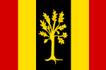 | Waalwijk | North Brabant | 28 September 1989 | The flag is derived from the corresponding municipal coat of arms. The background of the flag consists of five vertical stripes. The middle stripe is in the Brabantian coat of arms colours of yellow and black. The four narrower strips are red and yellow; these are the coat of arms of Holland. The vertical strips correspond to the earlier division of the landscape into straight strips. The black stripe features a young oak tree, which is also the supporter in the municipal coat of arms. |
 | Waddinxveen | South Holland | 10 May 1973 | The flag is based on the corresponding municipal coat of arms and is square. Central to the flag are two black crossed keys with a horizontal crossbar against a yellow background. The keys probably refer to the keys of heaven given to Saint Peter by Jesus. This is substantiated by the fact that the Petruskerk was founded in Waddinxveen in the 14th century. The flag of Leiden and the flag of Leiderdorp also include the crossed keys.[546] |
 | Wageningen | Gelderland | 10 November 1954 | The flag is based on the corresponding municipal coat of arms. The flag consists of a horizontal red and white stripe with an image of a wagon wheel in the upper left corner. This wagon wheel is central to the municipal coat of arms, dates from the 15th century, and is a literal representation of the municipal name. The wheel contains 12 spokes, the top one of which represents a cross.[547][548] |
 | Wassenaar | South Holland | 6 November 1962 | The flag is derived from the corresponding municipal coat of arms. Three half-white moons are placed against the flag's blue background. These are known as crescent moons and are included in sixfold on the municipal coat of arms. Van Wassenaer is also the oldest noble family in Holland and still exists today. Possibly, the family name is derived from the half crescent moons. These are said to have come to the family thanks to a captured Arab banner during the Crusades.[549][550] |
 | Waterland | North Holland | Unknown | The flag was never officially adopted. Waterland also has a historical flag, but it is very different from the current design. On the contemporary flag, the background consists of a colour gradient between blue and white. Centrally depicted is a blue uppercase letter W floating above a reflecting water surface. In this water, the W can be seen mirrored as a white serif letter. The flag literally depicts the municipal name. |
 | Weert | Limburg | 26 June 1980 | The flag is derived from the corresponding municipal coat of arms. The background of the flag consists of three horizontal stripes in white and blue. On the hoisting side, the flag shows a vertical yellow stripe containing three red horns. These horns appeared in the coat of arms of the noble Horne family, which ruled Weert for almost 500 years when it was still a heerlijkheid. A heerlijkheid is a form of government in which so-called lords hold power.[551] |
 | West Betuwe | Gelderland | 17 December 2024 | The flag is derived from the corresponding municipal coat of arms, and it was designed to mark the municipality's fifth anniversary. The municipal flag consists of three horizontal parts: each lane shows recognizable parts from the municipal coat of arms. The top part, horizontally divided in blue-white-blue, refers to the blue 'pales vair'. In heraldry, this is a well-known element. The central part, three white and two red embattled lanes, refers to the noble Van Arkel family. These embattlements also recur in arms of previous municipalities. The bottom part, horizontally divided red-yellow-red, refers to the golden discs. They are included in the flag in greatly simplified form. In the canton, The top-left corner, a yellow rectangle with a black gate symbolizes the city rights of Asperen and Heukelum and the many castles in the municipality used to count.[552][553][554][555][556] |
 | West Maas en Waal | Gelderland | 30 May 1985 | The flag is based on the corresponding municipal coat of arms. The background of the flag shows two blue wavy stripes, referring to the two rivers the municipality is named after, the Meuse and the Waal. In the foreground is a vertical yellow stripe containing a two-headed eagle. This eagle comes from the coat of arms of the former municipality of Maasbommel and is a commonly used heraldic animal.[557] |
 | Westerkwartier | Groningen | 1 January 2019 | Westerkwartier is a recently created municipality and a merger of the municipalities of Grootegast, Leek, Marum, Winsum (partly) and Zuidhorn. The flag features the municipal logo and shows arrow elements in the background pointing in a westerly direction. The municipal logo contains three arrows meant to represent three abstract W's. The colours blue, grey and green refer to characteristic elements of the municipality. The blue symbolizes the water, the grey the villages and the green refers to the municipality's meadows and forests.[558][559] |
 | Westerveld | Drenthe | 28 May 2019 | The flag is composed of five horizontal stripes and derived from the previously designed municipal coat of arms. The green colour of the flag symbolizes the agricultural sector. The yellow stands for the Drents-Friese Wold National Park. The blue colour comes from Dwingelderveld National Park and the black stands for the former peat extraction in the area. Previously, it used a white flag with the municipal logo on it.[560][561][562][563] |
 | Westervoort | Gelderland | 11 October 1976 | The flag is based on the corresponding municipal coat of arms and consists of four blocks in black and white. In the foreground of the flag, a white triangle is placed across the entire width, which is framed by a blue border with a wavy yellow line. The black and white refer to the Land van den Bergh, the former owner of Westervoort.[564][565] |
 | Westerwolde | Groningen | 4 March 2020 | The flag is derived from the corresponding municipal coat of arms. This new design replaces the former unofficial flag with municipal logo on it. The flag is quartered and consists of two yellow and two blue squares. The yellow colour returns as the background colour in the corresponding municipal coat of arms. Blue is used in it for the silhouette of a monastery. A sheaf of wheat can be seen at the top left of the flag. This is an ancient element dating back to the 14th century. The sheaf of wheat symbolizes the agricultural sector within the municipality.[566][567][568] |
 | Westland | South Holland | 22 March 2005 | The flag is derived from the corresponding municipal coat of arms and composed of a white and green zigzag pattern. This same pattern is prominently featured on the regional flag of Westland. The stripes of the regional flag of Westland are serrated to form a stylised representation of the many greenhouses present in the municipality. In doing so, the green colour represents the greenhouse plants and the white represents the greenhouses themselves. The five corners on the white strip represent the five former municipalities merged in the municipal redivision. The red lion is from the coat of arms of Naaldwijk.[569][570][571] |
 | Weststellingwerf | Friesland | 7 October 1963 | The flag contains a red and white colour and a griffin. This is a fabulous animal, representing a cross between a lion and an eagle. The flags of Ooststellingwerf and Weststellingwerf show many similarities because these two municipalities once formed one area called Stellingwerven. The flag is based on the municipal coat of arms that dates back to the 14th century and has been officially recognized since 1818. Possibly, the red and white colours of the coat of arms and the flag are so determined because of the historical ties with Utrecht, which the same is reflected in both the municipal and provincial flag.[572][573] |
 | Wierden | Overijssel | 11 December 1979 | The flag contains a blue Nordic cross against a white background. This makes the flag very similar to the Finnish flag and Swedish flag. The hoist side of the flag features a yellow ear of corn and a weaver's spool. These elements are also found in the older municipal coat of arms and represent farming and home weaving. These two forms of work used to be the main sources of livelihood for Wierden municipality.[574][19] |
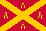 | Wijchen | Gelderland | 12 January 1984 | The flag is based on the corresponding municipal coat of arms. The flag is red and features a gold-coloured saltire in the foreground. The saltire divides the background into quarters. In each quarter, an inverted, so-called dry shear is placed. These scissors were formerly used in making sheets. The flag is identical to the flag of Batenburg, which has belonged to the municipality of Wijchen since the 1984 municipal redivision. |
 | Wijdemeren | North Holland | 4 October 2003 | The flag shows the municipal logo. However, the logo shown on the flag differs slightly in colour from the stand-alone logo: the colours are slightly darker. In addition, the flag has the logo with its three lily pads placed on a white centred lily pad which slopes down on both sides of the flag. The municipal logo was inspired by the landscape of Wijdemeren and the Loosdrechtse Plassen. Blue was used to write the municipal name. The designer chose a green painter's palette to symbolize the leaves of a water lily, with a wink to the French impressionist Claude Monet. There are three pallets for each of the former municipalities.[575] |
 | Wijk bij Duurstede | Utrecht | 27 April 1971 | The flag is derived from the corresponding municipal coat of arms. The upper red stripe of the flag depicts three white pillars, derived from the coat of arms of the noble Van Zuylen van Nijevelt family. This family played a role in the national government of the Netherlands and enjoyed power in the province of Utrecht. The bottom yellow stripe is incorporated into the shield of the municipal coat of arms as a golden background colour. |
 | Winterswijk | Gelderland | 29 July 1954 | The flag consists of four equal blocks. The colours of these blocks come from the municipal coat of arms. In this, blue is used as the background colour of the coat of arms, white (silver) for the leaping greyhound depicted on it and yellow for the collar and crown.[576] |
 | Woensdrecht | North Brabant | 14 November 1963 | The flag colours are derived from the corresponding municipal coat of arms. Only the blue colour is not derived from the municipal coat of arms. Green symbolizes the low-lying polder soil, yellow the high-lying sandy soil. The three blue strips represent the Eastern and the Western Scheldt and the previously existing open passage through the Kreekrakdam, to which Woensdrecht owes its origins. |
 | Woerden | Utrecht | 23 February 2017 | The flag is derived from the corresponding municipal coat of arms. Against the flag's yellow background, a blue and white chequered stripe can be seen in the centre. The origin of this stripe is a reference to the dukes of Bavaria. Albert I gave city rights to Woerden in 1372. Placed in the top left corner are three Saint Andrew's crosses, derived from the coat of arms of former Kamerik municipality and the family coat of arms of the noble Van Strijen family. The Saint Andrew's cross is a symbol that has been frequently used on flags (e.g. also on the Scottish flag). At the bottom is a post horn, which comes from the flag of Zegveld. The three diamonds come from the flag of Harmelen. Zegveld and Harmelen are both former municipalities that merged into the municipality of Woerden.[577][578][579][580] |
 | Wormerland | North Holland | Unknown | The design of the flag is based on the municipal coat of arms. The flag is blue and has a spoonbill depicted in the foreground. The coat of arms is derived from the coat of arms of Jisp, a former municipality that merged into Wormerland municipality in 1991. The spoonbill dates back to 1570 and possibly symbolizes the wetland area that makes up the municipality of Wormerland. |
 | Woudenberg | Utrecht | 27 June 1957 | The colours of the flag are derived from the corresponding municipal coat of arms. Against the flag's yellow background is a black bar containing a centred red narrower bar. The yellow (gold) is reflected as the background colour of the shield of the municipal coat of arms. The black colour has been used for the cocks depicted on it. The red colour has been used for the cock's crest and wattles.[581] |
 | Zaanstad | North Holland | 25 November 1974 | The flag is very similar to the Dutch flag, but features a shortened Greek cross on the hoisting side. This cross has two white and two red arms and is taken from the coat of arms of Zaanden. Zaanden was a noble family and a heerlijkheid which used the Zaanstad flag on its ships as early as the seventeenth century.[582] |
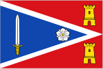 | Zaltbommel | Gelderland | 14 November 2002 | The flag was created after the merger of the former municipalities Kerkwijk and Brakel with Zaltbommel, and forms a combination of the old municipal flags. The flag has a red background and a white framed triangle in the foreground. A sword and a medlar flower (or guelder rose) are placed in this triangle. Two citadels are placed in the red field. These two citadels represent the two former municipalities of Kerkwijk and Brakel.[583][584] |
 | Zandvoort | North Holland | 18 October 1949 | The flag has a horizontal bicolour of yellow at the top and blue at the bottom. This makes the flag very similar to the Ukrainian flag and the flag of Bodegraven-Reeuwijk. Three golden fish are placed on the blue coat of arms of Zandvoort. Because the fish are more important than the shield, the yellow stripe on the flag is placed above the blue stripe. Zandvoort uses the so-called national colours (or and azure) which also appear on the national coat of arms of the Netherlands. The variant flag features the municipal coat of arms situated in the middle of the municipal flag.[585][586] |
 | Zeewolde | Flevoland | 16 August 1984 | In terms of colours, the flag is derived from the municipal coat of arms. The flag consists of a blue background with three widening stripes in green and yellow from the top left corner. The yellow symbolizes the grain on the fields and beaches along the border lakes; the green the meadows and forests; the blue the sea, from which Zeewolde was reclaimed. The diagonally widening stripes suggest a dynamic movement, stretching to characterize the community of Zeewolde.[587] |
 | Zeist | Utrecht | 24 May 1971 | The flag is based on the corresponding municipal coat of arms. At the top of the flag, a embattled black stripe is placed against a white background. This design is derived from the coat of arms of the noble Van Zeist family, which dates back to the twelfth century. At the time, the Van Zeist family enjoyed power in Zeist and the surrounding area.[588] |
 | Zevenaar | Gelderland | 27 April 1959 | The flag is derived from its coat of arms. The flag has a horizontal tricolour of red, yellow and red. Centred on the yellow stripe is the blackletter capital letter Z. On the municipal coat of arms, this Z is placed on a special inescutcheon. The Z dates from 1515 and undoubtedly stands for the name Zevenaar.[589][590][591] |
 | Zoetermeer | South Holland | 16 April 1991 | The flag is derived from the corresponding municipal coat of arms. The crest of the municipal coat of arms is also placed in the top left corner of the flag. On the right side, a large stylised lake flower (water lily) is placed, derived from the municipal logo. This water lily is derived from the water lilies of the municipal coat of arms, which date from the eighteenth century. A water lily was chosen because these were common in Zoetermeer in earlier times.[592][593][594][595] |
 | Zoeterwoude | South Holland | 1968 | The flag is based on the corresponding municipal coat of arms and has a dark blue background. In the foreground of the municipal flag are three yellow cloverleafs. These possibly represent the three woods from the earlier days when so-called lords still governed Zoeterwoude. The clover leaves could also represent corrupted violins, taken from the coat of arms of the Van Zwieten family. As lords, the Van Zwieten family ruled Zoeterwoude for a long time.[596] |
 | Zuidplas | South Holland | 1 January 2010 | This is probably a flag that is not officially established, but merely represents the municipal organization. The flag contains the municipal logo on a white background. On a less used version of the logo flag, two angled lines in red and blue have been added, along the hoist side and below the logo. On the left side, the red vignette of the municipality is placed. This vignette consists of three equal squares that represent the three former municipalities from which Zuidplas emerged. The fourth square contains two wavy lines and represents the water as a connecting factor between the former municipalities. The vignette was created by taking inspiration from historical municipal maps and the structure of the landscape in the municipality, which contains many avenues and ribbons.[597] |
 | Zundert | North Brabant | 8 June 1999 | The flag is derived from the corresponding municipal coat of arms. The base of the flag is divided into a red and white stripe, with a green triangle on the hoist side. A fleur-de-lis is placed in this triangle. This fleur-de-lis symbolizes purity and innocence and is a commonly used flag and coat of arms element. The white stripe represents the new municipality of Zundert, the red one the former municipality of Rijsbergen. The white fleur-de-lis should represent the red one from the municipal coat of arms.[598][599][25] |
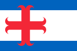 | Zutphen | Gelderland | 25 November 1974 | The flag is based on the corresponding municipal coat of arms. The flag features two blue stripes and a centred white stripe. A red cross moline is placed on the hoist side. This cross moline was a symbol for a Hanseatic city. Such a Hanseatic city belonged to the Hanseatic League, a former alliance between various European trading cities, including Zutphen.[600][601] |
 | Zwartewaterland | Overijssel | 1 January 2001 | The flag is based on the corresponding municipal coat of arms and divided into a yellow and blue field. These are separated by a red and white pattern. This pattern comes from the flag of the now defunct municipality of Zwartsluis. According to a legend, this pattern originated when two officers were so engrossed in a game of chess that it caused a defensive structure to be overpowered by surprise. The colours blue and yellow are taken from the flags and arms of the former municipalities of Genemuiden and Hasselt. Both Zwartsluis, Genemuiden and Hasselt merged into the municipality of Zwartewaterland in 2001. The municipal flag served as the basis for the municipal logo.[602] |
 | Zwijndrecht | South Holland | 28 July 1938 | The flag has a horizontal tricolour of yellow, black and yellow. In the centre foreground, the municipal coat of arms is placed, on which three trammel hooks can be seen. These trammel hooks were probably taken from the Van Swijndrecht family coat of arms. They are a kind of steel pokers that people used for the fireplace.[603] |
 | Zwolle | Overijssel | 28 May 1962 | The flag includes a white cross on a blue background. Both are the colours of Michael, a popular saint (and archangel) to whom a parish church in Zwolle was dedicated in the 11th century. Michael could be seen on ancient seals from the Middle Ages. Together with Saint George, he was seen as a defender of good against evil. The flag is based on the municipal coat of arms.[604][605][606] |
| Flag | Municipality | Adoption | Description |
|---|---|---|---|
 | Bonaire | 11 December 1981 | The flag has a large dark blue band in the lower right corner and a smaller yellow band in the upper left corner. The dark blue and yellow bands represent the sea and sun respectively, while the dividing white strip represents the sky. The yellow band was formerly red as a reference to the Dutch flag, but was changed at some point to avoid having two separated sections of red (from the star). The coloured bands are separated by a white strip, inside which is a black compass and a red six-pointed star. The black compass represents the population of Bonaire as a seafaring people, while the arrows adjusting it symbolises equality in the four cardinal directions of the compass. The red six-pointed star represents the original six villages of Bonaire: Antriol, Nikiboko, Nort Saliña, Playa, Rincon and Tera Korá.[607][608] |
 | Saba | 6 December 1985 | The flag has two equal red triangles at the top and two equal blue triangles at the bottom, with a white diamond with yellow star in the middle. This colour was chosen to symbolise the island's wealth and hope for a good future. The star represents the island; the colours red, white and blue symbolise the link with the Netherlands. Red also symbolises courage, unity and strength; white peace and blue the sea. The flag was designed by an 18-year-old Saban named Edmond Daniel Johnson.[609] |
 | Sint Eustatius | 29 July 2004 | The flag is rectangular with the colours blue, red, white, gold and green, and divided in four five-sided blue polygons, each fimbriated red. In its centre is a diamond-form white field; in the diamond is the silhouette of the island in green. In the centre in the top of the diamond is a five-pointed golden/yellow star. The colours of the flag each have their own meaning. The gold star represents unity, the four blue polygons represent the ocean that surrounds St. Eustasius, the Green shows the Quill, the red represents the Delonix regia, a flamboyant tree which was used by slaves to celebrate Emancipation Day, the white diamond in the centre represents a once diamond water fall which is referred to in the national anthem, "Golden Rock". The flag was designed by Zuwena Suares.[610][611][612] |
Seamless Wikipedia browsing. On steroids.
Every time you click a link to Wikipedia, Wiktionary or Wikiquote in your browser's search results, it will show the modern Wikiwand interface.
Wikiwand extension is a five stars, simple, with minimum permission required to keep your browsing private, safe and transparent.