Top Qs
Timeline
Chat
Perspective
Serif
Decorative detail in typography From Wikipedia, the free encyclopedia
Remove ads
In typography, a serif (/ˈsɛrɪf/) is a small line or stroke regularly attached to the end of a larger stroke in a letter or symbol within a particular font or family of fonts. A typeface or "font family" making use of serifs is called a serif typeface (or serifed typeface), and a typeface that does not include them is sans-serif. Some typography sources refer to sans-serif typefaces as "grotesque" (in German, grotesk) or "Gothic"[1] (although this often refers to blackletter type as well). In German usage, the term Antiqua is used more broadly for serif types.
| Sans-serif font | |
 |
Serif font |
 |
Serif font (red serifs) |
Serif typefaces can be broadly classified into one of four subgroups: Old-style, Transitional, Didone, and Slab serif, in order of first emergence.
Remove ads
Origins and etymology
Summarize
Perspective
Serifs originated from the first official Greek writings on stone and in Latin alphabet with inscriptional lettering—words carved into stone in Roman antiquity. The explanation proposed by Father Edward Catich in his 1968 book The Origin of the Serif is now broadly but not universally accepted: the Roman letter outlines were first painted onto stone, and the stone carvers followed the brush marks, which flared at stroke ends and corners, creating serifs. Another theory is that serifs were devised to neaten the ends of lines as they were chiselled into stone.[2][3][4]
The origin of the word 'serif' is obscure, but apparently is almost as recent as the type style. The book The British Standard of the Capital Letters Contained in the Roman Alphabet, Forming a Complete Code of Systematic Rules for a Mathematical Construction and Accurate Formation of the Same, with Letters of Exemplification, Elementary and Compleat: Together with an Useful and Practical Appendix by William Hollins (1813), defined 'surripses', usually pronounced "surriphs", as "projections which appear at the tops and bottoms of some letters, the O and Q excepted, at the beginning or end, and sometimes at each, of all". The standard also proposed that 'surripsis' may be a Greek word derived from σῠν- ('syn-', "together") and ῥῖψῐς ('rhîpsis', "projection").
In 1827, Greek scholar Julian Hibbert printed with his own experimental uncial Greek types, remarking that the types of Giambattista Bodoni's Callimachus were "ornamented (or rather disfigured) by additions of what [he] believe[s] type-founders call syrifs or cerefs". The printer Thomas Curson Hansard referred to them as "ceriphs" in 1825.[5] The oldest citations in the Oxford English Dictionary (OED) are 1830 for 'serif' and 1841 for 'sans serif'. The OED speculates that 'serif' was a back-formation from 'sanserif'.
Webster's Third New International Dictionary traces 'serif' to the Dutch noun schreef, meaning "line, stroke of the pen", related to the verb schrappen, "to delete, strike through" ('schreef' now also means "serif" in Dutch). Yet, schreef is the past tense of schrijven (to write). The relation between schreef and schrappen is documented by Van Veen and Van der Sijs.[6] In her book Chronologisch Woordenboek,[7] Van der Sijs lists words by first known publication in the language area that is the Netherlands today:
- schrijven, 1100;
- schreef, 1350;
- schrappen, 1406 (i.e. schreef is from schrijven (to write), not from schrappen (to scratch, eliminate by strike-through)).
The OED's earliest citation for "grotesque" in this sense is 1875, giving 'stone-letter' as a synonym. It would seem to mean "out of the ordinary" in this usage, as in art 'grotesque' usually means "elaborately decorated". Other synonyms include "Doric" and "Gothic", commonly used for Japanese Gothic typefaces.[8]
Remove ads
Classification
Summarize
Perspective
Old-style

Old-style typefaces date back to 1465, shortly after Johannes Gutenberg's adoption of the movable type printing press. Early printers in Italy created types that broke with Gutenberg's blackletter printing, creating upright ("roman") and then oblique ("italic") styles that were inspired by Renaissance calligraphy.[9][10] Old-style serif fonts have remained popular for setting body text because of their organic appearance and excellent readability on rough book paper. The increasing interest in early printing during the late 19th and early 20th centuries saw a return to the designs of Renaissance printers and type-founders, many of whose names and designs are still used today.[11][12][13]
Old-style type is characterized by a lack of large differences between thick and thin lines (low line contrast) and generally, but less often, by a diagonal stress (the thinnest parts of letters are at an angle rather than at the top and bottom). An old-style font normally has a left-inclining curve axis with weight stress at about 8 and 2 o'clock; serifs are almost always bracketed (they have curves connecting the serif to the stroke); head serifs are often angled.[14]
Old-style faces evolved over time, showing increasing abstraction from what would now be considered handwriting and blackletter characteristics, and often increased delicacy or contrast as printing technique improved.[10][15][16] Old-style faces have often sub-divided into 'Venetian' (or 'humanist') and 'Garalde' (or 'Aldine'), a division made on the Vox-ATypI classification system.[17] Nonetheless, some have argued that the difference is excessively abstract, hard to spot except to specialists and implies a clearer separation between styles than originally appeared.[18][b] Modern typefaces such as Arno and Trinité may fuse both styles.[21]
Early "humanist" roman types were introduced in Italy. Modelled on the script of the period, they tend to feature an "e" in which the cross stroke is angled, not horizontal; an "M" with two-way serifs; and often a relatively dark colour on the page.[9][10] In modern times, that of Nicolas Jenson has been the most admired, with many revivals.[22][9] Garaldes, which tend to feature a level cross-stroke on the "e", descend from an influential 1495 font cut by engraver Francesco Griffo for printer Aldus Manutius, which became the inspiration for many typefaces cut in France from the 1530s onwards.[23][24] Often lighter on the page and made in larger sizes than had been used for roman type before, French Garalde faces rapidly spread throughout Europe from the 1530s to become an international standard.[19][23][25]
Also during this period, italic type evolved from a quite separate genre of type, intended for informal uses such as poetry, into taking a secondary role for emphasis. Italics moved from being conceived as separate designs and proportions to being able to be fitted into the same line as roman type with a design complementary to it.[26][27][28][c]
Examples of contemporary Garalde old-style typefaces are Bembo, Garamond, Galliard, Granjon, Goudy Old Style, Minion, Palatino, Renard, Sabon, and Scala. Contemporary typefaces with Venetian old style characteristics include Cloister, Adobe Jenson, the Golden Type, Hightower Text, Centaur, Goudy's Italian Old Style and Berkeley Old Style and ITC Legacy. Several of these blend in Garalde influences to fit modern expectations, especially placing single-sided serifs on the "M"; Cloister is an exception.[30]
Dutch taste
A new genre of serif type developed around the 17th century in the Netherlands and Germany that came to be called the "Dutch taste" (goût Hollandois in French).[31] It was a tendency towards denser, more solid typefaces, often with a high x-height (tall lower-case letters) and a sharp contrast between thick and thin strokes, perhaps influenced by blackletter faces.[32][33][31][34][35]
Artists in the "Dutch taste" style include Hendrik van den Keere, Nicolaas Briot, Christoffel van Dijck, Miklós Tótfalusi Kis and the Janson and Ehrhardt types based on his work and Caslon, especially the larger sizes.[34]
Transitional

Transitional, or baroque, serif typefaces first became common around the mid-18th century until the start of the 19th.[36] They are in between "old style" and "modern" fonts, thus the name "transitional". Differences between thick and thin lines are more pronounced than they are in old style, but less dramatic than they are in the Didone fonts that followed. Stress is more likely to be vertical, and often the "R" has a curled tail. The ends of many strokes are marked not by blunt or angled serifs but by ball terminals. Transitional faces often have an italic 'h' that opens outwards at bottom right.[37] Because the genre bridges styles, it is difficult to define where the genre starts and ends. Many of the most popular transitional designs are later creations in the same style.
Fonts from the original period of transitional typefaces include early on the "romain du roi" in France, then the work of Pierre Simon Fournier in France, Fleischman and Rosart in the Low Countries,[38] Pradell in Spain and John Baskerville and Bulmer in England.[39][40] Among more recent designs, Times New Roman (1932), Noto Serif, Perpetua, Plantin, Mrs. Eaves, Freight Text, and the earlier "modernised old styles" have been described as transitional in design.[d]
Later 18th-century transitional typefaces in Britain begin to show influences of Didone typefaces from Europe, described below, and the two genres blur, especially in type intended for body text; Bell is an example of this.[42][43][e]
Didone

Didone, or modern, serif typefaces, which first emerged in the late 18th century, are characterized by extreme contrast between thick and thin lines.[f] These typefaces have a vertical stress and thin serifs with a constant width, with minimal bracketing (constant width). Serifs tend to be very thin, and vertical lines very heavy. Didone fonts are often considered to be less readable than transitional or old-style serif typefaces. Period examples include Bodoni, Didot, and Walbaum. Computer Modern is a popular contemporary example. The very popular Century is a softened version of the same basic design, with reduced contrast.[46] Didone typefaces achieved dominance of printing in the early 19th-century printing before declining in popularity in the second half of the century and especially in the 20th as new designs and revivals of old-style faces emerged.[47][48][49]
In print, Didone fonts are often used on high-gloss magazine paper for magazines such as Harper's Bazaar, where the paper retains the detail of their high contrast well, and for whose image a crisp, "European" design of type may be considered appropriate.[50][51] They are used more often for general-purpose body text, such as book printing, in Europe.[51][52] They remain popular in the printing of Greek, as the Didot family were among the first to establish a printing press in newly independent Greece.[53][54] The period of Didone types' greatest popularity coincided with the rapid spread of printed posters and commercial ephemera and the arrival of bold type.[55][56] As a result, many Didone typefaces are among the earliest designed for "display" use, with an ultra-bold "fat face" style becoming a common sub-genre.[57][58][59]
Slab serif


Slab serif typefaces date to about 1817.[g][60] Originally intended as attention-grabbing designs for posters, they have very thick serifs, which tend to be as thick as the vertical lines themselves. Slab serif fonts vary considerably: some, such as Rockwell, have a geometric design with minimal variation in stroke width—they are sometimes described as sans-serif fonts with added serifs. Others, such as those of the "Clarendon" model, have a structure more like most other serif fonts, though with larger and more obvious serifs.[61][62] These designs may have bracketed serifs that increase width along their length.
Because of the clear, bold nature of the large serifs, slab serif designs are often used for posters and in small print. Many monospace fonts, on which all characters occupy the same amount of horizontal space as in a typewriter, are slab-serif designs. While not always purely slab-serif designs, many fonts intended for newspaper use have large slab-like serifs for clearer reading on poor-quality paper. Many early slab-serif types, being intended for posters, only come in bold styles with the key differentiation being width, and often have no lower-case letters at all.
Examples of slab-serif typefaces include Clarendon, Rockwell, Archer, Courier, Excelsior, TheSerif, and Zilla Slab. FF Meta Serif and Guardian Egyptian are examples of newspaper and small print-oriented typefaces with some slab-serif characteristics, often most visible in the bold weights. In the late 20th century, the term "humanist slab-serif" has been applied to typefaces such as Chaparral, Caecilia and Tisa, with strong serifs but an outline structure with some influence of old-style serif typefaces.[63][64][65]
Other styles
During the 19th century, genres of serif type besides conventional body text faces proliferated.[66] These included "Tuscan" faces, with ornamental, decorative ends to the strokes rather than serifs, and "Latin" or "wedge-serif" faces, with pointed serifs, which were particularly popular in France and other parts of Europe including for signage applications such as business cards or shop fronts.[67]
Well-known typefaces in the "Latin" style include Wide Latin, Copperplate Gothic, Johnston Delf Smith and the more restrained Méridien.
Remove ads
Readability and legibility
Summarize
Perspective
Serifed typefaces are widely used for body text because they are considered easier to read than sans-serif typefaces in print.[68] Colin Wheildon, who conducted scientific studies from 1982 to 1990, found that sans-serif typefaces created various difficulties for readers that impaired their comprehension.[69] According to Kathleen Tinkel, studies suggest that "most sans serif typefaces may be slightly less legible than most serif faces, but ... the difference can be offset by careful setting".[70]
Sans-serif fonts are considered to be more legible on computer screens. According to Alex Poole,[71] "we should accept that most reasonably designed typefaces in mainstream use will be equally legible". A study suggested that serif typefaces are more legible on a screen but are not generally preferred to sans-serif typefaces.[72] Another study indicated that comprehension times for individual words are slightly faster when written in a sans-serif typeface versus a serif typeface.[73]
When size of an individual glyph is 9–20 pixels, proportional serifs and some lines of most glyphs of common vector typefaces are smaller than individual pixels. Hinting, spatial anti-aliasing, and subpixel rendering allow systems to render distinguishable serifs even in this case, but their proportions and appearances are off, and their thicknesses are close to many lines of the main glyph, strongly altering appearance of the glyph. Consequently, it is sometimes advised to use sans-serif typefaces for content meant to be displayed on screens, as they scale better for low resolutions. Indeed, most web pages employ sans-serif type.[74] The introduction of desktop displays with 300+ dpi resolution may eventually make this recommendation obsolete.
As serifs originated in inscription, they are generally not used in handwriting. A common exception is the printed capital I, where the addition of serifs distinguishes the character from lowercase L (l). The printed capital J and the numeral 1 are also often handwritten with serifs.
Remove ads
Gallery
Summarize
Perspective
Below are some images of serif letterforms across history:
 The roman type of Nicolas Jenson
 De Aetna, printed by Aldus Manutius
 Title page printed by Robert Estienne
 Great Primer type (c. 18 pt) by Claude Garamond
 Gros Canon type by Garamond
 1611 book, with arabesque ornament border
 Large roman by Hendrik van den Keere, introducing the "Dutch taste" style
 Type by Christoffel van Dijck
 The Romain du roi, the first "transitional" typeface
 Condensed, high x-height types in the "Dutch taste" style, c. 1720
 Title page by John Baskerville, 1757
 Alphabet by Pierre-Simon Fournier in his Manuel typographique, 1760s
 Transitional type by Joan Michaël Fleischman of Amsterdam, 1768
 Modern-face types by the Amoretti Brothers, 1797
 Didone type in a book printed by the company of Firmin Didot, 1804
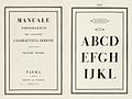 Bodoni's posthumous Manuale Tipografico, 1818
 Inline modern face
 Display type with pattern inside
 "Fat face" ultra-bold Didone type
 The original Clarendon typeface
 Display-size slab-serifs
 Miller and Richard's Modernised Old Style, a reimagination of pre-Didone typefaces
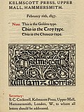 William Morris's Golden Type in the style of Jenson and other typefaces of his Kelmscott Press
 ATF's "Garamond" type, an example of historicist printing
 Memorial plaque by Eric Gill, c. 1920s
 Sample of the Linotype Legibility Group typefaces, the most popular newspaper typefaces during the twentieth century.[75]
 Humanist slab-serif PNM Caecilia on an Amazon Kindle


.jpg)


.jpg)


.jpg)


.png)
Remove ads
Analogues in other writing systems
Summarize
Perspective
East Asia

In the Chinese and Japanese writing systems, there are common type styles based on the regular script for Chinese characters akin to serif and sans serif fonts in the West. In Mainland China, the most popular category of serifed-like typefaces for body text is called Song (宋体, Songti); in Japan, the most popular serif style is called Minchō (明朝); and in Taiwan and Hong Kong, it is called Ming (明體, Mingti). The names of these lettering styles come from the Song and Ming dynasties, when block printing flourished in China. Because the wood grain on printing blocks ran horizontally, it was fairly easy to carve horizontal lines with the grain. However, carving vertical or slanted patterns was difficult because those patterns intersect with the grain and break easily. This resulted in a typeface that has thin horizontal strokes and thick vertical strokes.[citation needed] In accordance with Chinese calligraphy (kaiti style in particular), where each horizontal stroke is ended with a dipping motion of the brush, the ending of horizontal strokes are also thickened.[citation needed] These design forces resulted in the current Song typeface characterized by thick vertical strokes contrasted with thin horizontal strokes, triangular ornaments at the end of single horizontal strokes, and overall geometrical regularity.
In Japanese typography, the equivalent of serifs on kanji and kana characters are called uroko—"fish scales". In Chinese, the serifs are called either yǒujiǎotǐ (有脚体, lit. "forms with legs")[citation needed] or yǒuchènxiàntǐ (有衬线体, lit. "forms with ornamental lines").
The other common East Asian style of type is called black (黑体/體, Hēitǐ) in Chinese and Gothic (ゴシック体, Goshikku-tai) in Japanese. This group is characterized by lines of even thickness for each stroke, the equivalent of "sans serif". This style, first introduced on newspaper headlines, is commonly used on headings, websites, signs and billboards. A Japanese-language font designed in imitation of western serifs also exists.[76]
Thai
Farang Ses, designed in 1913, was the first Thai typeface to employ thick and thin strokes reflecting old-style serif Latin typefaces, and became extremely popular, with its derivatives widely used into the digital age. (Examples: Angsana UPC, Kinnari)[77]
Compared to blackletter
In Germany and other Central European countries, blackletter remained the norm in body text for longer than in Western Europe; see the Antiqua–Fraktur dispute, often dividing along ideological or political lines. After the mid-20th century, Fraktur fell out of favor and Antiqua-based typefaces became the official standard in Germany. (In German, the term "Antiqua" refers to serif typefaces.[78])
Remove ads
See also
Look up serif in Wiktionary, the free dictionary.
- Homoglyph
- Ming (typeface), a similar style in Asian typefaces
- The analogs of serifs, known in Japanese as 鱗 uroko, literally "fish scales"
- San Serriffe, an elaborate typographic joke
Lists of serif typefaces
Notes
- Specifically, Manutius's type, the first type now classified as "Garalde", was not so different from other typefaces around at the time.[9] However, the waves of "Garalde" faces coming out of France from the 1530s onwards did tend to cleanly displace earlier typefaces, and became an international standard.[19][20]
- Early italics were intended to exist on their own on the page, and so often had very long ascenders and descenders, especially the "chancery italics" of printers such as Arrighi.[29] Jan van Krimpen's Cancelleresca Bastarda typeface, intended to complement his serif family Romulus, was nonetheless cast on a larger body to allow it to have an appropriately expansive feel.
- Monotype executive Stanley Morison, who commissioned Times New Roman, noted that he hoped that it "has the merit of not looking as if it had been designed by somebody in particular".[41]
- It should be realised that "Transitional" is a somewhat nebulous classification, almost always including Baskerville and other typefaces around this period but also sometimes including 19th and 20th-century reimaginations of old-style faces, such as Bookman and Plantin, and sometimes some of the later "old-style" faces such as the work of Caslon and his imitators. In addition, of course Baskerville and others of this period would not have seen their work as "transitional" but as an end in itself. Eliason (2015) provides a leading modern critique and assessment of the classification, but even in 1930 A.F. Johnson called the term "vague and unsatisfactory."[42][44]
- Early slab-serif types were given a variety of names for branding purposes, such as 'Egyptian', 'Italian', 'Ionic', 'Doric', 'French-Clarendon' and 'Antique', which generally have little or no connection to their actual history. Nonetheless, the names have persisted in use.
Remove ads
Citations
Bibliography
Wikiwand - on
Seamless Wikipedia browsing. On steroids.
Remove ads