WIMP (computing)
Style of human-computer interaction From Wikipedia, the free encyclopedia
In human–computer interaction, WIMP stands for "windows, icons, menus, pointer",[1][2][3] denoting a style of interaction using these elements of the user interface. Other expansions are sometimes used, such as substituting "mouse" and "mice" for menus, or "pull-down menu" and "pointing" for pointer.[4][5][6]

Though the acronym has fallen into disuse, it has often been likened to the term graphical user interface (GUI). Any interface that uses graphics can be called a GUI, and WIMP systems derive from such systems. However, while all WIMP systems use graphics as a key element (the icon and pointer elements), and therefore are GUIs, the reverse is not true. Some GUIs are not based in windows, icons, menus, and pointers. For example, most mobile phones represent actions as icons and menus, but often do not rely on a conventional pointer or containerized windows to host program interactions.[citation needed]
WIMP interaction was developed at Xerox PARC (see Xerox Alto, developed in 1973) and popularized with Apple's introduction of the Macintosh in 1984, which added the concepts of the "menu bar" and extended window management.[7]
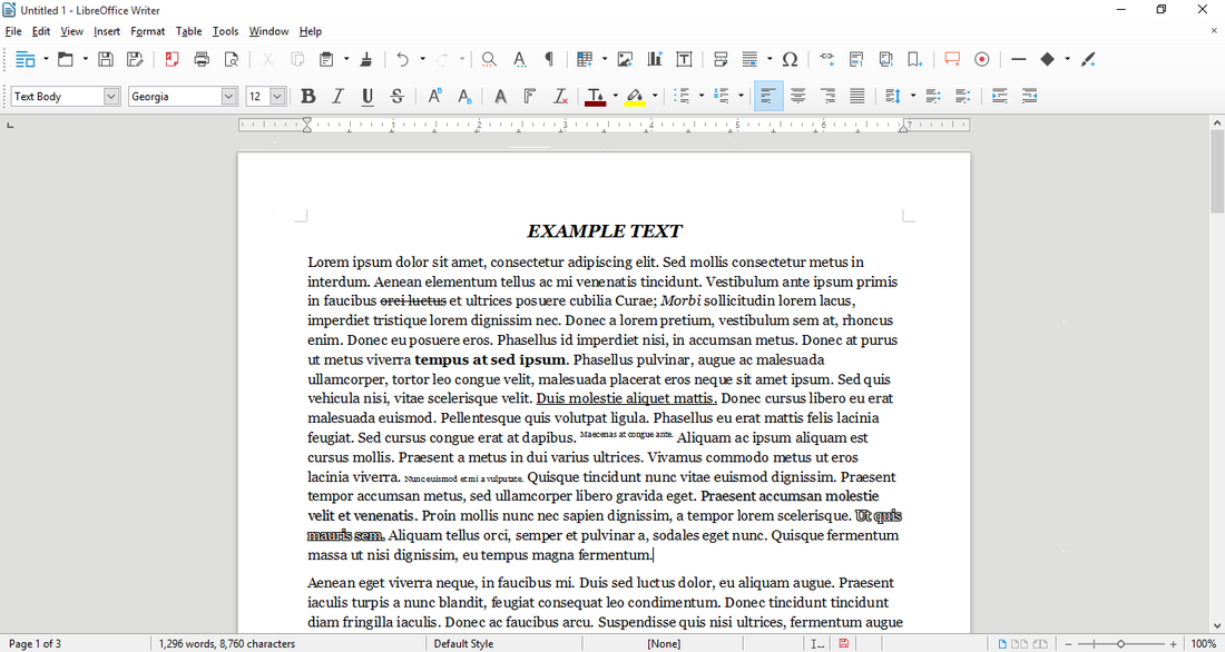
The WIMP interface has the following components:[8]
- A window runs a self-contained program, isolated from other programs that (if in a multi-program operating system) run at the same time in other windows.
- These individual program containers enable users to move fluidly between different windows.
- The window manager software is typically designed such that it is clear which window is currently active. Design principles of spacing, grouping, and simplicity help the user maintain focus when working between more than one window.
- An icon acts as a shortcut to an action the computer performs (e.g., execute a program or task).
- Text labels can be used alongside icons to help identification for small icon sets.
- A menu is a text or icon-based selection system that selects and executes programs or tasks. Menus may change depending on context in which they are accessed.
- The pointer is an onscreen symbol that represents movement of a physical device that the user controls to select icons, data elements, etc.
This style of system improves human–computer interaction (HCI) by emulating real-world interactions and providing greater ease of use for non-technical people. Because programs contained by a WIMP interface subsequently rely on the same core input methods, the interactions throughout the system are standardized. This consistency allows users' skills to carry from one application to another.
Criticism
Some human–computer interaction researchers consider WIMP to be ill-suited for multiple applications, especially those requiring precise human input or more than three dimensions of input.[9] Drawing and writing are example of these limitations; a traditional pointer is limited by two dimensions, and consequently doesn't account for the pressure applied when using a physical writing utility. Pressure-sensitive graphics tablets are often used to overcome this limitation.[10]
Another issue with WIMP-style user interfaces is that many implementations put users with disabilities at a disadvantage. For example, visually impaired users may have difficulty using applications when alternative text-based interfaces are not made available. People with motor impairments, such as Parkinson's disease, may not be able to navigate devices precisely using the traditional mouse pointer for input. To overcome these barriers, researchers continue to explore ways to make modern computer systems more accessible.[11] Recent developments in artificial intelligence, specifically machine learning, have opened new doors for accessibility in technology, or assistive technology.[12][13]
Moving past the WIMP interface
Multiple studies have explored the possibilities of moving past the WIMP interface, such as using reality-based interaction,[14] making the interface "three-dimensional" by adding visual depth through the use of monocular cues,[15][16][17][18] and even combining depth with physics.[19] The latter resulted in the development of BumpTop desktop and its acquisition and release by Google.[citation needed]
See also
References
Bibliography
External links
Wikiwand - on
Seamless Wikipedia browsing. On steroids.
