Pie menu
Software menu where elements are arranged in a circle From Wikipedia, the free encyclopedia
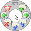
In user interface design, a pie menu or radial menu is a circular context menu where selection depends on direction. It is a graphical control element. A pie menu is made of several "pie slices" around an inactive center and works best with stylus input, and well with a mouse. Pie slices are drawn with a hole in the middle for an easy way to exit the menu.

Pie menus work well with keyboard acceleration, particularly four and eight item menus, on the cursor keys and the number pad. A goal of pie menus is to provide a smooth, reliable gestural style of interaction for novices and experts.[1] A slice can lead to another pie menu; selecting this may center the pointer in the new menu.
A marking menu[2] is a variant of this technique that makes the menu less sensitive to variance in gesture size.[3]
As a kind of context menu, pie menus are often context-sensitive,[4] showing different options depending on what the pointer was pointing at when the menu was requested.
History
The first documented radial menu is attributed to a system called PIXIE in 1969. Some universities explored alternative visual layouts.[5]
In 1986, Mike Gallaher and Don Hopkins together independently arrived at the concept of a context menu based on the angle to the origin where the exact angle and radius could be passed as parameters to a command, and a mouse click could be used to trigger an item or submenu.[6]
The first performance comparison to linear menus was performed in 1988, and showed an increase in performance of 15% less time and a reduction of selection errors.[7]
The role-playing video game Secret of Mana featured an innovative icon-based radial menu system in 1993.[8] Its ring menu system was adopted by later video games.[9]
Usage
This section needs additional citations for verification. (March 2015) |
Pie menus are a self-revealing gestural interface: they display multiple options to a user and direct them to select one.
Users operate the menu by observing the labels or icons present as options, moving the pointer in the desired direction, then clicking to make a selection. This action is called a "mark ahead" ("mouse ahead" in the case of a mouse, "wave ahead" in the case of a dataglove).[citation needed]
Repetition of actions and memorization of the interface further simplify the user experience. Pie menus take advantage of the body's ability to remember muscle motion and direction, even when the mind has forgotten the corresponding symbolic labels.[1]
Comparison with other interaction techniques
Summarize
Perspective
Pie menus are faster and more reliable to select from than linear menus, because selection depends on direction instead of distance. The circular menu slices are large in size and near the pointer for fast interaction (see Fitts's law). Experienced users use muscle memory without looking at the menu while selecting from it.[1][10] Nested pie menus can efficiently offer many options, and some pie menus can pop up linear menus, and combine linear and radial items in the same menu.[11] Pie menus, just like any popup menu, are shown only when requested, resulting in less visual distraction and cognitive load than toolbars and menu bars that are always shown.
Pie menus show available options, in contrast to invisible mouse gestures. Pie menus, which delay appearance until the pointer is not moving, reduce intrusiveness to the same level as mouse gestures for experienced users. Pie menus take up more screen space than linear menus, and the number of slices in an individual menu must be kept low for effectiveness by using submenus. When using pie menus, submenus may overlap with the parent menu, but the parent menu may become translucent or hidden.
Pie menus are most suited for actions that have been laid out by humans, and have logical grouping choices. Linear menus are most suited for dynamic, large menus that have many possible options, without any logical grouping,[1] since pie menus can only show a limited number of menu items. Around 3-12 items can be reasonably accommodated in a radial layout, but additional items past that tend to counteract the benefits of using pie menus in the first place. This can be overcome with related techniques that allow chaining commands in one single gesture through submenus.[3][12]
However, using interaction techniques that are not pointer-based have proven problematic with both pie and linear menus for cluttered digital tabletop, where physical objects might occlude menu items.[13]
Pie menus are unavailable as standard graphical control element in common commercial toolkits. Video games often require custom widget development, so pie menu cost is lower in that particular scenario.
Notable implementations
This section may contain information not important or relevant to the article's subject. (March 2011) |
Software

- Pie Menu for Mac OS can trigger a Pie Menu for every active app
- Pieoneer for macOS lets users switch between running apps and launch favorites ones
- Android Browser in Android
- Autodesk Maya, a commercial 3D modelling program[14]
- Blender, an open source 3D modelling program, which currently has pie menus as an optional feature
- BumpTop, a computer desktop created to mimic paper files on a real world desk that uses pie menus as many of its control menus
- PowerAnimator, a commercial 3D modelling program that used marking menus[15]
- Mozilla and Mozilla Firefox extensions RadialContext[16][17] and easyGestures[18]
- Metisse and Unix Desktop Environment, window managers for the X Window System
- modo, an advanced polygon and subdivision surface modeling package
- SolidWorks, a 3D modeling software.
- Songza, a music search engine and internet jukebox that uses a pie menu for its main mode of interaction, by Aza Raskin
- Quicksilver via the Constellation plug-in
- Sugar, GUI implementation for the One Laptop per Child project
- OneNote App for Windows 8 and Windows RT
- The Cherry mouse driver for the Power Pad mouse M-1000 optionally offers a circular context menu
- The Samsung Galaxy Note series, starting with the Note 3[19][20][21]
- RadialMenu, lightweight free software for Windows programmed with AutoHotkey
Games
- In the game Counter-Strike: Global Offensive, the buy menu is a radial menu.
- The 2000 videogame The Sims extensively utilized pie menus for player-directed interaction. These pie menus were primarily developed by Don Hopkins.[22]
- The videogame Grand Theft Auto V, for weapon and radio station selection[23]
- Secret of Mana[24] and its successor Secret of Evermore (where the menu was used to accelerate the pacing of combat[25])
- The Curse of Monkey Island, also called a "Verb Coin"[26][27]
- Games by BioWare use the "Dialogue Wheel", a patented radial menu
See also
References
External links
Wikiwand - on
Seamless Wikipedia browsing. On steroids.
