Top Qs
Timeline
Chat
Perspective
Matrix (printing)
Mould used to cast letter blocks (sorts) used in printing From Wikipedia, the free encyclopedia
Remove ads
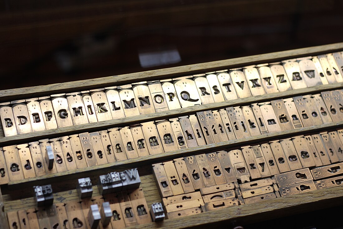
In the manufacture of metal type used in letterpress printing, a matrix (from the Latin meaning womb or a female breeding animal) is the mould used to cast a letter, known as a sort.[4] Matrices for printing types were made of copper.[5]

However, in printmaking the matrix is whatever is used, with ink, to hold the image that makes up the print, whether a plate in etching and engraving or a woodblock in woodcut.
Remove ads
Description
Summarize
Perspective
In letterpress or "cold metal" typesetting, used from the beginning of printing to the late nineteenth century, the matrix of one letter is inserted into the bottom of an adjustable-width hand mould, the mould is locked and molten type metal is poured into a straight-sided vertical cavity above the matrix. When the metal has cooled and solidified the mould is unlocked and the newly cast metal sort is removed. The matrix can then be reused to produce more copies of the sort.[6] The sorts could then be cleaned up and sent to the printer. In a low-pressure hand mould matrices are long-lasting and so could be used many times.[7]

In the hot metal typesetting systems of the later years of metal type printing, from the late nineteenth century onwards, new type is cast for each job under the control of a keyboard. The matrix or mats for a complete font are loaded into a matrix-case and inserted into a casting machine, which casts the required sorts (or, in a Linotype machine, a solid block for each line) for a page composition automatically, often from a paper reel.
Manufacture

The standard method to make a matrix was to drive a steel punch in the shape of the type to be made into soft copper.[10] The matrix could then be cleaned up and cut down to the width of the letter to be cast: this is called "justification" and sets the width of the letter when cast. A matrix that has not yet been justified is called a "strike". Adjustment of the matrix had to be done very carefully to ensure even flow of letters on the page.
Large typefaces, or wide designs such as emblems or medallions, were never very easily produced by punching since it was hard to drive large punches evenly. Early alternative methods used included printing from woodblocks, 'dabbing', where wood-blocks were punched into metal softened by heating, or carefully casting type or matrices in moulds made of softer materials than copper such as sand, clay, or punched lead.[11][12][13][14] One solution to the problem in the early nineteenth century was William Caslon IV's riveted "Sanspareil" matrices formed by cut-out from layered sheets. The problem was ultimately solved in the mid-nineteenth century by new technologies, electrotyping and pantograph engraving, the latter both for wood type and then for matrices.
From the nineteenth century additional technologies arrived to make matrices. The first was electrotyping from the 1840s, which forms a copper matrix around a pattern letter by electrodeposition of copper.[a] The advantage of electrotyping was that the pattern letter did not have to be out of hard steel, so it could be cut in soft lead alloy much faster than a punch could. This allowed an explosion in the number of display typefaces available.[16] It also allowed printers to form matrices for types for which they did not have matrices, or duplicate matrices when they had no punches, and accordingly was less honourably used to pirate typefaces from other foundries.[16] The technology was most commonly used for larger and more esoteric display typefaces, with punched matrices preferred for body text types.[16] An additional technology from the 1880s was the direct engraving of punches (or matrices, especially with larger fonts) using a pantograph cutting machine, controlled by replicating hand movements at a smaller size.[10]
Duplexing

A duplexed matrix with two sites for casting letters was common on Linotype machines. By switching the position of the matrices in the machine it was easy to switch between casting two styles in the same line, the characters of which would have identical width.[17][18][19] A common combination was regular and italic for printing body text, or regular and bold as with Metro, but Linotype also offered more unusual combinations, such as a serif text face duplexed with a bold sans-serif for emphasis.[20]
Remove ads
See also
References
Wikiwand - on
Seamless Wikipedia browsing. On steroids.
Remove ads
