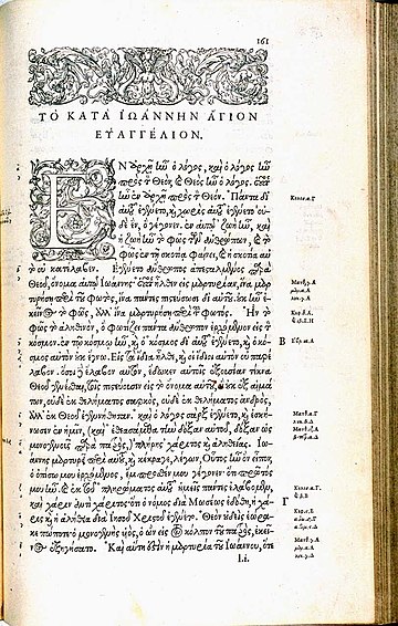
Les Grecs du roi (lit. "the king's Greeks") are a celebrated and influential Greek alphabet typeface in the Greek minuscule style which was cut by the French punchcutter Claude Garamond between 1541 and 1550. Arthur Tilley calls the books printed from them "among the most finished specimens of typography that exist".[2]


The Grecs du roi punches were ordered by Pierre du Chastel on behalf of King Francis I of France from Robert Estienne in a contract dated 2 November 1540 and remain the property of the French government.[3] The design was based on the handwriting of the Cretan copyist Angelo Vergecio, and includes many alternate letters and ligatures. The Grecs du roi were influenced by types cut by Francesco Griffo and used by printer Aldus Manutius in Venice. The types formed the basic model for Greek typefaces for the next two centuries.[4]
History
Garamond was contracted to cut the Grecs du roi types on 2 November 1540.[5][6] It took Garamond nearly 10 years to complete all the sizes. In 1543, he completed the medium sized 16pt character set, which he named "gros romaine". Three years later, in 1546, he completed the small sized 9pt character set which he named "Cicéro". Finally, in 1550, he completed the large sized 20pt character set, which he named "gros parangon".[7][8][9][10]

The Grecs du roi were extremely influential and became a model other printers and publishers quickly sought to emulate, with versions by other French punchcutters even before Garamond had finished the last size.[11] According to John A. Lane, the most popular imitations were those made by Pierre Haultin and Robert Granjon, which were also widely used abroad.[12][13] More obscure versions in France were made by du Villiers, Jean Arnoul le Jeune dit Picard and possibly Michel Du Boys, and abroad one known in Hamburg from 1587, and in the sixteenth century several by Jean Jannon and one made in London by Arthur Nicholls.[14][15]
The Grecs du roi style, although extremely influential, placed significant demands on printers, since it requires a choice among many possible sorts that could be used in every word, in contrast to Latin-alphabet general-purpose typefaces which do not attempt to simulate handwriting as closely. Typefaces designed for Greek since that time have generally been much simpler, with a decline in number of ligatures. Gerry Leonidas, a leading expert on Greek typesetting, felt that Vergecio's handwriting "has all the marks of a script that is unsuitable for conversion to [printing]."[16]
In 1946, the original punches were classified as historical monuments.[17]
Digitizations

A digital revival of the Grecs du roi was created by Franck Jalleau of the Imprimerie Nationale and used for a publication of Pindar's Olympic Odes on the occasion of the 2004 Summer Olympics in Athens.[18][19]
A later digital revival of the Grecs du roi was created by Anagrafi Fonts in 2009, being renamed to KS-GrequeX in the process. It includes 2 weights and over 1100 glyphs and ligatures, more than Garamond had cut.[20]
Mindaugas Strockis created a free digital font named Grecs du roi WG in 2001, though it lacks ligatures.[21]
George Douros's Anaktoria, part of his Unicode Fonts for Ancient Scripts, is a reproduction of the Grecs du roi with ligatures. After several years in the public domain, Douros attempted to claw back his copyright on the font files in 2018, licensing the font for private personal use only.[22]
See also
- Garamond
- Greek minuscule - includes information on ligatures
References
External links
Wikiwand in your browser!
Seamless Wikipedia browsing. On steroids.
Every time you click a link to Wikipedia, Wiktionary or Wikiquote in your browser's search results, it will show the modern Wikiwand interface.
Wikiwand extension is a five stars, simple, with minimum permission required to keep your browsing private, safe and transparent.
