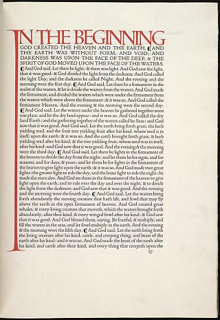
The Doves Press was a private press based in Hammersmith, London. During nearly seventeen years of operation, Doves Press produced notable examples of twentieth-century typography. A distinguishing feature of its books was a specially-devised typeface, known variously as Doves Roman, Doves Press Fount of Type, or simply Doves Type.

Doves Press publishing business
Financed by Anne Cobden-Sanderson, Doves Press was founded by T. J. Cobden-Sanderson sometime before 1900 (when he invited Emery Walker to join him). Their partnership was dissolved in 1908,[1] but Cobden-Sanderson continued printing.
Cobden-Sanderson had commissioned the press's own typeface – Doves Type – that was drawn under the supervision of Walker. The Doves Bindery that Cobden-Sanderson had set up in 1893 bound the books he and Walker printed. The press produced all its books using a single 16-point size of this house typeface between 1900 and 1916. The press is considered to have been a significant contributor to the Arts and Crafts movement, whose founders ware associated with William Morris and the Kelmscott Press.
The capital letters of Doves Type were based on typefaces used by Nicolas Jenson from the 1470s and the lowercase letters were based on typefaces used by Jacobus Rubeus. Atypical punctuation, extremely wide capitals, and an offset dot of the letter 'i' were distinctive features of the typeface. Doves Type was similar to William Morris's earlier Golden Type and, like it, was cut by punchcutter Edward Prince.[2][3][4][5][6]
The press was located at No. 1 Hammersmith Terrace. It was named after The Dove, Hammersmith, a nearby riverside pub. The Doves Press was responsible for the Doves Bible (5 vols, 1902–1904), which the Columbia Encyclopedia considered one of the best examples of its kind.[3]
The Doves Type dispute
By 1909, on the dissolution of their partnership, Cobden-Sanderson and Walker were in a protracted and bitter dispute involving the rights to Doves Type. As part of the partnership dissolution agreement, all rights to Doves Type were to pass to Walker upon the death of Cobden-Sanderson. Instead of letting this happen, on Good Friday, 21 March 1913, Cobden-Sanderson threw the matrices and punches into the River Thames off Hammersmith Bridge in London, a short walk from the press.[7] In the journals of Cobden-Sanderson, however, he recorded that he began the destruction of the typeface matrices and punches three years later, beginning on 31 August 1916 at midnight, when "it seemed a suitable night, and time".[8] He is said to have completed the task in January 1917, after 170 trips to the river,[9] although his Journals do not mention the culmination.
Re-creating Doves Type
The first digital revival of Doves Type was made in 1994 by Swedish designer Torbjörn Olsson, who added an italic font for the typeface. His fonts reproduce the soft corners and imperfections of the printed characters.[10]
In 2013, designer Robert Green began to create a more polished digital version of Doves Type.[11] In 2015, after searching the riverbed of the Thames near Hammersmith Bridge with help from the Port of London Authority, Green managed to recover 150 pieces of the original type, which helped him to refine the re-created typeface.[12][13][14]
Two variants of Green's re-created Doves Type, Text and Headline fonts, are now distributed by Typespec. The Headline variant is used by the Thames Tideway Scheme for architectural lettering.[15][16]
Other digital revival projects include "Mebinac" by Alan Hayward as well as "Thames-Capsule" by Raphaël Verona and Gaël Faure.[10]
See also
- Ashendene Press – Private press (1895–1935) based in Chelsea, London
- Essex House Press – Private press (1898-1910) founded by Charles Robert Ashbee
- Golden Cockerel Press – English fine press operating between 1920 and 1961
- Kelmscott Press – Private press founded by designer William Morris in 1891
References
Sources
Further reading
External links
Wikiwand in your browser!
Seamless Wikipedia browsing. On steroids.
Every time you click a link to Wikipedia, Wiktionary or Wikiquote in your browser's search results, it will show the modern Wikiwand interface.
Wikiwand extension is a five stars, simple, with minimum permission required to keep your browsing private, safe and transparent.
