Arthur Rackham
English book illustrator (1867–1939) From Wikipedia, the free encyclopedia
Arthur Rackham RWS (19 September 1867 – 6 September 1939) was an English book illustrator. He is recognised as one of the leading figures during the Golden Age of British book illustration. His work is noted for its robust pen and ink drawings, which were combined with the use of watercolour, a technique he developed due to his background as a journalistic illustrator.
Arthur Rackham | |
|---|---|
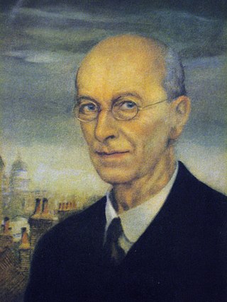
 Self-portrait, 1934 | |
| Born | 19 September 1867 London, England |
| Died | 6 September 1939 (aged 71) Limpsfield, Surrey, England |
| Known for | Children's literature, Illustration |
Rackham's 51 colour pieces for the early American tale Rip Van Winkle became a turning point in the production of books since – through colour-separated printing – it featured the accurate reproduction of colour artwork.[1] His best-known works also include the illustrations for Peter Pan in Kensington Gardens, and Fairy Tales of the Brothers Grimm.
Biography
Summarize
Perspective
Rackham was born at 210 South Lambeth Road, Vauxhall, London as one of 12 children. In 1884, at the age of 17, he was sent on an ocean voyage to Australia to improve his fragile health, accompanied by two aunts.[2] At the age of 18, he worked as an insurance clerk at the Westminster Fire Office and began studying part-time at the Lambeth School of Art.[3]
In 1892, he left his job and started working for the Westminster Budget as a reporter and illustrator. His first book of illustrations were published in 1893 in To the Other Side by Thomas Rhodes, but his first serious commission was in 1894 for The Dolly Dialogues, the collected sketches of Anthony Hope, who later went on to write The Prisoner of Zenda. Book illustrating then became Rackham's career for the rest of his life.
By the turn of the century, Rackham had developed a reputation for pen and ink fantasy illustration with richly illustrated gift books such as The Ingoldsby Legends (1898), Gulliver's Travels and Fairy Tales of the Brothers Grimm (both 1900). This was developed further through the austere years of the Boer War with regular contributions to children's periodicals such as Little Folks and Cassell's Magazine. In 1901 he moved to Wychcombe Studios near Haverstock Hill, and in 1903 married his neighbour Edyth Starkie.[4] Edyth suffered a miscarriage in 1904, but the couple had one daughter, Barbara, in 1908. Although acknowledged as an accomplished black-and-white book illustrator for some years, it was the publication of his full-colour plates to Washington Irving's Rip Van Winkle by Heinemann in 1905 that particularly brought him into public attention, his reputation being confirmed the following year with J.M.Barrie's Peter Pan in Kensington Gardens, published by Hodder & Stoughton. Income from the books was greatly augmented by annual exhibitions of the artwork at the Leicester Galleries. Rackham won a gold medal at the Milan International Exhibition in 1906 and another one at the Barcelona International Exposition in 1912. His works were included in numerous exhibitions, including one at the Louvre in Paris in 1914. Rackham was a member of the Art Workers' Guild and was elected its Master in 1919.[5]
From 1906 the family lived in Chalcot Gardens, near Haverstock Hill,[6] until moving from London to Houghton, West Sussex in 1920. In 1929, the family settled into a newly built property in Limpsfield, Surrey.[7] Ten years later, Arthur Rackham died at home of cancer.
Significance
Summarize
Perspective

Arthur Rackham is widely regarded as one of the leading illustrators from the 'Golden Age' of British book illustration which roughly encompassed the years from 1890 until the end of the First World War. During that period, there was a strong market for high quality illustrated books which typically were given as Christmas gifts. Many of Rackham's books were produced in a de luxe limited edition, often vellum bound and usually signed, as well as a smaller, less ornately bound quarto 'trade' edition. This was sometimes followed by a more modestly presented octavo edition in subsequent years for particularly popular books. The onset of the war in 1914 curtailed the market for such quality books, and the public's taste for fantasy and fairies also declined in the 1920s.
Sutherland, referring to Rackham's work in the 20th century, states: "Rackham was, without doubt, one of the finest illustrators of the century."[8] In his survey of British Book Illustration, Salaman stated: "Mr. Rackham stands apart from all the other illustrators of the day; his genius is so thoroughly original. Scores of others have depicted fairyland and wonderland, but who else has given us so absolutely individual and persuasively suggestive a vision of their marvels and allurements? Whose elves are so elfish, whose witches and gnomes are so convincingly of their kind, as Mr. Rackham's?"[9]
Carpenter and Prichard noted that "For all the virtuosity of his work in colour, Rackham remained an artist in line, his mastery having its roots in his early work for periodicals, then breaking free to create the swirling intricate pictures of his prime, and finally reaching the economy and impressionism of his last work." They also remarked on his decline: "Rackham made his name in a heyday of fairy literature and other fantasy which the First World War brought to an end."[10] House stated that Rackham "concentrated on the illustration of books and particularly those of a mystical, magic or legendary background. He very soon established himself as one of the foremost Edwardian illustrators and was triumphant in the early 1900s when colour printing first enabled him to use subtle tints and muted tones to represent age and timelessness. Rackham's imaginative eye saw all forms with the eyes of childhood and created a world that was half reassuring and half frightening."[11]
Hamilton summarised his article on Rackham in the Oxford Dictionary of National Biography thus: "Rackham brought a renewed sense of excitement to book illustration that coincided with the rapid developments in printing technology in the early twentieth century. Working with subtle colour and wiry line, he exploited the growing strengths of commercial printing to create imagery and characterizations that reinvigorated children's literature, electrified young readers, and dominated the art of book illustration at the start of a new century."[12]
Arthur Rackham's works have become very popular since his death, both in North America and Britain. His images have been widely used by the greeting card industry and many of his books are still in print or have been recently available in both paperback and hardback editions. His original drawings and paintings are keenly sought at the major international art auction houses.
Technique
Summarize
Perspective

Rackham's illustrations were chiefly based on robust pen and India ink drawings. Rackham gradually perfected his own uniquely expressive line from his background in journalistic illustration, paired with subtle use of watercolour, a technique which he was able to exploit due to technological developments in photographic reproduction. With this development, Rackham's illustrations no longer needed an engraver (lacking Rackham's talent) to cut clean lines on a wood or metal plate for printing because the artist merely had his works photographed and mechanically reproduced.[13]
Rackham would first lightly block in shapes and details of the drawing with a soft pencil, for the more elaborate colour plates often utilising one of a small selection of compositional devices.[14] Over this, he would then carefully work in lines of pen and India ink, removing the pencil traces after the drawing had begun to take form. For colour pictures, Rackham preferred the 3-colour process or trichromatic printing, which reproduced the delicate half-tones of photography through letterpress printing.[15] He would begin painting by building up multiple thin washes of watercolour creating translucent tints. One of the disadvantages of the 3-colour (later 4-colour) printing process in the early years was that definition could be lost in the final print. Rackham would sometimes compensate for this by over-inking his drawings once more after painting.[16] He would also go on to expand the use of silhouette cuts in illustration work, particularly in the period after the First World War, as exemplified by his Sleeping Beauty and Cinderella.[17]
Typically, Rackham contributed both colour and monotone illustrations towards the works incorporating his images – and in the case of Hawthorne's Wonder Book, he also provided a number of part-coloured block images similar in style to Meiji era Japanese woodblocks.
Rackham's work has been described as a fusion of a northern European 'Nordic' style strongly influenced by the Japanese woodblock tradition of the early 19th century. However, his style is distinctly British and follows a long tradition of Victorian fairy painting and close and often uncomposed studies of understated brier-patch nature in the inclement British climate, as was common in the works of Joseph Noel Paton, the Pre-Raphaelites, and the more nature and fairy-inspired work of John Atkinson Grimshaw. The evolution in Rackham's work towards strong illustrative line and abstracted representation fuses these elements with British interpretations of the organic and sinuous forms of Art Nouveau and wider Arts & Crafts influences, such as the Glasgow Style or "Spook School", especially evident in the work of Margaret Macdonald Mackintosh. This impacts on reception of Rackham as far as the work may be viewed as illustrative painted art or as more decorative art suited to muted colour schemes; something that may have influenced a later 20th century revival in interest in Rackham for the creation of wall poster prints. The sombrely expressive and quite Gothic Horror elements of Rackham's work is reminiscent of some compositions by the French illustrator Gustave Doré, although any aspect of horror is underplayed for an audience which was intended by majority to be readers of childhood fantasy.[citation needed]
Notable works


- Sunrise-Land by Berlyn Annie (Jarrold, 1894)
- The Sketch Book by Washington Irving (Putnam, 1895)
- The Zankiwank and the Bletherwitch by Shafto Justin Adair Fitzgerald (40 line, 1896)
- Two Old Ladies, Two Foolish Fairies, and a Tom Cat by Maggie Browne (pseudonym of Margaret Hamer) (4 colour plates, 19 line, Cassel, London, 1897)
- Evelina by Fanny Burney (Newnes, London, 1898)
- Feats on the Fjord by Harriet Martineau (f/p colour, 11 line, 1899)[18]
- The Greek Heroes by Barthold Georg Niebuhr (4 colour plates, 8 line, 1903)
- Rip Van Winkle by Washington Irving (51 colour plates, 3 line, William Heinemann, London, 1905)
- Puck of Pook's Hill by Rudyard Kipling (4 colour plates; 1906, Doubleday, Page & Co. (one US ed.))
- Peter Pan in Kensington Gardens by J.M. Barrie (49 colour plates, Hodder & Stoughton, London, 1906)
- Alice's Adventures in Wonderland by Lewis Carroll (13 colour plates, 15 line, William Heinemann, London, 1907)
- The Ingoldsby Legends by Thomas Ingoldsby (12 colour, 80 line 1898; reworked edition 23 colour plates, 73 line, J.M. Dent, London, 1907)
- A Midsummer Night's Dream by William Shakespeare (40 colour plates, 34 line, William Heinemann, London, 1908)
- Tales from Shakespeare by Charles and Mary Lamb (colour F/P, 11 line 1899, reworked edition 12 colour plates, 37 line, 1909)
- Fairy Tales of the Brothers Grimm by the Brothers Grimm (95 line, 1900, reworked edition 40 colour plates, 62 line, 1909)
- Gulliver's Travels by Jonathan Swift (Colour F/P, 11 line 1900, reworked edition 12 colour plates, 34 line, 1909)
- Undine by Friedrich de la Motte Fouqué (15 colour plates, 41 line, William Heinemann, London, 1909)
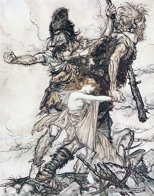
- The Rhinegold and The Valkyrie by Richard Wagner (34 colour plates, 8 line, William Heinemann, London, 1910)
- Siegfried and Twilight of the Gods by Richard Wagner (32 colour plates, 8 line, William Heinemann, London, 1911)
- Aesop's Fables by Aesop (13 colour plates, 82 line, William Heinemann, London, 1912)
- Arthur Rackham's Book of Pictures (44 colour plates, William Heinemann, London, 1913)
- Mother Goose: The Old Nursery Rhymes by Charles Perrault (13 colour plates, mostly reprinted from the US monthly St. Nicholas Magazine, 78 line, 1913)
- A Christmas Carol by Charles Dickens (12 colour plates, William Heinemann, London, 1915)
- The Allies' Fairy Book with an introduction by Edmund Gosse (12 colour plates, 23 line, William Heinemann, London, 1916)
- Little Brother and Little Sister and Other Tales by the Brothers Grimm (13 colour plates, 45 line, 1917)
- The Romance of King Arthur and His Knights of the Round Table by Alfred W. Pollard (23 colour and monotone plates, 16 line, 1917)
- English Fairy Tales by Flora Annie Steel (16 colour plates, 43 line, 1918)
- The Springtide of Life: Poems of Childhood by Algernon Charles Swinburne (8 colour plates, William Heinemann, London, 1918)
- Some British Ballads (16 colour plates, 23 line, 1918)
- Cinderella by Charles Perrault, ed. Charles S. Evans (1 colour plate, 60 silhouettes, William Heinemann, London, 1919)
- The Sleeping Beauty by Charles Perrault and the Brothers Grimm, ed. Charles S. Evans (1 colour plate, 65 silhouettes, William Heinemann, London, 1920)
- Irish Fairy Tales by James Stephens (16 colour plates, 20 line, 1920)
- Snowdrop and Other Tales by the Brothers Grimm (20 colour plates, 29 line, 1920)
- Comus by John Milton (22 colour plates, 35 line, 1921)
- A Wonder-Book for Girls and Boys by Nathaniel Hawthorne (16 colour plates, 21 line, 1922)
- Poor Cecco by Margery Williams (7 colour plates, 12 line, 1925)
- Where the Blue Begins by Christopher Morley (4 colour plates, 16 line, 1925)
- The Tempest by William Shakespeare (20 colour plates, 20 line, William Heinemann, London, 1926)
- The Legend of Sleepy Hollow by Washington Irving (8 colour plates, 32 line, 1928)
- The Vicar of Wakefield by Oliver Goldsmith (12 colour plates, 23 line, 1929)
- The Compleat Angler by Izaak Walton (12 colour plates, 22 line, 1931)
- The King of the Golden River by John Ruskin (4 colour plates, 13 line, T/P 2 colour, 1932)
- Fairy Tales by Hans Christian Andersen (12 colour plates, 43 line, 9 silhouettes, 1932)
- The Arthur Rackham Fairy Book (8 colour plates, 39 line, 13 silhouettes, 1933)
- Goblin Market by Christina Rossetti (4 colour plates, 19 line, E/P, 1933)
- The Pied Piper of Hamelin by Robert Browning (4 colour plates, 15 line, 1 silhouette, E/P, 1934)
- Tales of Mystery & Imagination by Edgar Allan Poe (12 colour plates, 28 line, 1935)
- Peer Gynt by Henrik Ibsen (12 colour plates, 38 line, 1936)
- The Wind in the Willows by Kenneth Grahame (16 colour plates; posthumous, 1940 US, 1950 UK)
Gallery
- "Fee-fi-fo-fum, I smell the blood of an Englishman", illustration to a 1918 English Fairy Tales, by Flora Annie Steel
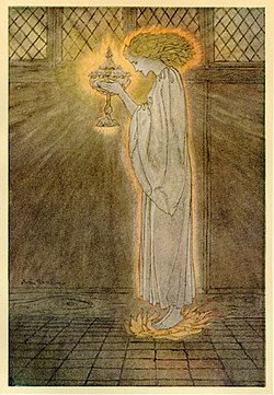
- "How at the Castle of Corbin a Maiden Bare in the Sangreal and Foretold the Achievements of Galahad", from The Romance of King Arthur and His Knights of the Round Table, by Alfred W. Pollard, 1917
- "The giant Galligantua and the wicked old magician transform the duke's daughter into a white hind", illustration to English Fairy Tales, by Flora Annie Steel
- "The giant Cormoran was the terror of all the country-side", illustration to English Fairy Tales, by Flora Annie Steel
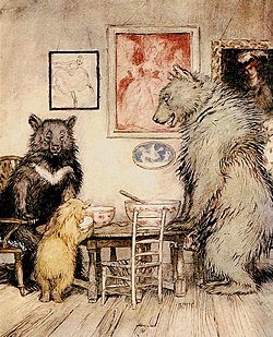
- "The Three Bears", illustration to English Fairy Tales, by Flora Annie Steel
- "The Rhinemaidens warn Siegfried", illustration to Richard Wagner's The Ring
- "The Rhinemaidens try to reclaim their gold", illustration to Richard Wagner's The Ring
- "The Twa Corbies", illustration to Some British Ballads
- "One day they were overheard by a fairy", illustration of Maimie and Tony in Peter Pan in Kensington Gardens
Influence
Summarize
Perspective

Rackham's work influenced a number of artists. These include Gustaf Tenggren, Brian Froud, William Stout, Tony DiTerlizzi, and Abigail Larson.[19] Froud cites the early influence of Rackham, "in particular, [Rackham's] drawings of trees that had faces", as sparking his interest in illustrating fairy tales, and describes having had a love of nature from childhood that has informed his style.[20]
According to Arthur Rankin, the visual style of the 1977 film The Hobbit was based on early illustrations by Rackham.[21]
The original Broadway Costume Designer for "Into the Woods", Ann Hould-Ward discussed looking at Arthur Rankin's illustrations as a starting place for the costume design. "Then, we spent a lot of time looking at illustrations through time of all of these various fairy tales. We spent a lot of time with the [Arthur] Rackham versions, which are those are beautiful illustrations..."[22]
In one of the featurettes on the DVD of Pan's Labyrinth, and in the commentary track for Hellboy, director Guillermo del Toro cites Rackham as an influence on the design of "The Faun" of Pan's Labyrinth. He liked the dark tone of Rackham's gritty realistic drawings and had decided to incorporate that into the film. In Hellboy, the design of the tree growing out of the altar in the ruined abbey off the coast of Scotland where Hellboy was brought over, is actually referred to as a "Rackham tree" by the director.
References
External links
Wikiwand - on
Seamless Wikipedia browsing. On steroids.
